20 Facebook carousel ad examples that stop the scroll and sell
What makes a user stop scrolling and start buying? Zeely AI reveals 20 high-performing Facebook carousel ad examples that turn engagement into conversions.
In a feed full of forgettable ads, Facebook Carousel Ads are built to break the scroll. With just a few swipeable frames, brands can showcase products, tell a story, or drive direct action — all within one compact format. From e-commerce giants to health brands, these carousels deliver visual rhythm, product clarity, and measurable results.
In this guide, you’ll find the best real-world carousel ad examples, each one breaking the mold with smart sequencing, strong visuals, and swipe-worthy copy. Whether you’re after engagement, clicks, or conversions, this list will show you exactly how top brands are using carousels to win attention and how you can, too.
Facebook carousel ad formats
Facebook Carousel Ads are an interactive ad format that allows users to swipe through multiple images or videos in a single ad unit.
These ads are designed to showcase multiple products, features, or messages within one ad space, providing a dynamic and engaging experience for the audience.
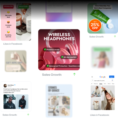
Here are some of the best Facebook carousel ad examples:
- Multi-image carousel ads. These ads feature a series of images that users can swipe through. Each image can have its own headline, description, and link. For example, a fashion brand might showcase different outfits in each card, allowing users to explore a variety of styles
- Video carousel ads. Instead of images, these ads use videos in each card. This format is great for storytelling or demonstrating product features. For instance, a tech company could use each video card to highlight different functionalities of a new gadget
- Mixed media carousel ads. These ads combine images and videos within the same carousel. This format offers flexibility and variety, making the ad more engaging. A travel agency might use images of destinations and videos of customer testimonials in the same ad
Facebook carousel ads are versatile and can be tailored to fit various marketing objectives, from brand awareness to direct sales. Their interactive nature encourages user engagement, making them a powerful tool in any advertiser’s arsenal. Find out whether you should use manual or automatic placement for your Facebook carousel ads.
Why use Facebook carousel ads?
Facebook carousel ads are a powerful choice for marketers seeking to boost engagement and ROI through interactive storytelling. By showcasing multiple products or features in a swipeable format, these ads capture attention and drive higher click-through rates compared to static ads.
- Storytelling carousels allow brands to build narratives that resonate emotionally with audiences, increasing the likelihood of conversions
- High engagement carousels use compelling visuals and calls-to-action to encourage user interaction, resulting in measurable ROI improvements
These examples demonstrate how leveraging the unique capabilities of carousel ads can elevate campaign performance and inspire creative strategies.
In this section, we’ll explore the best Facebook Carousel Ad examples that highlight these benefits, supported by logical reasoning, data-backed examples, and creative inspiration.
20 best Facebook carousel ad examples
Discover 20 standout Facebook carousel ad examples that showcase innovative ways to engage audiences and drive results.
E-commerce Facebook carousel ad examples
In the e-commerce sector, these Facebook carousel ad examples demonstrate powerful product sequencing to drive sales.
1. BarkBox: A monthly joy delivery for your dog
BarkBox delivers a curated box of dog toys, treats, and surprises to your doorstep every month. The brand leans into fun, pet-loving energy with a carousel-style ad format that invites viewers to swipe through each playful card. The message is simple: spoil your pup with thoughtfully selected goodies.
Why it worked:
- The swipeable design mimics unboxing — an interactive storytelling format
- Each frame offers a focused benefit, keeping the message digestible
- Engaging visuals build curiosity and encourage users to continue swiping
- The tone feels lighthearted, emotionally resonant, and timeless
Results:
While specific metrics aren’t disclosed, the design encourages high engagement and shares among pet lovers.
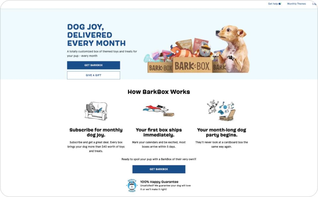
Photo source: BarkBox
2. Garmin: Premium smartwatches in a minimalist carousel
Garmin’s carousel ad keeps things sleek and efficient, spotlighting its high-end digital watches across just two well-designed cards. With bold visuals and crisp messaging, the ad emphasizes key features like fitness tracking, health monitoring, GPS, and long battery life, appealing to both tech and lifestyle audiences.
Why it worked:
- The message is sharp and economical — only two cards, but rich with value
- Each slide uses vibrant, consistent color schemes to grab attention
- The product benefits are clearly highlighted and tied directly to user needs
- Strong headlines make the value prop instantly scannable
Results:
This style of concise, high-impact creative is ideal for fast-scrolling environments. With just two cards, Garmin efficiently introduces its product and its value — a great model for brands aiming for clarity and elegance in carousel ads.
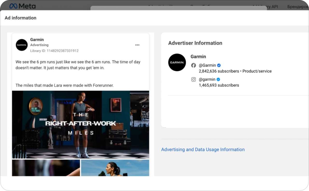
Photo source: Meta Library
3. Shein: Fast fashion meets flash deals
Shein’s carousel ad is built for quick impact, showcasing trendy, affordable fashion through bold visuals and empowering headlines. With each card spotlighting a different clothing item, the ad caters to fashion-forward shoppers looking for great Black Friday discounts without breaking the bank.
Why it worked:
- The copy is concise and clear — users immediately know it’s about fashionable deals
- Each carousel card displays a different outfit in consistent, polished photography
- The use-case styling helps viewers imagine themselves in the products
- Empowering headlines and product ID numbers add both emotion and convenience
Results:
The ad delivers both variety and clarity, helping Shein stand out in a crowded sales season. Its structure supports fast scrolling and quick purchase decisions, especially for mobile-first shoppers.
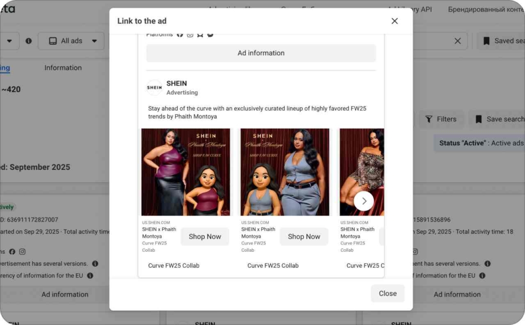
Photo source: Meta Library
4. Ralph Christian watches: Affordable luxury for the modern man
Ralph Christian’s carousel ad blends sophistication with accessibility, spotlighting luxury timepieces that look high-end without the high price tag. Each card maintains a consistent aesthetic, offering a clear visual experience while underscoring key product benefits.
Why it worked:
- The messaging is direct — viewers immediately understand what’s being sold
- Product photography is consistent and polished, showing the watch in lifestyle context
- Each card includes unique benefits, adding persuasive depth without overwhelming text
- The visual layout offers a strong sense of the product’s real-life look and quality
Results:
This ad serves as a clean and effective product showcase, appealing to aspirational buyers who value both design and price. Its structured simplicity makes it well-suited for platforms where fast visuals and clarity matter most.
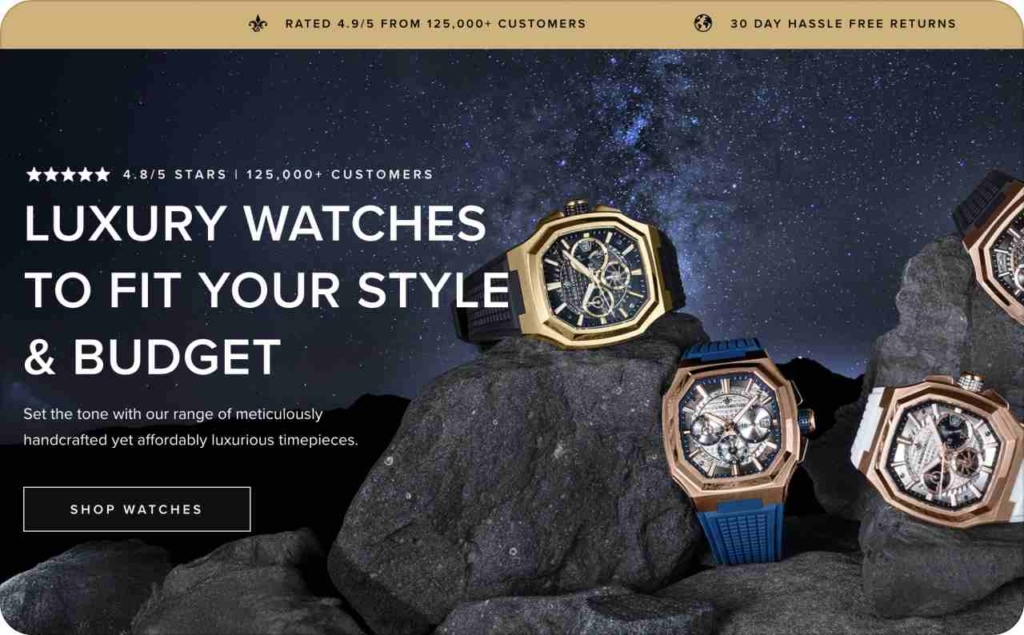
Photo source: Ralph Christian
5. Nike: Performance and comfort for young athletes
Nike’s ad delivers a clean, kid-focused message, showcasing activewear designed specifically for children. Through original photography and model-led visuals, the ad balances performance-driven appeal with the everyday comfort parents look for when shopping for their kids.
Why it worked:
- Original content and imagery give the ad an authentic, polished feel
- Using child models helps parents visualize the product in action
- Strong CTAs and clickable headlines guide users smoothly to product pages
- The layout is minimal yet effective, keeping focus on the gear and its use
Results:
This ad effectively positions Nike as a go-to for kids’ athleticwear, using lifestyle-led design and direct navigation to drive engagement and purchases. It’s a strong example of balancing emotional resonance with ecommerce functionality.
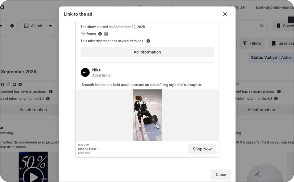
Photo source: Meta Library
Travel and hospitality Facebook carousel ad examples
Travel and hospitality brands leverage these carousel ad examples to spark wanderlust through sequenced visuals.
6. Airbnb: Turning travel dreams into scrollable stories
Airbnb’s storytelling carousel transforms a typical ad into a journey, guiding users through a series of immersive, swipeable cards that highlight unique stays and local experiences. Each frame builds on the last, mimicking the flow of a real vacation narrative.
Why it worked:
- The carousel format unfolds like a story, making each swipe feel purposeful
- Each card spotlights a different part of the travel experience — from cozy interiors to nearby hotspots
- Visuals are warm and inviting, encouraging emotional connection
- The structured progression subtly nudges viewers toward planning their next trip
Results:
The ad achieved high engagement and a measurable boost in bookings, proving that narrative-driven carousel ads can translate curiosity into conversions. It’s a standout example of using story structure to create emotional and commercial impact.
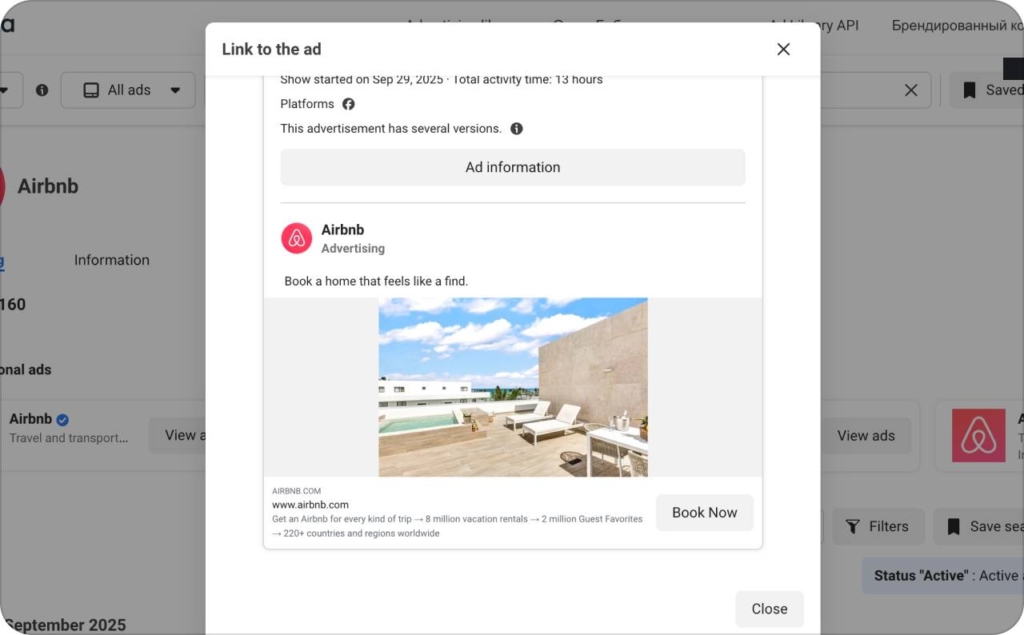
Photo source: Meta Library
7. Marriott: Elevating event promotions with swipeable luxury
Marriott’s event promotion carousel showcases how hospitality brands can use storytelling structure to drive bookings. Each card presents a key element of the event experience — from stunning venues to exclusive amenities, guiding users through a compelling, swipe-friendly preview.
Why it worked:
- Each card highlights a different selling point: location, ambiance, services, and perks
- The carousel structure mirrors a guided tour, inviting viewers to discover more with each swipe
- High-quality visuals create a sense of luxury and occasion
- The layout builds anticipation, making the offer feel more exclusive and time-sensitive
Results:
The ad delivered strong engagement and a measurable lift in bookings, proving that a well-sequenced carousel can turn passive viewers into active planners. It’s a top-tier template for event-based promotions in the hospitality space.
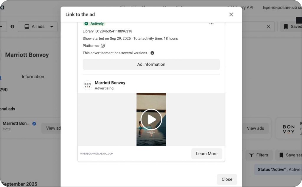
Photo source: Meta Library
8. Expedia: Swipe-to-explore travel destinations
Expedia’s manual carousel ad offers a visual buffet of travel options — each card spotlighting a unique destination with stunning imagery and direct booking links. The swipeable format invites users to browse effortlessly, mirroring the feeling of exploring a digital travel brochure.
Why it worked:
- Each card features a different destination, making the ad feel expansive and exploratory
- High-quality visuals capture the essence of each location, sparking emotional travel triggers
- Direct links streamline the journey from interest to action
- The manual swipe format keeps users engaged and in control of their experience
Results:
Expedia saw strong engagement and an uptick in bookings, highlighting the power of visual variety and interactivity in travel ads. This format is a proven winner for driving discovery and conversions in experience-based industries.
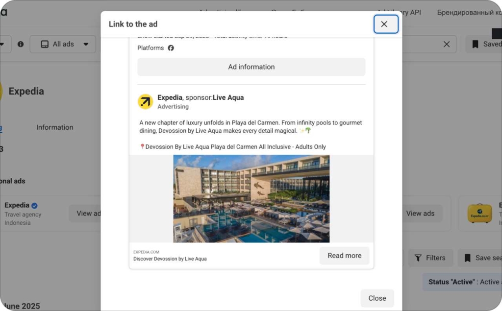
Photo source: Meta Library
9. Hilton: Storytelling that sells the experience
Hilton’s storytelling carousel ad paints a complete picture of the travel journey — from lavish accommodations to nearby cultural attractions. Each card plays a role in an immersive narrative, inviting viewers to envision a full stay, not just a place to sleep.
Why it worked:
- Each card contributes to a larger narrative arc, enhancing emotional engagement
- The visuals strike a balance between luxury interiors and lifestyle scenes
- The flow mirrors a real itinerary — from check-in to local exploration
- It builds momentum with every swipe, encouraging deeper interaction
Results:
The ad earned high engagement and boosted bookings, proving that storytelling carousels are especially effective in the hospitality space. By selling the journey, not just the hotel, Hilton made its offer more aspirational and memorable.
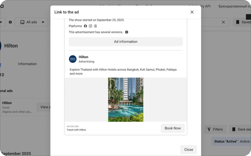
Photo source: Meta Library
10. Booking.Com: Driving urgency with event-focused carousels
Booking.com’s event promotion carousel delivers a compelling visual walk-through of a travel-based offer, highlighting key details like location, perks, and exclusive deals across multiple cards. The format builds narrative tension and urgency, nudging viewers toward action.
Why it worked:
- Each card zooms in on a different selling point — amenities, environment, or booking benefits
- The swipe sequence mirrors a guided pitch, educating and enticing with every step
- Clear visuals and concise copy make the promotion feel accessible and appealing
- Strong flow encourages users to continue swiping, increasing time spent with the ad
Results:
The campaign achieved notable engagement and a spike in bookings. This carousel format proves effective for promotions that require storytelling, urgency, and clear visual differentiation between features.
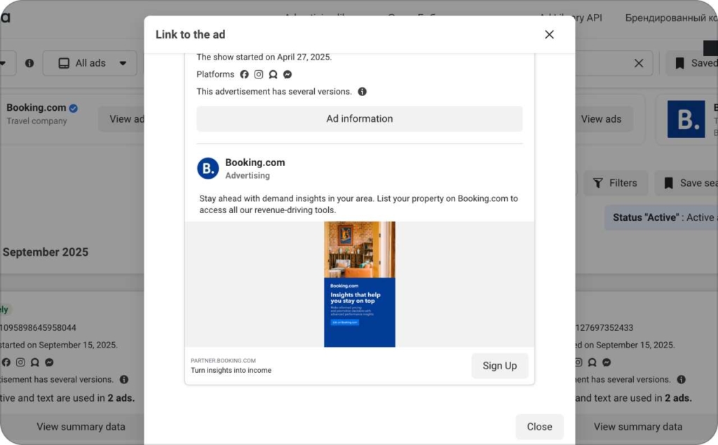
Photo source: Meta Library
Health and wellness Facebook carousel ad examples
Health and wellness carousel ads inspire transformation with these sequenced examples. Let’s explore these examples to understand how health and wellness brands are using carousel ads to boost engagement and conversions.
11. Peloton: Feature-driven storytelling in motion
Peloton’s product feature carousel offers a sleek and focused walkthrough of its product ecosystem — from bikes to treadmills and accessories. Each card spotlights a different item, pairing clean visuals with benefit-focused copy to deliver a compelling, scrollable product tour.
Why it worked:
- Each card zeroes in on a single product, making the message clear and digestible
- High-quality visuals maintain consistency while allowing each product to shine
- Feature-focused copy builds value and helps differentiate offerings
- The progression feels intentional, guiding viewers through a mini-catalog experience
Results:
The carousel boosted product awareness and engagement by making comparison shopping intuitive and visually rewarding. Peloton’s approach is a smart template for product-rich brands looking to tell multiple stories in a single ad.
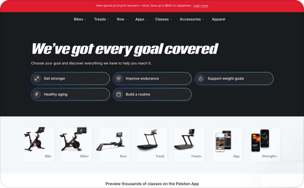
Photo source: Peloton
12. Fitbit: Personalized retargeting with dynamic product carousels
Fitbit’s dynamic product ad taps into Facebook’s smart carousel format to serve personalized product recommendations based on user behavior. Each card showcases an item a viewer previously interacted with, like image, name, price, and a frictionless path to purchase.
Why it worked:
- Personalization makes each ad feel relevant, boosting engagement and conversion likelihood
- Dynamic cards reduce manual creative work while ensuring freshness across campaigns
- Simple layout keeps focus on the product
- Seamless link-back to purchase page shortens the buying journey
Results:
This dynamic carousel approach drove higher return on ad spend by targeting intent-rich users with the exact products they showed interest in. A best-in-class example of automated, performance-driven personalization at scale.
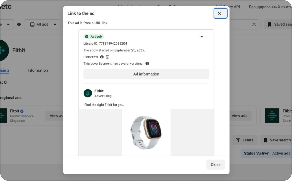
Photo source: Meta Library
13. GNC Live Well: Multi-product storytelling for wellness shoppers
GNC’s product feature carousel brings its health and wellness lineup to life with each card spotlighting a different supplement or product, paired with high-impact visuals and benefit-driven copy. The sequence builds brand credibility while helping consumers quickly identify what fits their needs.
Why it worked:
- Each product gets its own spotlight, making it easy for viewers to scan and choose
- Concise descriptions highlight key ingredients and health benefits
- Consistent visual branding across cards reinforces trust and recognition
- A clear call to action anchors the end of the journey, driving clicks and conversions
Results:
The carousel improved product visibility and drove engagement by enabling viewers to explore options in a curated, scrollable format. GNC effectively used this layout to combine education, promotion, and action into one cohesive ad.
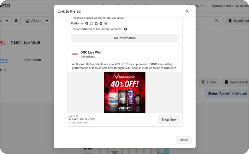
Photo source: Meta Library
14. Whole Foods: Swipeable wellness for conscious consumers
Whole Foods’ high engagement carousel ad turns healthy living into a swipeable experience, each card offering value-packed content like recipes, nutrition tips, and wellness hacks. Rather than pushing product, the ad builds trust by delivering education and inspiration first.
Why it worked:
- Every card provides actionable, relevant content — from recipes to healthy habits
- The layout mimics a guided wellness journey, with consistent visual tone and pacing
- Non-salesy approach fosters trust, making it feel more like a magazine spread than an ad
- Encourages interaction through value rather than urgency
Results:
The ad saw strong engagement and boosted brand awareness by focusing on lifestyle enrichment over direct sales. It’s a standout example of how content-forward carousels can drive long-term brand loyalty and deepen consumer connection.
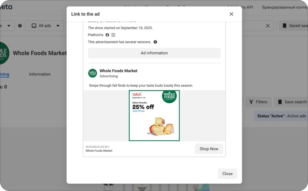
Photo source: Meta Library
15. MyFitnessPal: Personalized retargeting that converts
MyFitnessPal’s dynamic product carousel leverages Facebook’s smart ad tech to retarget users with items they’ve previously browsed. Each card is automatically populated with personalized content, showcasing products with image, name, price, and a frictionless path to purchase.
Why it worked:
- Personalization ensures high relevance and stronger intent-to-convert
- Auto-generated content reduces creative workload while maximizing reach
- The clean design keeps user focus where it matters
- Direct purchase links create a seamless path from consideration to conversion
Results:
The ad delivered a boost in re-engagement and sales by matching products to user interest in real time. MyFitnessPal’s execution proves the impact of dynamic ads for digital-first brands aiming to re-capture attention and drive efficient growth.
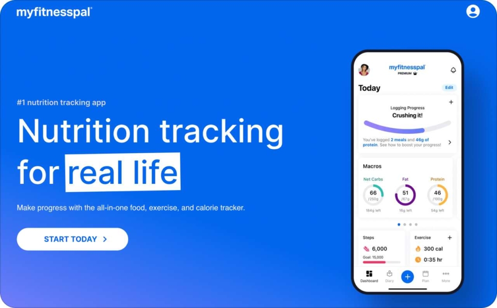
Photo source: MyFitnessPal
Education and professional services Facebook carousel ad examples
Education and professional services thrive with these innovative carousel ad examples.
16. MasterClass: Storytelling that elevates the learning journey
MasterClass’s storytelling carousel transforms education into an engaging narrative with each card highlighting a different dimension of the learning experience, from world-renowned instructors to inspiring course themes. The ad invites viewers to swipe through and experience the brand’s premium value, one insight at a time.
Why it worked:
- Each card introduces a new layer of the experience — instructor, topic, takeaway
- Visual storytelling makes abstract subjects feel personal and cinematic
- The swipe structure mimics a course preview, increasing anticipation and curiosity
- Emotionally rich imagery helps the brand feel inspirational, not transactional
Results:
The ad saw high engagement and a lift in course enrollments, validating storytelling as a conversion driver in the e-learning category. MasterClass showcases how carousel ads can move users from intrigue to intent through thoughtful narrative pacing.
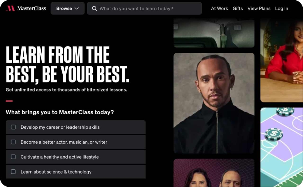
Photo source: MasterClass
17. Coursera: Swipeable learning that drives action
Coursera’s swipeable carousel ad delivers an interactive path through the online learning journey, highlighting everything from course variety and career benefits to learner success stories. Each card acts as a motivational touchpoint, encouraging exploration and boosting user confidence in enrolling.
Why it worked:
- Each card showcases a unique angle: credentials, outcomes, or course categories
- Real-world success stories add social proof and emotional resonance
- The swipe format simulates browsing a catalog — intuitive and user-led
- Clear CTAs and course previews reduce friction between interest and signup
Results:
The ad saw high engagement and an increase in enrollments, demonstrating that well-sequenced, swipeable content can bridge the gap between curiosity and conversion in digital learning. Coursera proves that inspiration, when structured correctly, can drive measurable results.
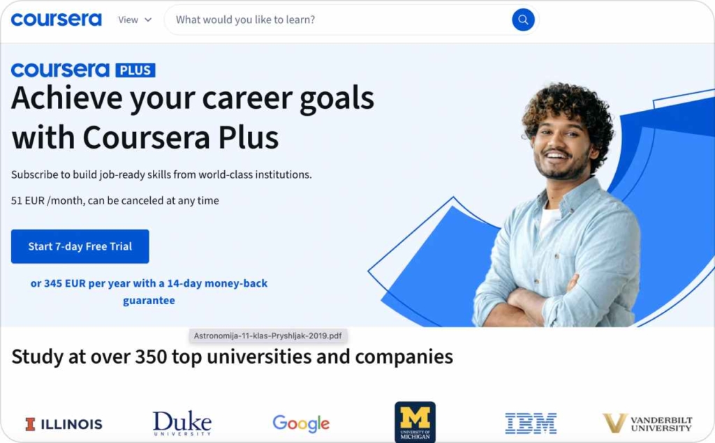
Photo source: Coursera
18. LinkedIn Learning: Swipe-to-discover professional growth
LinkedIn Learning’s manual carousel ad acts as a curated course showcase with each card presenting a different learning opportunity across business, tech, and creative fields. High-quality visuals and direct enrollment links make the ad feel like a personalized career toolkit.
Why it worked:
- Each card highlights a specific course, making options easy to browse at a glance
- Clean design and platform-consistent visuals reinforce trust and brand authority
- Direct CTAs reduce friction, letting users jump straight into learning
- The carousel mimics a learning menu, making browsing feel purposeful and empowering
Results:
The ad drove strong engagement and increased enrollments, proving that structured, manual carousels are ideal for promoting catalog-based offerings. LinkedIn Learning’s approach balances clarity, credibility, and conversion — a formula fit for professional audiences.
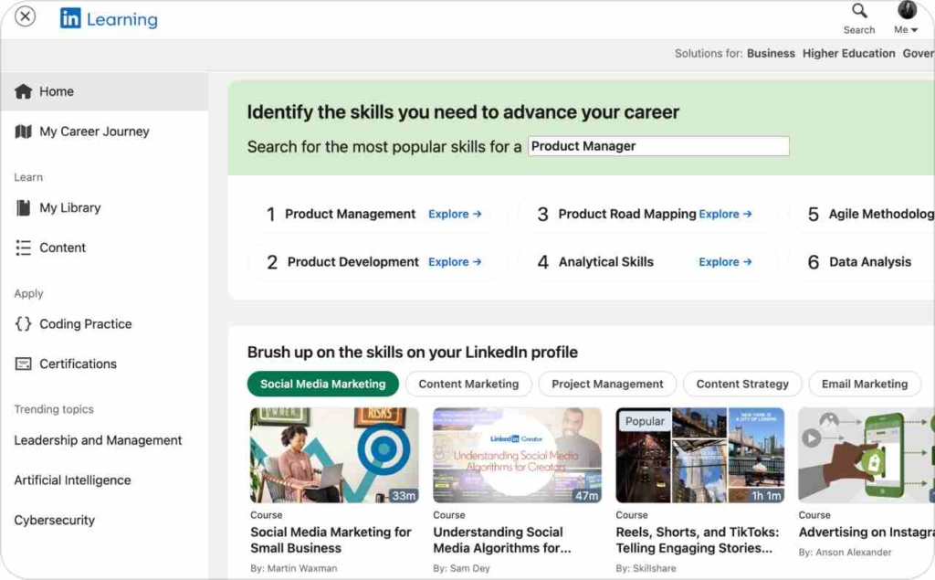
Photo source: LinkedIn Learning
19. Udemy: Storytelling that makes learning relatable
Udemy’s storytelling carousel ad walks viewers through a compelling learning narrative, highlighting expert instructors, practical course content, and real-world outcomes. Each card adds a new layer of motivation, making the educational journey feel achievable and personalized.
Why it worked:
- The narrative builds progressively — from instructor credibility to student success
- Each card is visually distinct yet thematically connected, maintaining flow and clarity
- The tone is approachable and empowering, demystifying the learning process
- The swipe format encourages exploration, mimicking the journey of selecting a course
Results:
The ad saw high engagement and a significant lift in course enrollments. Udemy’s execution proves how storytelling carousels can turn online education into an emotional and actionable journey — one swipe at a time.
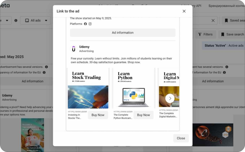
Photo source: Meta Library
20. Khan Academy: Accessible learning through swipeable storytelling
Khan Academy’s swipeable carousel ad transforms education into an engaging, scrollable experience. Each card highlights a unique element of the learning journey — from subject offerings to student impact stories, designed to educate, inspire, and drive action.
Why it worked:
- The swipeable format makes exploration easy and inviting
- Cards mix practical information with emotional storytelling
- The clean, accessible design mirrors Khan Academy’s educational philosophy
- The flow gently encourages engagement without feeling salesy
Results:
The ad generated strong engagement and boosted course enrollments, showcasing how value-first, swipeable content can deepen audience connection. Khan Academy proves that you don’t need hard sells to drive real impact, just clarity, heart, and a great user experience.
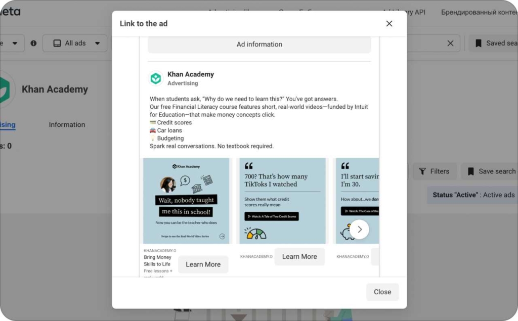
Photo source: Meta Library
Create Facebook carousel ads that convert with AI
Ready to make Facebook carousel ads that actually drive results? Make sure all your ads are personalized. Whether you’re running a clinic, a service-based business, a coaching brand, or a local shop, Zeely helps you launch scroll-stopping creatives fast. Our AI ad generator creates static and video ads in minutes.
Why Zeely AI changes Facebook advertising
In fast-moving industries like yours, earning trust, converting quickly, and standing out are real challenges. Zeely’s platform is built to meet those head-on.
- Fast ad creation. Go from idea to live ad in minutes, not days
- More clients, higher conversion. Ads built to persuade and perform
- No production crew needed. AI handles the visuals and messaging
- Reach the right audience. Multi-platform publishing with smart targeting
- Test and improve faster. Run A/B tests and scale winning creatives easily
Features built for different industries
Zeely offers smart features tailored for clinics, service businesses, coaches, and shop owners who want results without hiring teams.
- 100+ marketing templates. Plug-and-play layouts for different ad goals
- AI-written ad copy. Headlines, offers, CTAs using proven frameworks like AIDA & PAS
- 150+ realistic AI avatars. Visuals that match your brand and audience
- Simple creative editing. Drag-and-drop controls for colors, logos, images
- Integrated publishing. One-click exports to Meta, Instagram, Facebook
- Script generator. Step-by-step storytelling for video ads that convert
Pricing that fits your business
Zeely’s pricing is designed with growing businesses in mind. Whether you’re testing your first ads or scaling a service, our plans give you flexibility without breaking the bank.
Start with just $29.95/month, with premium tiers for businesses that want to scale faster.
Why businesses choose Zeely AI
Clinics, service providers, coaches, and shops trust Zeely for one reason: it gets results, fast. With clear messaging and no learning curve, you’ll launch better ads in less time.
- Launch powerful campaigns yourself. No agency or design skills needed
- Scale your programs or fill your calendar faster. More leads, less effort
Start using AI for Facebook ads optimization and AI-powered ads today to grow your business.
Final thoughts
Facebook Carousel Ads are one of the most engaging and conversion-friendly ad formats for modern businesses. Whether you run a clinic, coach clients, sell services, or operate a retail shop, the right visuals and messaging can turn swipes into sales.
With Zeely’s AI ad generator, you don’t need a team of marketers or a production budget to create high-converting ads. In just minutes, you can launch dynamic, swipeable carousels that tell your brand’s story, showcase your offerings, and drive real results across platforms.
Start creating AI-powered ads today and turn your scrolls into signups, sales, and success.