Display ads examples: 14 best brand banners
What makes a display ad truly stand out? Zeely AI highlights 14 top-performing brand banners and the creative tactics behind their success.
Display ads are the visual units you see across the Google Display Network—headers, sidebars, in-article MPUs, and feed blocks. In 2023, advertisers spent about $207.4B on display worldwide, making it the largest digital ad format; forecasts put that at roughly $266.6B by 2026. This guide shows where each format fits, which files to use, and how to match banners, native, video, rich media, and remarketing to your goal so you lift CTR/CVR and avoid wasted spend.
What are display ads?
Display ads are visual creatives served across websites and apps, primarily on the Google Display Network. Units render in headers, sidebars, in-article MPUs, and feed blocks. Creatives ship as PNG/JPG, GIF, or HTML5 and can be static or animated.
Types of display ads
There are different types of display ads. Choose the format that matches your goal, placement, and build budget. The wrong type lowers viewability, wastes spend, and drags CTR/CVR.
Banner ads
Banner ads are rectangular visual placements that run across the Google Display Network and publisher sites. They can be static images or animated graphics, sized for standard slots like 300×250 or 728×90. For example, a 300×250 unit can appear inside a news article, promoting a new product launch with a bold headline and a “Shop now” CTA.
You’ll use banner ads for brand awareness and direct response because they scale across headers, sidebars, and in-article placements. To maximize impact, keep one focal element, write a short hook, maintain a persistent logo, and end motion on a final-frame CTA. If you’re building animated versions, keep GIFs ≤150 KB and 15–30 s. For faster coverage, add Responsive Display Ads, so Google can auto-resize your assets to common sizes.
Banner ads are easy to produce, test, and target by audience or context. Start with high-inventory sizes — 300×250, 728×90, 160×600, 970×250, 300×600, and A/B test hooks, images, and CTA verbs. Aim for WCAG AA ≥4.5:1 contrast so text stays readable even at 50% scale.
Pros
- Highly visible across many placements
- Quick to create and scale; RDA extends coverage
- Flexible for awareness and direct response
- Targets by interests, demographics, and context
Cons
- Can be ignored if the message is vague
- Animated GIFs hit file-size limits quickly; quality can degrade
- Creative may require frequent refresh to avoid fatigue
Native ads
Native ads blend into the host site’s look and feel, think in-feed cards, “recommended” modules, or sponsored articles. They match typography, layout, and tone while carrying your brand’s message. For example, a sponsored story on a news site can teach a quick tactic, then invite readers to download a checklist.
Use native ads for mid-funnel education and soft offers. They shine when you have value to share: guides, comparisons, case studies, or how-tos. Native networks can distribute these units at scale, and the same image set you use for RDA often adapts well here.
To build trust, label the unit “Sponsored”. Write an editorial headline with a clear benefit subhead, and keep your logo visible but not loud. Link to a fast, content-rich landing page that continues the story.
Pros
- Lower ad fatigue; higher engagement time
- Strong fit for content marketing and lead magnets
- Contextual placements improve relevance
Cons
- Heavier production
- Performance varies by publisher quality and page speed
Video display ads
Video display ads use motion and sound to deliver your message in display placements or in-stream. They work as short clips, product walkthroughs, or before/after demos. Formats ship as MP4 or HTML5; always add captions for silent autoplay. Example: a 10–15s clip that shows the product benefit in the first two seconds, then ends on a branded card.
Use video when you need storytelling, feature reveals, or clear transformations. They’re ideal for launches and seasonal promos where freshness matters and visual proof beats text.
Build with a hook in the first 1–2 seconds. Use 1:1 or 4:5 for feeds and keep a clear end-card CTA. Design for sound-off: on-screen text, captions, and legible UI crops. Keep motion purposeful; cut any frames that don’t move the story forward.
Pros
- High stopping power and recall
- Demonstrates outcomes better than static
- Strong fit for social and feed placements
Cons
- Higher production cost and lead time
- Weak hooks cause fast drop-off
Rich media ads
Rich media ads add interaction to display: expandable panels, swipeable carousels, product configurators, and mini demos. They run as HTML5 packages with polite load and usually expand on user action. Example: a collapsed tile that opens to a gallery, lets users pick a color, then prompts “See pricing.”
Use rich media when your product needs hands-on exploration — complex features, multiple variants, or a catalog you want to preview without leaving the page.
Build with simple states: closed → open → CTA. Keep performance budgets tight; defer heavy assets until interaction. Make every interactive element obvious and thumb-friendly. Always include a visible close control and a clear end action.
Pros
- Deeper engagement; higher qualified interest
- Packs multiple messages or SKUs into one unit
- Lets users self-select before the click
Cons
- Heavier builds and QA; higher production cost
- Not all inventory allows expansion or interactivity
Remarketing ads
Remarketing ads target past visitors or app users with tailored creatives. Dynamic remarketing auto-populates products a user viewed from your product feed. Set clear audience lists, apply frequency caps, and keep UTM tagging consistent for clean attribution. Example: a user who viewed a laptop sees the same SKU with a limited-time discount and a “Checkout” CTA.
When to use
- Cart abandoners, product/category viewers, trial sign-ups
- Cross-sell and win-back
Creative cues
- Mirror the last action: SKU, category, or plan tier
- Show price, promo, or incentive; shorten the path to convert
Pros
- High intent; strong CPA and ROAS
- Personalization at scale via feeds and rules
Cons
- Can feel intrusive without frequency and recency controls
- Demands clean tagging, dependable feeds, and audience hygiene
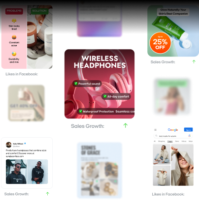
14 display ad examples
Below are display ad examples you can ship today. Each card follows the same structure so you can copy, test, and learn fast. These examples of banner ads span common sizes and placements to help you design the best display ads for each goal.
1. Semrush: Number led social proof with a case anchor
This banner leads with a bold specific claim: “Want to grow revenue 1800%?” It is grounded by a named example: “the Cycleverse did and you could too.” The message stays on brand with Semrush colors and typography. The layout keeps one promise and one CTA with no clutter.
Results:
- Instant credibility from a precise statistic instead of a vague claim
- Higher motivation through a relatable named case
- Faster comprehension from tight copy and consistent brand design
- Stronger CTA pull from promise to proof to action sequencing
Why it worked:
It combines specificity at 1800% with social proof from a real brand and visual consistency. The exact figure does the math for the reader. The case reference makes the outcome feel attainable. The clean layout channels attention to one CTA. Clarity wins the click.
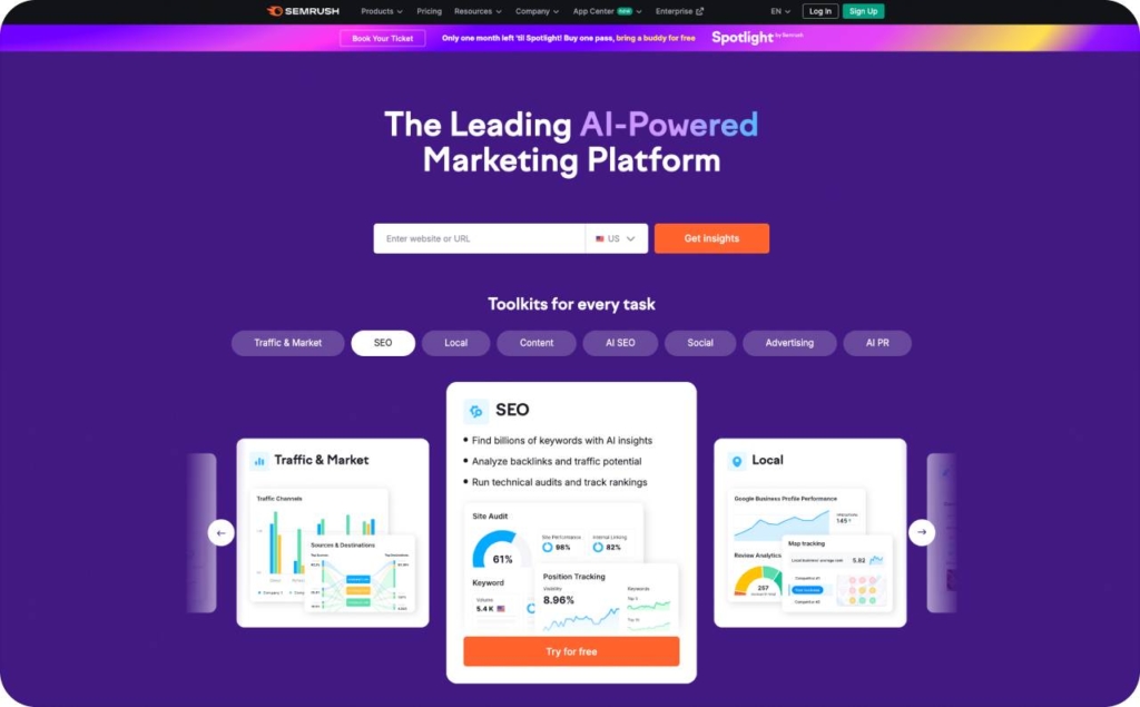
Photo source: Semrush
2. Disney+: Character-led launch ad with brand bundle and direct CTA
This banner stacks instant recognition and clear value. The top row features iconic characters that signal the Disney universe at a glance. The creative also includes the logos of major franchises so users see what the subscription unlocks. Disney owns Lucasfilm and Marvel, so Star Wars and Captain America cues are fair game and on platform. A large call to action sits at the bottom to push the click.
Results:
- Fast attention through familiar faces and franchise recall
- Clear assortment signal through recognizable logos
- High trust from a world-class brand presented consistently
- Strong trial intent due to a single, obvious next step
Why it worked:
It leveraged mental availability. Characters trigger memory structures built over decades. Logos make the content bundle explicit without extra copy. The composition keeps one promise and one action, which reduces cognitive load. The only improvement is CTA contrast. Use a high-visibility color such as orange or green, increase contrast to meet WCAG AA, and ensure the button outshines nearby elements.
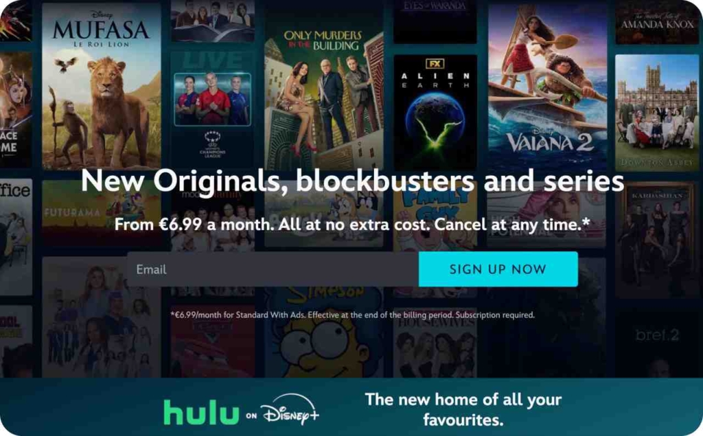
Photo source: Disney+
3. Apple TV: Minimalist leaderboard with product-first visual and four-word copy
This banner proves that simplicity wins attention. The creative puts the colorful Apple TV gift cards front and center. The copy uses just four words. The layout is clean and readable at a glance. Apple timed the message to home viewing habits and kept the visual language unmistakably on brand. Square variants from the same campaign used emojis to replace letters for a playful twist.
Results:
- Immediate recognition through product as hero
- High legibility and low cognitive load
- Strong brand recall from color and composition
- Timely relevance tied to at-home streaming
Why it worked:
The ad reduced friction. Few words and bold visuals carried the message without effort. The color contrast guided the eye to the card art and the button. The theme matched audience behavior during stay-at-home periods, which increased intent. One improvement to test is a stronger CTA verb such as Get your card or Start watching and an even higher contrast button that clearly meets WCAG AA.
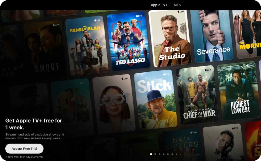
Photo source: Apple TV
4. Amazon: Wage led recruitment banner with simple promise and welcoming CTA
This ad speaks to the top job seeker pain point: pay. The headline highlights wages above the national average and pairs that value with a friendly invitation to join the team. The creative keeps copy tight, uses brand recognition to build trust, and points to a clear next step without extra friction.
Results:
- Immediate relevance for hourly workers focused on compensation
- Higher motivation from a concrete wage value proposition
- Positive sentiment through team oriented language
- Clear path to action via a single CTA
Why it worked:
It led with value and reduced uncertainty. A direct pay promise sets the anchor, brand familiarity lowers risk, and a welcoming CTA shifts the frame from application stress to opportunity. To push performance further, test a specific hourly rate by location, add icons for benefits such as health and tuition, use a high contrast button that meets WCAG AA, and try stronger verbs such as Start application or See shifts.
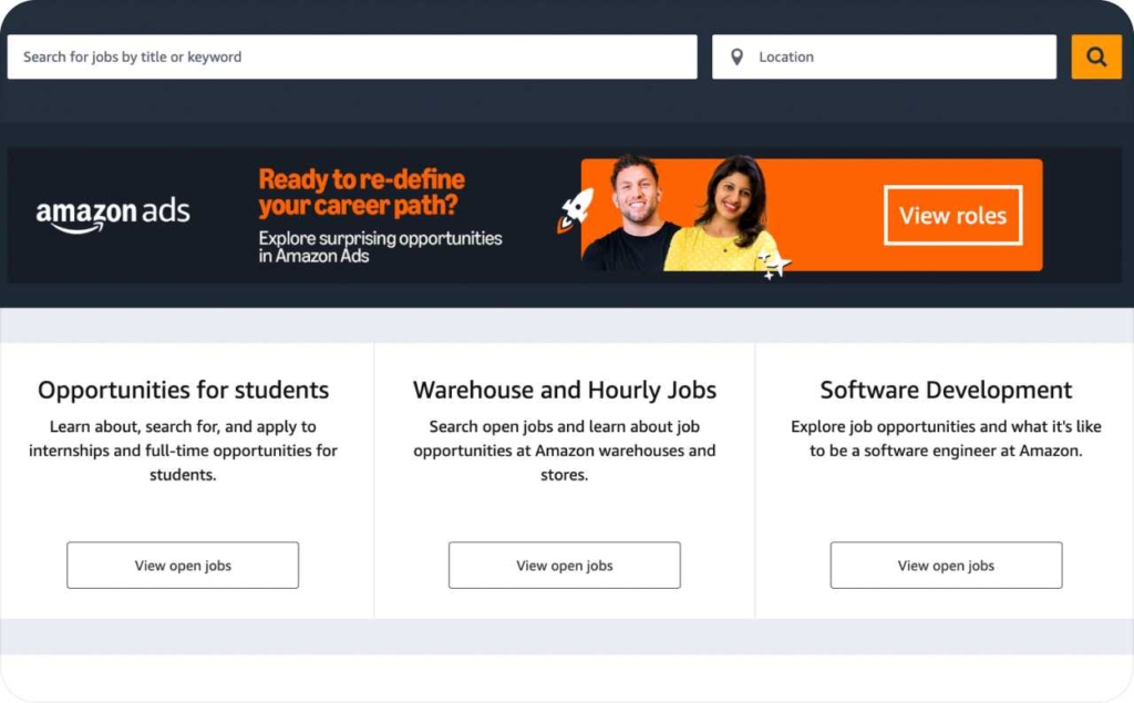
Photo source: Amazon jobs
5. Perigold: Niche luxury positioning with designer-first value and decisive CTA
This banner speaks directly to luxury interior designers and affluent clients. The copy states Perigold’s value proposition with no fluff: premium brands, curated selection, designed for high-end projects. The creative signals luxury through refined typography, generous whitespace, and editorial product photography. A clear CTA drives qualified traffic.
Results:
- Precise audience match for high-intent designer buyers
- Fast value recognition from concise proposition
- Strong click motivation via direct CTA language
- Higher expected AOV thanks to luxury cues and brand lineup
Why it worked:
It led with niche clarity and elevated craft. Designer-specific language created message match. Luxury visual codes established trust before the click. The CTA gave a single next step. For extra lift, test a proof line such as 500 plus luxury brands or White glove delivery, try a stronger verb like Shop luxury brands or Explore trade perks, and add a discreet trust badge highlighting trade program benefits.
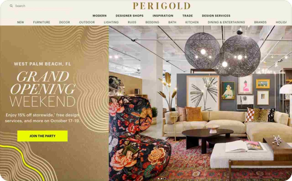
Photo source: Perigold
6. HIRMER: Big and tall positioning with editorial imagery and direct CTA
This banner targets a specific audience with clarity and style. HIRMER is a plus size clothing brand that leads with a full-bleed lifestyle image to stop the scroll. The copy spells out the category with Big and tall and New arrivals so first-time viewers know it is apparel. The layout uses a wide banner format to remind you that display ads are not only squares. A clean Shop now button turns interest into action.
Results:
- Fast attention from striking editorial imagery
- Clear category signaling for new audiences
- Higher intent from a decisive Shop now CTA
- Flexible placement through a wide format option
Why it worked:
Aspirational visuals created emotional pull. Direct language removed ambiguity about what is being sold. The single CTA gave a clear next step and reduced friction. The composition balanced lifestyle and product promise so the message stayed focused.
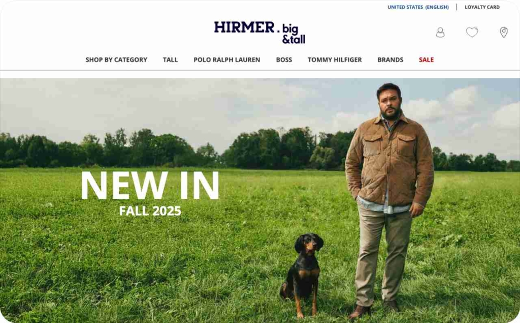
Photo source: HIRMER
7. SE Ranking: Accuracy led headline with feature proof and trial CTA
This banner tells prospects exactly what SE Ranking does and why it is different. The headline uses a clear promise with 100% accurate to anchor value. The body lists core features that matter to buyers such as tracking across Google, Bing, Yahoo, and YouTube. A large button offers a 14 day free trial, which lowers risk and turns interest into action.
Results:
- Immediate relevance from a precise accuracy claim
- Higher intent through feature coverage across multiple engines
- Faster comprehension via tight headline plus scannable bullets
- Strong conversion pull from a free trial CTA
Why it worked:
It led with the outcome users care about and backed it with capability proof. The accuracy promise captured attention. The feature list answered common objections such as engine coverage and channel support. The oversized CTA created a single path forward.
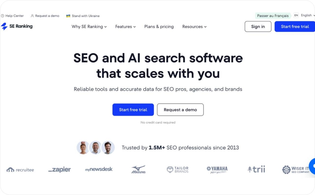
Photo source: SE Ranking
8. Fiverr: Bright palette with niche targeting and high contrast CTA
This banner makes the marketplace instantly clear. The headline points to e-commerce development experts so prospects know which talent pool to expect. The creative uses bold orange for the background and a contrasting green button for the action. Branding is unmistakable and the copy stays tight.
Results:
- Fast attention from high saturation color
- Clear relevance through niche specific headline
- Strong brand recall from consistent visual language
- Higher click intent from a button that pops against the field
Why it worked:
Color did the stopping and clarity did the selling. The niche callout matched searcher needs. The contrast between background and CTA guided the eye to the next step. The message kept one promise and one action which reduced friction.
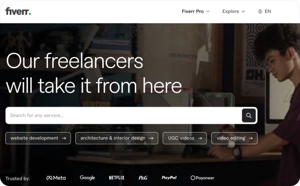
Photo source: Fiverr
9. LinkedIn: Pain point headline with speed promise and talent quality frame
This banner speaks to the hiring team’s core frustration: finding qualified candidates without wasting budget. The copy says find the people you want to interview faster, which targets speed and fit in one line. Brand cues are clear and the CTA leads directly into the hiring workflow.
Results:
- Immediate relevance for recruiters and hiring managers
- Higher motivation from a concrete speed promise
- Strong trust from LinkedIn’s employer brand
- Clear next step via a direct CTA
Why it worked:
It named the pain and offered a fast outcome. Speed plus quality maps to the hiring KPI chain time to shortlist and cost per hire. The focused message reduced cognitive load and funneled attention to one action.
10. GEICO: Color-contrast skyscraper that launches home plus auto bundle
This banner uses GEICO’s car-insurance equity to introduce home coverage. The 160×600 skyscraper pairs car and house icons with split colors to signal a bundled policy at a glance. The square 300×250 variant keeps the concept instead of simply shrinking the art, so the message stays clear in both formats. Copy frames the upgrade as more than just car insurance and points to a single action.
Results:
- Fast recognition from brand colors and mascot association
- Clear new-offering signal through dual icons and split palette
- Higher interest from a bundle value frame home plus auto
- Consistent comprehension across skyscraper and square units
Why it worked:
It bridged existing brand memory to a new product. Strong color contrast separated the two lines of coverage without extra text. Size-specific design preserved legibility and focal points, which lifted clarity and reduced cognitive load. One promise and one CTA created a direct path to explore the bundle.
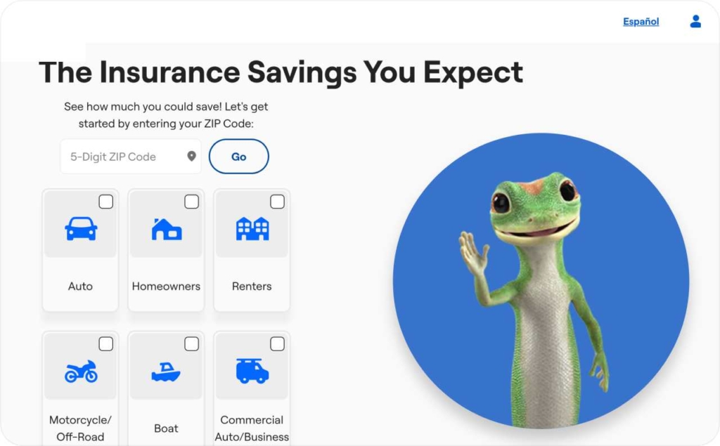
Photo source: GEICO
11. Instapage: Feature led headline with proof seeking CTA for technical buyers
This banner goes straight to value. The tagline says the most powerful landing page builder and lets the product claim the stage. The layout is clean and readable. The CTA says see why which invites a quick evaluation rather than a hard sell.
Results:
- Instant clarity from a single strong statement
- Higher curiosity from a low friction CTA
- Good fit for technical marketers who read features as benefits
- Fast comprehension with minimal copy and clear hierarchy
Why it worked:
Simplicity removed noise. A bold feature claim hooked the right audience and the CTA opened a path to proof. Technical buyers map features to outcomes without extra explanation, so the message felt efficient and respectful of their time.
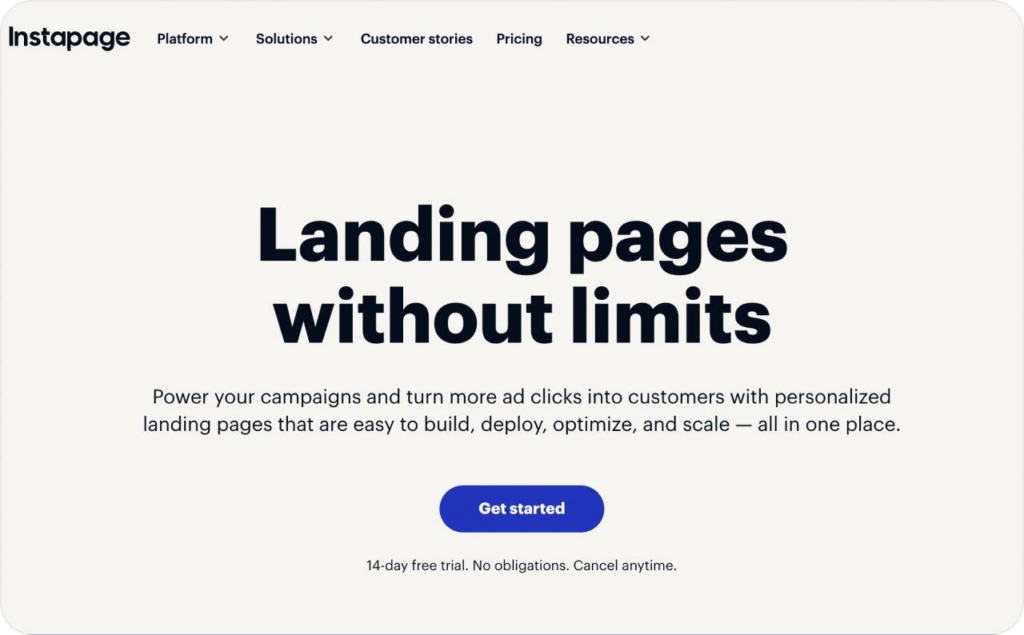
Photo source: Instapage
12. PlayerUnknown’s Battlegrounds: Rule breaking key art with explosive motion cue
This banner leans on the franchise’s signature explosion to sell pace and chaos in one glance. The team repurposed cover art instead of building a tidy layout, which kept the ad true to the gameplay. Copy stays minimal so the action does the talking. Brand recognition carries the rest.
Results:
- Instant attention from a high energy visual
- Strong brand recall through familiar key art
- Clear product fit for action hungry players
- Fast comprehension with almost zero copy
Why it worked:
It matched message to experience. The ad showed the feeling players want rather than describing it. Authentic visuals beat generic banners for a title known for intensity. The creative stayed focused on one promise and one focal point, which lowered cognitive load and lifted click intent.
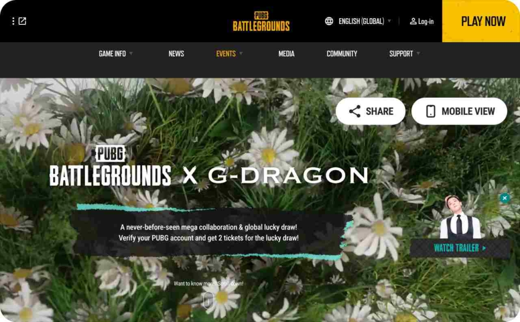
Photo source: PlayerUnknown’s Battlegrounds
13. Lexus: Eye contact creative that sells sound innovation
This banner uses a human face to pull the viewer’s gaze, then pivots to the story Lexus wants to tell: the new speaker system in the Lexus ES. The ad does not push engine specs or model pricing. Instead, it teases an innovation narrative and hands off to a landing page with a dedicated video on hearing and sound design. The ad and the video work as one experience that frames Lexus as an innovator.
Results:
- Fast attention through direct eye contact
- Clear message shift from car metal to acoustic experience
- Higher curiosity from a narrative handoff to video
- Stronger brand lift through an innovation storyline
Why it worked:
It matched the creative to the claim. Eyes attract attention and set an intimate tone. The landing page delivers sensory proof with audio led storytelling, which a static spec sheet cannot do. The sequence moves from hook to education to brand meaning, so viewers remember the innovation, not just the model.
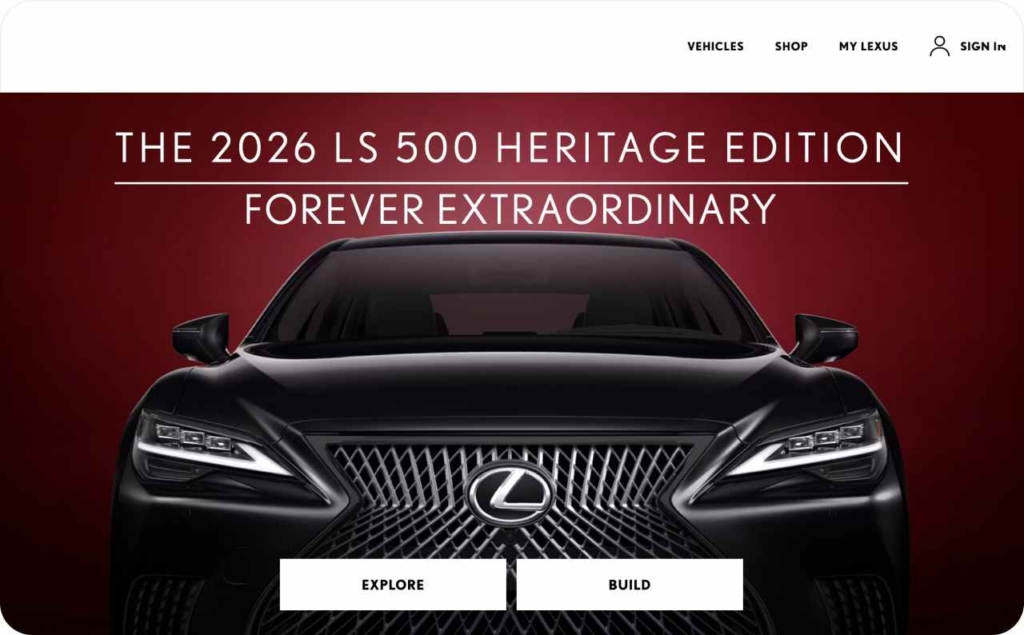
Photo source: Lexus
14. Harry’s: Minimal product shot remarketing with strong trial CTA
This banner keeps the message simple and direct. The product sits front and center with clear branding. The headline reminds users what Harry’s sells. The orange Redeem trial button invites an immediate next step. This approach fits remarketing to past visitors who already know the brand and just need a nudge to finish signup.
Results:
- High recall for recent site visitors
- Strong conversion intent from a free trial offer
- Low cognitive load from a clean layout
- Efficient spend against competitors that rely on broad TV reach
Why it worked:
It matched the audience and the moment. Product as hero confirmed relevance. The trial CTA reduced risk and focused attention on one action. The color contrast guided the eye from the product to the button, which shortened the path to sign up.
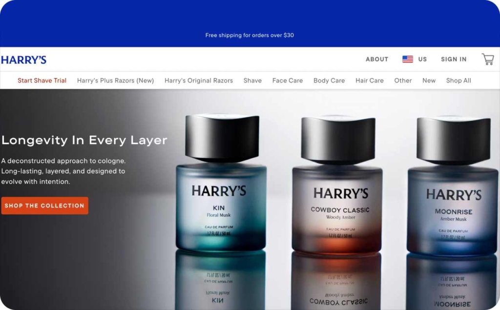
Photo source: Harry’s
How to create display ads with Zeely AI
Zeely is an AI ad generator built for speed and conversions. You get AI ad creation that turns your product data into ready-to-ship banners and videos. The AI script tool drafts copy that matches your offer, while the fast ad generator produces variants you can test in minutes.
Steps
1) Add your product URL or connect Shopify → Get instant assets. Zeely pulls titles, images, prices, and features. You skip manual copy and image gathering. The system builds on accurate data, so ads stay on-brand.
2) Pick your format → Match message to placement. Choose static ads, video ads, or AI digital avatars. 100+ static templates fits quick reach; video shows benefits; avatars add personality. You align format with funnel goals.
3) Generate copy and visuals with AI → Launch strong first drafts. Zeely creates headlines, hooks, CTAs, and layouts. It also suggests size packs for GDN workhorses like 300×250 and 728×90. You start with persuasive options rather than a blank canvas.
4) Edit fast → Keep control without the heavy lift. Tweak colors, logos, fonts, text, and music. Swap crops, adjust aspect ratios, or add price/offer badges. You keep brand consistency and meet WCAG contrast targets.
5) Launch via Meta integration → Go live in fewer clicks. Push creatives to Meta from Zeely. Attach UTMs, set budgets, and map audiences. You reduce tool-hopping and speed up approvals.
6) Bulk generate for A/B tests → Find winners sooner. Spin out hook, image, and CTA variants in batches. You test systematically, improve CTR, and lower CPA with data.
Zeely’s AI ad creation automates the slow parts and lets you focus on message–market fit. Teams ship more variants, learn faster, and lift CTR and ROI through structured testing. Use Zeely as a universal growth tool to create, refine, and launch display ads—without the usual production bottlenecks.
Conclusion
Great banners stay simple and deliberate: Hook → Benefit → Proof → CTA. Ship proven sizes like 300×250, 728×90, and 300×600, design for contrast and legibility, and read results by context — CTR for reach, CVR/CPA for offers and remarketing. Draft one clear message stack per offer, run a 3×2×2 test, promote winners, refresh fatigued creatives, and log patterns. Speed the workflow with Zeely’s AI ad creation: pull product data, generate on-brand variants, bulk test, and launch via Meta. More iterations mean tighter message–market fit, higher CTR, and stronger ROI with far less production drag.