How to make a collage on Instagram story: 3 fast methods I recommend
Discover how to make a collage on Instagram Story that stands out. Learn my three fastest methods, Layout, Photo Stickers, and Templates, to design clean, on-brand Stories that attract views and clicks.
A collage on Instagram Story isn’t just a design detail anymore. With Instagram now serving 3 billion monthly users, according to Reuters, your Story is potentially being seen by millions. So when you want to show a before-and-after, highlight a full product set, or tell a bigger story in one frame, you’ll want a method that works well. By the end, you’ll know which collage style fits your goal and how to keep your Stories sharp after upload.
3 fast ways to make an Instagram Story collage
If you’ve ever spent too long stitching photos together, don’t worry, you can make a clean collage on Instagram Story in minutes. Hootsuite notes, with Stories designed for mobile full-screen viewing at 1080×1920px, you’ve got the ideal canvas to work fast. I’ve tested all the methods out there, and these three are the fastest. Let’s start with the one I recommend most when you just need something quick and neat.
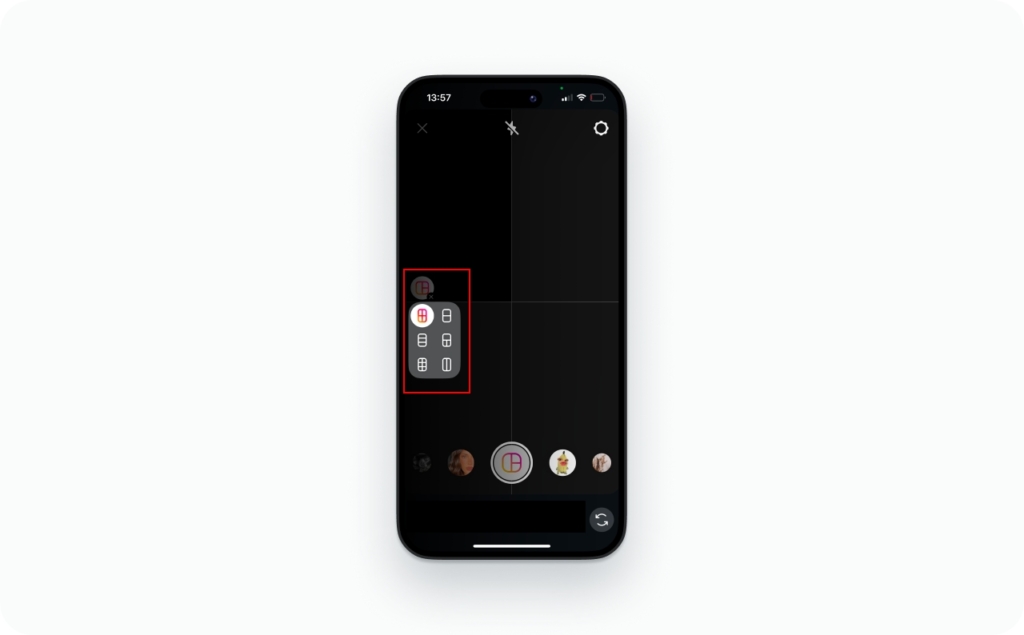
Method 1: Use Instagram’s layout tool
I always suggest starting with layout, Instagram’s own collage feature. It’s the quickest way to line up your photos without using another app.
- Step 1: Open your Story camera, tap the Layout icon, and choose a grid
- Step 2: Add photos from your gallery or take new ones. Swap or retake until it looks right
- Step 3: Add your text, stickers, or a Link sticker, then share
I recommend using Layout when you need something fast and tidy, like a before-and-after or a quick 2-to-6 photo grid. It’s built right into Instagram, so you don’t have to switch apps, and it keeps your Story looking clean and balanced every time.
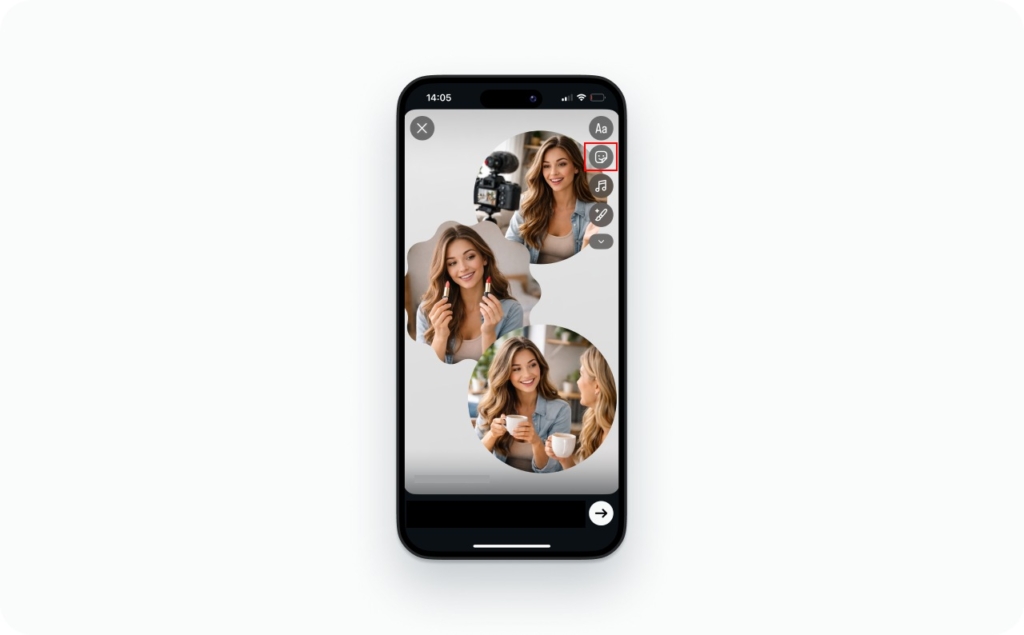
Method 2: Use photo stickers
If you want your Story to feel more creative or personal, try Photo Stickers. It’s my go-to when I’m helping clients build that “scrapbook” look, less structured, more expressive.
- Step 1: Start by adding a background. It can be a solid color or a photo that sets the mood
- Step 2: Tap Sticker → Photo and choose your images one by one. Each one drops in like a movable sticker
- Step 3: Resize, rotate, or layer them to create your layout. Add a few shadows or small overlaps for depth, then share.
I often recommend Photo Stickers for behind-the-scenes shots, quick product roundups, or customer photos. It feels spontaneous and real, perfect for brands that want to look human, not polished.
Method 3: Use templates or apps for advanced layouts
When you want your Instagram collage to match your brand colors or campaign style, templates are the way to go. I recommend this method to clients who post regularly or want every Story to look consistent.
- Step 1: Choose a 9:16 Story template from tools like Canva, Zeely, or Adobe Express. Look for clean margins and safe zones, so nothing gets cut off when you upload
- Step 2: Drop in your photos, then adjust spacing, colors, and fonts to match your brand style
- Step 3: Export the file as a 1080×1920 MP4 or JPG, then upload it to Stories.
I suggest templates when you want every post to feel intentional. They save time, keep your visuals aligned, and make your Story look like part of a bigger brand moment, not just a one-off upload.
Choosing the right collage style
Not every collage on Instagram Story tells the same story. The right style depends on what you want people to feel and how much structure you’re comfortable with. According to data from Buffer, carousel posts on Instagram drove 12% more engagement than Reels in recent analyses. That tells us: choosing the right format matters. Here’s how I help clients pick the one that fits their goals.
If you’re showing products or running a clean retail campaign, try a grid layout. It keeps everything tidy and balanced, great for before-and-after visuals, product sets, or step-by-step posts. Just remember, too many grids can make your feed feel stiff.
When you want to show the human side of your brand, go freeform. It’s the most natural way to share what’s happening behind the scenes or highlight customer photos. I like it because it feels spontaneous, like flipping through someone’s creative sketchbook. Keep spacing neat so it still looks intentional.
And when you’re posting often or running a series, templates will save you time. They help your Stories stay consistent with your brand colors and layout without reinventing the design every week. You’ll trade a bit of flexibility for that polished, repeatable look, but it’s worth it when you’re building recognition.
I recommend starting with freeform to find your brand’s visual rhythm. Once it feels right, switch to templates to scale that style with confidence.
Design best practices for Story collages
A strong collage on Instagram Story is more than a collection of photos, it’s a design that guides attention. Every frame should feel intentional, easy to read, and visually balanced. For example, according to Canva the ideal canvas size is 1080 × 1920 px. That’s the full-screen size most phones display, so designing at those exact dimensions gives your Story the clearest, sharpest look across devices. Read more about Instagram story size and dimensions.
1. Visual hierarchy
Start with one hero image that tells the main story. Then use smaller supporting shots to add detail or context. That single focal point helps the viewer understand your message at a glance and keeps your Story from feeling cluttered.
2. Spacing and alignment
Keep spacing consistent across every layout. I suggest gutters between 16–24 pixels, wide enough to separate visuals, but tight enough to feel cohesive. Straight lines and even margins make your Instagram collage Story look instantly more professional.
3. Typography
Choose bold sans-serif fonts with strong contrast. When your background is busy, add a thin outline or shadow to keep text legible. Remember: if someone can’t read it in two seconds, they’ll swipe past it.
4. CTA placement
Your Link sticker or call-to-action should sit in the lower-center area, right where thumbs naturally rest. This small placement tweak consistently improves engagement and click-through rates.
When I create a collage on Instagram Story, I treat it like a mini poster. I lead with one clear message, give it space to stand out, and place the CTA where it’s easy to tap. That structure keeps my Stories looking clean and performing better every time.
Keep it sharp: Quality & export checklist
Even a great collage on Instagram Story can lose its edge if it’s exported the wrong way. Instagram compresses every upload to save bandwidth, which means your crisp design can turn soft, colors can fade, and gradients can break. According to Sprout Social’s 2025 video specs guide, vertical 9:16 videos in Stories should use the full-screen resolution of 1080×1920 px to stay sharp through compression. I’ve spent years testing settings for clients, and here’s the export checklist I use to keep every Story looking sharp and scroll-stopping.
1. Canvas setup
Always design on a 1080×1920 px canvas, that’s the 9:16 aspect ratio Instagram Stories use. It ensures your layout fills the screen edge-to-edge, without cropping or empty borders.
If you’re working with motion, set your project to 30 frames per second. Anything higher will compress unevenly and might drop frames. Anything lower can look choppy on modern screens. Keep your text and main visuals inside the central 1080×1420 px zone so they stay visible when uploaded.
2. Color profile
Export in sRGB, never AdobeRGB or Display P3. Instagram converts everything to sRGB on upload, and if your file starts in a wider color space, it’ll look muted or gray once compressed.
When you’re editing, make sure your monitor is also set to sRGB mode so what you see is what your audience sees.
3. Gradients and texture
Smooth color transitions often break into harsh stripes when compressed. To prevent that, add a subtle 1–2% noise or dither to your gradients before export. It’s almost invisible to the eye but helps the algorithm preserve smooth transitions. If you’re using a solid color background, a soft gradient with a touch of noise can also make your Instagram collage Story feel more premium and less flat.
4. Bitrate and format
For videos, stick to H.264 codec for video and AAC codec for audio. Export in MP4 format with a bitrate between 3.5–8 Mbps, that’s the sweet spot between crisp visuals and fast load time.
If you go lower, expect pixelation; go higher, and Instagram will overcompress it for you. For still collages, JPG works best at 80–90% quality; it keeps detail while reducing file size for faster upload.
5. Safe zones
Don’t forget about safe zones. Always leave about 250 px of padding at the top and bottom. That’s where Instagram overlays the username, reply bar, and buttons. Keep your text, CTAs, and logos inside the safe area to avoid having them hidden behind interface elements. When I build a collage for Instagram Story, I often drop a “safe zone” overlay layer in my design file, it’s a small step that prevents awkward cutoffs later.
6. Consistency check
Before you publish, preview your Story on both iOS and Android devices. Instagram’s compression and font rendering differ slightly between them, especially for thinner fonts and bright gradients.
I always avoid ultra-thin typefaces or faint outlines. Instead, use medium or bold weights with strong contrast. This guarantees your text stays readable, even on older screens or dim brightness settings.
When I deliver a collage on Instagram Story for a client, I never skip the preview step. I export, upload to a private Story, and check how it looks live before sending the final version. That extra minute protects your quality, keeps colors vibrant, and ensures your Story looks as good on your audience’s phone as it did in your editor.
Examples & swipe-worthy templates
If you’re building your first collage on Instagram Story, these layout examples will save you hours of trial and error. I use them with clients who want their Stories to look designed, but still feel natural. According to Adobe Express, there are over 12,000 Instagram Story templates available, making it easy to pick one that fits your brand in minutes. Each layout follows how people actually view Stories: fast scrolls, short attention spans, and tight visual focus.
Grid layouts
Grids are the cleanest way to organize multiple visuals without losing clarity. They’re ideal for product collections, comparisons, or step-by-step tutorials. A grid layout gives the viewer structure: they instantly understand what they’re seeing and where to look next.
Here’s how I recommend using them:
- 2×2 grid: Simple, balanced, and perfect for before-and-after posts or small product sets. You get equal weight for each image, which keeps attention moving evenly across the screen
- 3×3 grid: Works best for carousels, menus, or full-series visuals. Each square feels intentional, like a preview of a bigger story
- Asymmetrical grid: One large “hero” image supported by smaller secondary visuals. It adds hierarchy and motion, which helps the eye travel naturally from one detail to the next
I recommend always keep gutters between 16–24 px. That spacing feels clean but still compact, and it scales well between phones. Anything tighter can make your Instagram collage Story feel cramped.
Freeform arrangements
A freeform Instagram collage is where your brand personality comes alive. It’s flexible, fun, and feels like something a real person made, not a designer. I often recommend this for behind-the-scenes moments, UGC mashups, or mood boards that tell a story visually.
Here’s how to make it work:
- Start with a solid or textured background
- Add photos as stickers and slightly overlap them to create movement
- Drop in shadows or a bit of depth using Zeely’s built-in shadow or tape effects
- Layer small stickers, like stars, arrows, or text bubbles, to guide attention
Keep your spacing intentional. Even a “messy” collage needs quiet space where the viewer can rest their eyes.
Pro tip: Imagine the viewer’s thumb swiping through. If you can tell the story in one glance before they swipe again, it’s a win.
Templates and reusable assets
If you post consistently, templates will save you hours while keeping your Instagram collage Stories on brand. I recommend creating a small library of pre-sized layouts, one grid, one freeform, and one branded variant with your colors and fonts.
To keep it precise:
- Use a blank 1080×1920 grid for your base canvas
- Layer a safe-zone overlay on top of your design. It marks the top and bottom 250 px that Instagram’s interface covers, so your logo, text, and CTAs never disappear behind buttons
- Build and export templates in Canva, Zeely, or Adobe Express so your team can edit quickly without breaking the layout
I tell every client that once you find a layout that performs well, save it and reuse it. Your audience learns to recognize your visual rhythm, which builds trust and brand recall. The best Stories don’t look new every time; they look consistently like you.
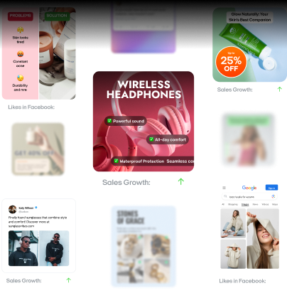
AI ad creator: Your shortcut to high-converting Instagram ads
Running Instagram ads used to mean juggling tools, drafts, and design files. Now, with Zeely AI Instagram ad generator, you can go from idea to polished ad in minutes, no agency, no Photoshop, no wasted budget. Everything I recommend below comes straight from how I help small businesses launch fast and sell smarter.
1. Quick generation: From hours to minutes
Creating static ads shouldn’t take half your day. With Zeely AI, you can build and publish professional ad creatives in just a few taps. Upload your product, choose a style, and let the AI do the rest — layout, copy, and visuals.
You can download your finished static ads in PNG format and start posting instantly. It’s the same process I use when helping clients turn product photos into ready-to-launch ads in under five minutes.
2. Higher conversion rates: Powered by data
Every ad you make with Zeely is backed by AI-driven campaign data. That means your creatives are optimized for CTR, CPA, and ROAS. The system studies your performance over time and generates static ads designed to convert better with every launch.
3. Proven & tested templates
Zeely’s library of 100+ high-performing templates gives you an instant edge. Each one is built around conversion psychology, where to place your price, how to highlight a discount, and where to put your CTA.
What makes them work:
- AI-powered text generation: The AI writes ad copy tailored to your product and industry
- Smart generation from product data: The clearer your input, like product name, features, and price, the stronger your output
- Profile check: Make sure your company info and industry are correct before generating; the AI uses this to fine-tune your visuals
And because Zeely updates templates regularly, your ads never feel stale.
4. Easy content generation
If writing copy stresses you out, Zeely takes care of it. Generate titles, descriptions, and CTAs that match your tone, all powered by AI. You can create two types of static ads:
- Template-based ads, ready to publish directly to Meta
- Fully editable ads, complete creative control with AI-generated visuals
Two tools I love recommending:
- Instant ad maker — create ads in 1:1 or 3:4 formats with AI visuals
- Brand-inspired remix — upload your product photo and let AI recreate a design inspired by a visual reference
5. Simple editing for everyone
The built-in editor keeps your creative process fast and easy:
- Adjust layout, crop, or zoom
- Enhance images with AI tools for background removal or image cleanup
- Regenerate or fine-tune copy to match your brand tone
If your product image appears cut out,that’s intentional. The background cutout feature helps your product pop. It’s a small tweak that makes a big difference in engagement.
I recommend Zeely AI to clients who want to look like they have a full marketing team without hiring one. It’s simple, fast, and grounded in real performance data. Whether you’re making your first Instagram collage ad or running daily campaigns, Zeely AI gives you the speed, structure, and clarity to sell confidently. Try Zeely AI today and create your first high-converting Instagram ad in minutes.
Emma blends product marketing and content to turn complex tools into simple, sales-driven playbooks for AI ad creatives and Facebook/Instagram campaigns. You’ll get checklists, bite-size guides, and real results, pulled from thousands of Zeely entrepreneurs, so you can run AI-powered ads confidently, even as a beginner.
Written by: Emma, AI Growth Adviser, Zeely
Reviewed on: December 18, 2026