Scroll-stopping hooks for ads: 7 frameworks that work
Why do some video ads earn the next three seconds while others disappear in one swipe? I built this guide from Zeely creative patterns, current ad platform guidance, and 2026 ad data, so you can choose a hook framework before you write a script.
A scroll-stopping hook is not a magic phrase. It’s the first tiny agreement between your ad and the person scrolling past it.
In this guide, I’ll show you how to write scroll-stopping hooks without turning your ad into bait.
What makes scroll-stopping hooks work without empty bait
A scroll-stopping hook earns attention by creating fast recognition. The viewer should understand what they’re seeing, why it matters, and what they’ll get next.
That’s different from clickbait. Bait opens a loop it can’t close. A strong ad hook opens a loop your product can answer.
In 2026, this matters because paid attention keeps getting more expensive. IAB’s 2026 Outlook says total U.S. ad spend is projected to grow 9.5%, with social media expected to grow 14.6%. More spend means more creative crowding the same feeds, so the first three seconds carry more weight. You may like to read more about hooks that sell.
A good scroll-stopping ad hook usually does one of these jobs:
- Shows a problem the viewer already knows
- Shows proof before making a claim
- Makes the product visible right away
- Creates a visual break from the surrounding feed
- Asks a question the buyer has secretly asked already
A weak hook does the opposite. It starts with your logo, a slow setup, a vague mood shot, or a line like “You won’t believe this.” That may create curiosity, but it doesn’t create trust.
A hook is not the whole ad
The hook only has one job: get the next three seconds.
That means you don’t need to explain every benefit at once. You need to choose one door into the message. For a skincare brand, that door could be a texture demo. For a local service, it could be the painful before moment. For a software product, it could be a two-second screen recording that shows time saved.
I like to ask one question before writing any hook:
What would make my buyer stop because they recognize themselves?
That question keeps the hook clear, human, and tied to the offer. Learn also about creating high-converting ads with AI.
Hook anatomy: visual, verbal, and text-on-screen
Every strong scroll-stopping hook framework has three parts working together.
The first is the visual hook. This is what someone sees before they read or hear anything. It could be a face, a product close-up, a messy before state, a hand motion, a surprising object, or a bold transformation.
The second is the verbal hook. This is the first spoken line or voiceover. It should make the visual easier to understand, not compete with it.
The third is the text-on-screen hook. This is the short overlay that helps silent viewers understand the promise.
Kantar’s 2026 Super Bowl ad study found strong performance was tied to early brand presence within two seconds and product-forward storytelling across the first ten seconds. That’s a good reminder for smaller ads too. If your product waits until second eight, your viewer may never meet it.
Here’s the simple structure I use:
Visual: What stops the eye?
Verbal: What makes the viewer care?
Overlay: What promise can they read in one glance?
Example for a stain remover:
Visual: Red sauce on a white shirt
Verbal: “I tested this on the stain every parent hates.”
Overlay: “White shirt vs. pasta night”
That works because the product, pain, and test are clear immediately.
Keep one main idea per hook
Most hooks fail because they try to do too much.
Don’t combine a discount, a founder story, a product demo, and a funny joke in the first frame. Pick one reason to watch. Then let the rest of the ad do its job.
Use this rule:
If the viewer paused the ad at second one, they should still know what kind of story is starting.
7 scroll-stopping hook frameworks that earn the next 3 seconds
Google’s Demand Gen creative guidance says video ads should capture people in the first 5 to 10 seconds with a problem statement and show how the product or service solves it. That maps neatly to hooks because the opening should create a fast problem-to-solution path, not just a pretty scene.
Below are the seven frameworks I’d use before writing any scroll-stopping ad hooks.
1. Pattern interrupt hooks
A pattern interrupt hook breaks the expected feed rhythm.
It works because people scroll by prediction. They expect polished product shots, influencer smiles, and flat offer text. When your first frame breaks that rhythm, the brain checks again.
Use it when your category looks visually similar.
Good first frames:
- A product placed in the “wrong” setting
- A close-up of an unexpected texture
- A creator freezing mid-action
- A bold prop that makes the product use clearer
- A visual mistake that gets fixed fast
Structure:
Unexpected visual: Something feels different
Clarifying line: “This is why I stopped doing X”
Product tie-in: The offer explains the interruption
Example:
“I stopped storing my skincare in the bathroom.”
First frame: Moisturizer sitting inside a tiny fridge.
That hook works because the visual interrupts, but the promise stays clear.
2. Surprise and reveal hooks
The surprise and reveal framework works when the product has a hidden benefit.
This is not about tricking the viewer. It’s about showing a result first, then revealing the reason behind it.
Use it for products with a clear “I didn’t know that” moment.
Structure:
Result first: Show the surprising outcome
Pause: Let the viewer wonder why
Reveal: Show the product, step, or mechanism
Example:
“This candle made my whole apartment smell clean in 12 minutes.”
First frame: Someone opening the front door, then reacting.
Keep the reveal close. If the surprise takes too long, the ad feels like a gimmick.
3. Pain-first hooks
A pain-first hook starts with the buyer’s real friction.
This framework works best when your audience already knows the problem. You don’t need to educate them from zero. You need to name the moment they hate.
Use it for services, local businesses, apps, home products, beauty, fitness, and time-saving tools.
Structure:
Pain: “Tired of X?” is usually too flat
Specific moment: Name the annoying scene
Relief: Show the easier way
Better than:
“Tired of messy drawers?”
Use:
“Your drawer isn’t messy. It’s missing zones.”
That line feels more useful because it reframes the problem.
4. Proof-first hooks
A proof-first hook starts with evidence before persuasion.
This framework is helpful when buyers are skeptical. It works for high-ticket offers, new brands, wellness products, B2B tools, and anything where trust comes before the click.
Use proof you can actually support:
- Customer result
- Before-and-after
- Test
- Demonstration
- Order volume
- Review pattern
- Time saved
- Side-by-side comparison
Structure:
Proof: Show or state the evidence
Context: Explain what the viewer is seeing
Offer: Make the product role clear
Example:
“Three orders came from this one product video.”
First frame: Dashboard or order notification, with private details hidden.
Don’t inflate proof. A believable number beats a dramatic claim.
5. Demo-first hooks
A demo-first hook shows the product doing the thing.
This is my favorite framework for products people can understand visually. If the product has motion, texture, size, fit, speed, flavor, shine, grip, or transformation, show it before explaining it.
Structure:
Action: Product in use immediately
Micro-result: Show the payoff
Line: Explain the use case in plain words
Example:
“This mop head twists into corners I used to ignore.”
First frame: Mop cleaning under a cabinet edge.
A demo-first hook should not start with packaging. Start with use.
6. Contrast and before-after hooks
Contrast hooks work because people understand change fast.
They can compare old versus new, wrong versus right, expensive versus affordable, slow versus fast, messy versus clean, or DIY versus done-for-you.
Use this framework when the viewer needs to see the gap.
Structure:
Before: Show the friction
After: Show the improved state
Bridge: Show how the product creates the change
Example:
“Same 10-minute lunch, completely different energy.”
First frame: Left side shows a sad desk snack. Right side shows a full meal prep bowl.
Make the before honest. If it looks fake, the after feels fake too.
7. Question and challenge hooks
A question hook works when it makes the viewer answer in their head.
A weak question is generic. A strong question feels uncomfortably specific.
Weak:
“Want better skin?”
Stronger:
“Are you moisturizing, or just making your skin feel wet?”
Use this framework for educational ads, expert-led offers, and products that correct a common mistake.
Structure:
Question: Specific and buyer-aware
Tension: Suggest a hidden mistake
Answer: Show the product or method
Challenge hooks can also work well:
“Stop packing like this.”
That line invites action. It also creates a clear product role.
How to choose a scroll-stopping hook framework by offer type
The best hook depends on the offer, not the platform.
Deloitte’s 2026 Digital Media Trends survey of 3,575 U.S. consumers found the average consumer spends six hours per day on media and entertainment activities. It also reported that 32% of consumers say social media content feels more relevant than traditional media, while 33% feel a stronger personal connection to social creators than to TV personalities or actors.
That tells me one thing: your hook has to feel native to the viewer’s problem, not just native to a platform.
Use this chooser before writing:
| Offer type | Best hook framework | Why it works |
| Physical product with visible use | Demo-first or contrast | The viewer can see the value fast |
| New or unusual product | Surprise and reveal | The hook explains why it exists |
| Local service | Pain-first | The buyer recognizes the annoying moment |
| High-trust offer | Proof-first | Evidence lowers doubt before the pitch |
| Beauty or wellness product | Demo-first or proof-first | Texture, use, and proof matter |
| Course, coaching, or expert offer | Question and challenge | The viewer wants a smarter way |
| Discount or seasonal sale | Contrast | The value gap needs to feel obvious |
| Crowded category | Pattern interrupt | The first frame must break sameness |
Match hook intensity to buyer awareness
If the buyer knows the problem, start with pain or proof.
If the buyer doesn’t know the problem yet, start with a question or contrast.
If the buyer doesn’t know your product category exists, start with surprise and reveal.
This keeps the hook from feeling random. A cold audience needs more context. A warm audience can handle a sharper promise. Read also about video ad hooks.
First-frame design rules for visual hooks on mobile ads
Your first frame is the thumbnail your ad never officially had.
For Reels and Stories ads, Meta says text, logos, and key creative elements should stay inside safe zones so platform icons, captions, or CTA buttons don’t cover them.
I use these first-frame rules for visual hooks for ads:
- Put the product or face in the center third.
- Start with action already happening.
- Make the object large enough to read on mobile.
- Keep text away from bottom buttons and captions.
- Use one focal point, not five.
- Show contrast through motion, color, size, or expression.
- Make the first frame understandable with sound off.
A good first frame should pass the one-second test.
Show it to someone without audio. If they can’t tell what the ad is about, the hook needs work.
Suggested visual: mobile hierarchy diagram
Add a simple 9:16 phone screen graphic here.
Label these zones:
Top area: light branding or no text
Center area: face, product, main motion
Lower center: short overlay
Bottom area: keep clear for caption and CTA space
This helps readers see why a strong hook can still fail when the text sits under platform buttons. read those articles to learn more about Instagram and TikTok safe zones.
Caption and text overlay rules for scroll-stopping ad hooks
Text overlay should make the hook faster to understand.
It should not repeat every spoken word. It should carry the one idea that matters if the viewer watches silently.
The FTC’s advertising guidance says ad claims must be truthful, cannot be deceptive or unfair, and must be evidence-based. That matters for hooks because the fastest way to lose trust is to make a promise the product cannot prove.
Use this overlay formula:
Pain or proof plus product context
Examples:
- “Dry shampoo test on day-three hair”
- “One shelf, 22 pantry items”
- “Before work coffee in 40 seconds”
- “Real order packing for a $38 product”
- “The mistake that ruins most home workouts”
Keep overlays short. Aim for six to ten words when possible.
Clear promise beats clever wording
Clever is nice. Clear pays better.
A line like “Your lashes called” may sound fun, but it doesn’t tell the viewer enough. A clearer hook would be:
“Mascara test on short, straight lashes”
That line is less cute, but more useful. The buyer knows whether the ad is for them.
Caption rules I use
- Put the strongest phrase in the first line.
- Keep the caption tied to the hook, not a separate essay.
- Add proof or offer details after the opening.
- Avoid vague claims like “best ever” unless you can support them.
- Use disclosure where needed for paid creator or testimonial content.
If a hook uses a testimonial, free product, or paid creator, make the relationship clear. FTC guidance for social endorsements says disclosures should be hard to miss and placed with the endorsement itself. You might like to read an article about Instagram caption ideas.
Testing scroll-stopping hooks one variable at a time
Hook testing gets messy when you change too many things.
If you change the first frame, voiceover, offer, CTA, and landing page at once, you won’t know what caused the result. I’d rather run a smaller test that teaches me something useful.
Smartly’s 2026 Digital Advertising Trends Report, built from 450 marketers, found 41% say it still takes three to four weeks to launch a digital campaign, while respondents estimated about 20% of annual digital marketing spend is wasted. That’s why hook testing needs a clean system, not random creative swaps.
Use this test setup:
Round 1: Same ad, different first frame
Keep the script, offer, audience, caption, and landing page the same.
Round 2: Same first frame, different opening line
Test pain-first against proof-first.
Round 3: Same hook, different overlay
Test a plain promise against a proof-based phrase.
Track these metrics:
- 3-second video views or thumbstop rate
- Hook hold rate
- CTR
- CPC
- CPA
- ROAS
- Comment quality
- Save or share rate
When to keep, cut, or rebuild a hook
Keep the hook if CTR rises and CPA stays stable or improves.
Cut the hook if people watch but don’t click. That usually means the opening is interesting but not tied to the offer.
Rebuild the hook if the first three seconds are weak. Don’t fix the CTA before fixing the opening.
My simple rule:
If the hook wins attention but loses buyers, make the promise clearer.
Creative roadmap: turn hook frameworks into ad assets
A framework page needs visuals, not just theory. Here’s the creative roadmap I’d add to this article so readers can see the system in action.
Add a first-frame gallery
Create a gallery with seven tiles, one for each hook framework.
Each tile should show:
- First frame
- Opening line
- Overlay text
- Best offer type
- Why it works
This keeps the article from turning into a giant hook list. The visual teaches structure.
Add “same product, 3 hook frameworks”
Use one product and show three different openings.
Example product: travel makeup pouch
Pattern interrupt: Pouch dumped upside down, nothing falls out
Overlay: “This passed my suitcase chaos test”
Demo-first: Hand opens pouch and removes five items fast
Overlay: “Five products, one flat pouch”
Pain-first: Makeup rolling inside a tote bag
Overlay: “Your bag isn’t messy. Your pouch is wrong.”
This visual helps readers understand that hooks are not random lines. They are different doors into the same offer. Read now about the best TikTok hooks.
Add storyboard strips
Use three-frame strips for each framework.
Frame 1: Hook
Frame 2: Proof or demo
Frame 3: Offer and CTA
That keeps the page focused on hook structure for video ads, not full UGC scripts.
Add clear promise vs. empty bait comparison
Show two versions side by side.
Empty bait: “You won’t believe what this does.”
Clear promise: “This mini steamer fixed a wrinkled shirt in 40 seconds.”
Then explain why the second one wins. It gives the viewer a reason to stay and a result to expect.
How I use Zeely AI to build stronger ad hooks
I use AI best when the framework is already clear.
Zeely can help you turn one product into multiple hook directions, but you still need to choose the reason someone should care. That’s where this framework helps.
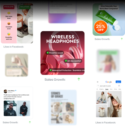
Zeely’s Avatar video ad guide says you can create a short clip where an AI avatar presents your product, choose from ready-made scenarios, enhance your script with AI, and optionally add a visual hook as the first visual in your video.
Zeely’s Image to video guide also explains how you can turn a product image into motion, choose a reference, write or improve a prompt, and create a start image for the video.
For static first-frame testing, Zeely’s AI image ad guide says you can start from a product photo, choose a reference, and create a polished image ad in a few taps.
Here’s how I’d use Zeely for scroll-stopping hooks:
- Choose one offer.
- Pick three hook frameworks.
- Create three first frames.
- Keep the offer and CTA the same.
- Run the creatives against the same audience.
- Keep the winner and build the next round from it.
Example:
Product: handmade ceramic mug
Offer: buy one, get one 20% off
Audience: gift buyers
Test three hook frameworks:
Pattern interrupt: Mug sitting in a freezer
Pain-first: “Stop giving gifts people politely store away”
Demo-first: Coffee pour close-up with steam and texture
The winner tells you what the buyer cares about. Then you make the next ad better.
Emma blends product marketing and content to turn complex tools into simple, sales-driven playbooks for AI ad creatives and Facebook/Instagram campaigns. You’ll get checklists, bite-size guides, and real results, pulled from thousands of Zeely entrepreneurs, so you can run AI-powered ads confidently, even as a beginner.
Written by: Emma, AI Growth Adviser, Zeely
Reviewed on: May 19, 2026