Push Ads Examples 2026: 10+ Templates that Lift CTR and Sales
Can push ads still drive big results in 2026? Zeely AI reveals 10+ high-performing templates designed to boost CTR and sales instantly.
You want push advertising that wins clicks and sales without wasting budget. In this guide, you’ll get a clear view of what push ads are, how they differ from push notifications, and 10+ creative examples with copy formulas you can paste into your next campaign. You’ll also learn how to test, measure, and scale push traffic like a pro.
What you’ll take away:
- When to use classic web push, in-page push, and mobile push
- The anatomy of a high-converting push ad
- 10+ examples by goal and industry with ready-to-edit copy
What are push ads
Push ads are paid messages that look like notifications and show on a user’s device or browser. They ride the familiarity of notification UI so they bypass banner blindness, and you can buy this traffic from push ad networks at competitive CPC or CPM rates. That mix of message-like format and low friction delivery is why affiliates and SMBs still lean on push in 2026.
You’ll see three flavors in practice:
- Classic web push shows as a small notification in the browser after a user has given permission through a publisher. It supports major browsers and covers the bulk of web traffic.
- In-page push mimics the push look directly on a webpage without requiring subscription, which expands reach and solves some permission friction.
- Mobile app push is owned media sent by apps to their users. Marketers often borrow patterns from these to shape paid push creative on ad networks. Inspiration lists and templates widely circulate for e-commerce and publishers.
When you should use push ads
Use push when you need fast reach, simple creative production, and clear calls to action. Push works well for quick promotions, retargeting, content recirculation, and time-sensitive drops. It’s also a solid entry channel when you want affordable tests before scaling to costlier inventory. RichAds’ guide emphasizes push as an efficient format that looks like a messenger ping and avoids classic banner fatigue.
If you already run lifecycle push notifications in your stack, borrow the best performing hooks. iZooto’s library shows how urgency, relevance, and personalized timing move numbers for publishers and e-commerce. You can translate those same angles into paid push.
The anatomy of a high-converting push ad
You control five levers:
- Icon or small image that is recognizable at a glance. Use a clear logo or a product visual with strong edges. Affroom’s icon guide highlights clarity and quality as non-negotiables.
- Title that states value in 30–45 characters. Use numbers, specificity, and one benefit. RichAds even shares title lists per vertical like Finance to boost engagement.
- Description that adds proof or detail. Keep it crisp and scannable.
- CTA that explains the next step, not just “Learn more.”
- Landing page match so the promise in your copy equals the first screen of the click-through page. Trust signals, pricing, and availability must align.
Timing matters. Test send windows and dayparting. Affroom’s timing breakdown suggests adapting to niche behavior so you boost engagement at the right hour instead of blasting everyone at lunch.
Creative frameworks you can copy
- AIDA. Move the reader from Attention to Interest to Desire to Action. Use a short hook, one proof detail, one outcome, one command. Template: “Attention: clear benefit. Interest: single fact. Desire: result. Action: next step.” Example retail: “New sneakers under $60. Limited sizes restocked. Walk lighter this week. Shop now.” Example software: “Edit videos in minutes. Smart trims save 40%. Finish more posts today. Start free.”
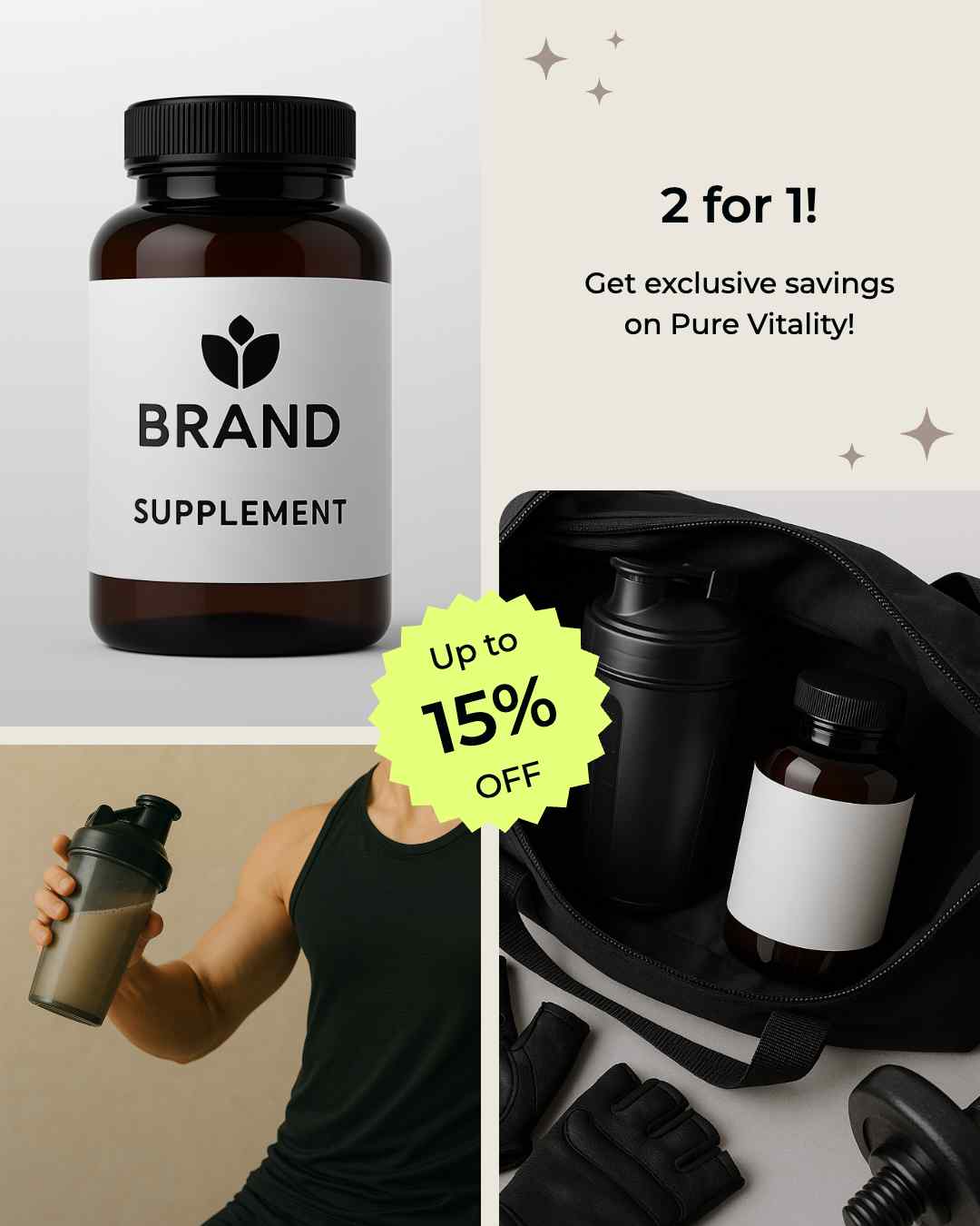
- 4U. Make it Useful, Urgent, Unique, Ultra specific. Compress all four into one message with numbers and names. Retail example: “Member price today. $25 off $100. Free returns. Ends Sunday.” Local service example: “Same day setup in Austin. First visit $49. Two slots left.”
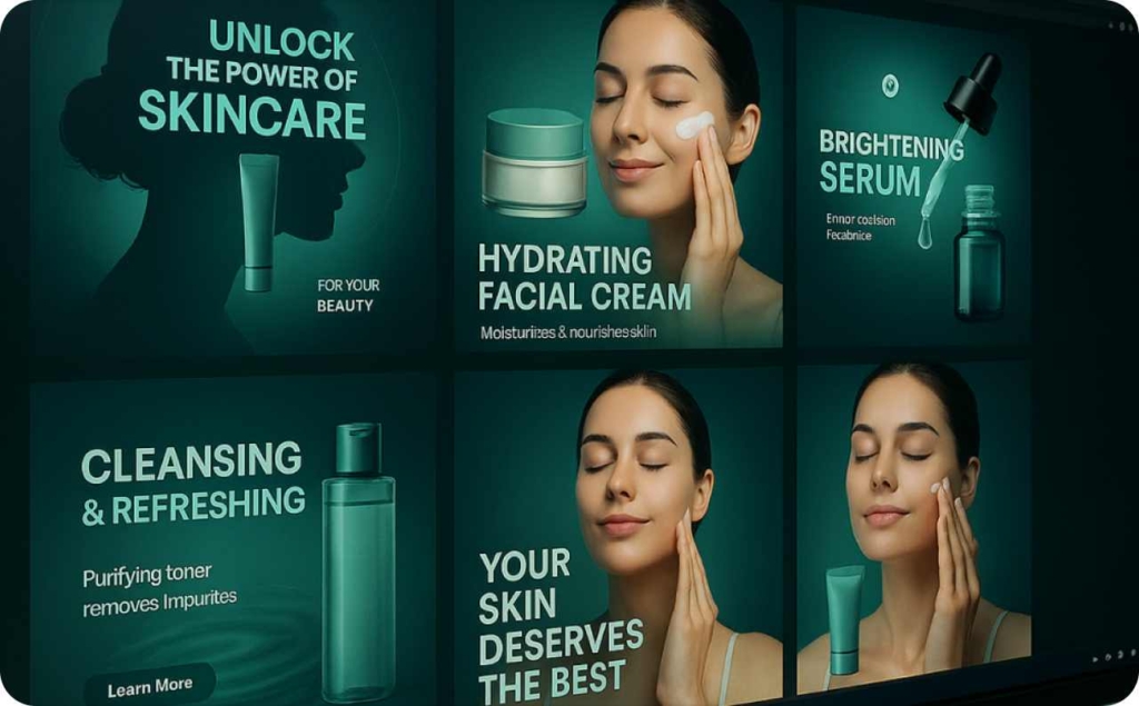
- P.S.T. State the Problem, give the Solution, add Trust. Keep each to one line. Skincare example: “Dry winter skin. Vitamin E cream ships today. 4.8★ from 12K reviews.” SaaS example: “Slow product photos. Batch resize in one click. Used by 8,000 stores.” If you’re in a compliance-heavy niche, place the trust line first on the landing page.
Plug-and-play micro-patterns for push titles: no bullets
Keep your push titles between 30 to 45 characters. Lead with the strongest word and prefer numerals over words. Specific numbers increase clarity and trust.
Number + benefit
This pattern works because the number grabs attention and the benefit explains the click. Use formats like “3-day sale: Save 25%,” “Save $15 on backpacks,” “2 for 1 today only,” or “Save 20% annually.” Apply it to promos, launches, clearances, or starter bundles. Avoid vague lines like “Big discount.” If prices change often, write “from $9” to stay accurate. Precision increases credibility and credibility increases clicks.
Curiosity with anchor
A short tease gets attention and the anchor sets the expectation. Use lines like “New drop for fall, under $30,” “Just in: travel kits, under $20,” “Early access: pro presets,” or “Fresh colors for school.” Keep one curiosity hook and one anchor. Too many hooks dilute intent. Curiosity increases interest and the anchor maintains relevance.
Urgency with clarity
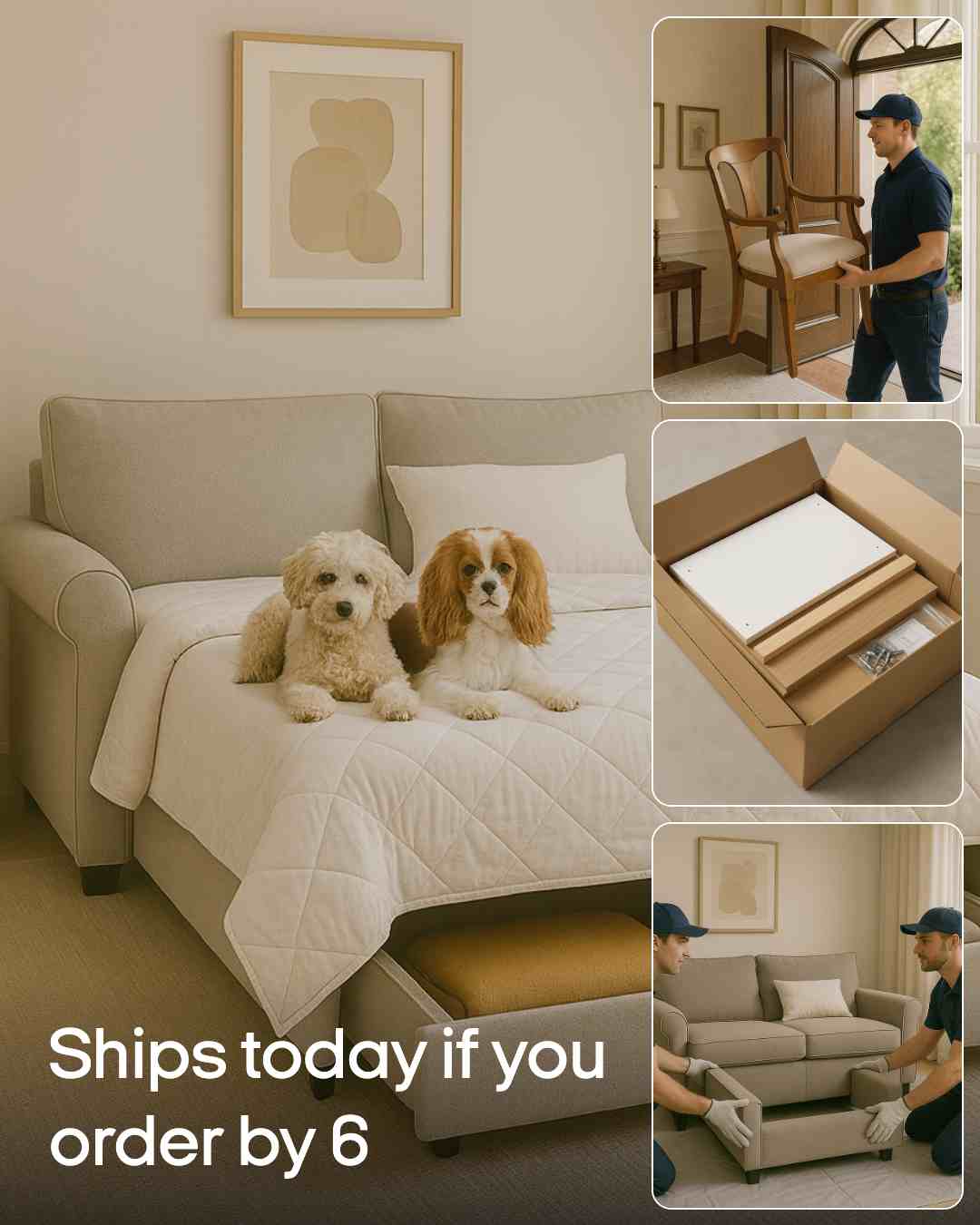
Deadline plus specificity drives action without tricks. Write “Ends tonight at 10 pm,” “Only 3 hours left,” “Ships today if you order by 6 pm,” or “Booking closes Sep 10.” Use this for flash sales, shipping cutoffs, and event registrations. Do not fake countdowns. Clear timing supports honest urgency and honest urgency drives faster decisions.
Social proof
Proof reduces risk and speeds decisions. Structure it as “9,412 reviews say it lasts,” “4.8★ rated by bakers,” “8,000 shops use this theme,” or “Chosen by Austin runners.” Round large numbers cleanly, for example “9.4K,” and tie the proof to a concrete outcome. Evidence strengthens trust and trust raises conversion intent.
Location signal
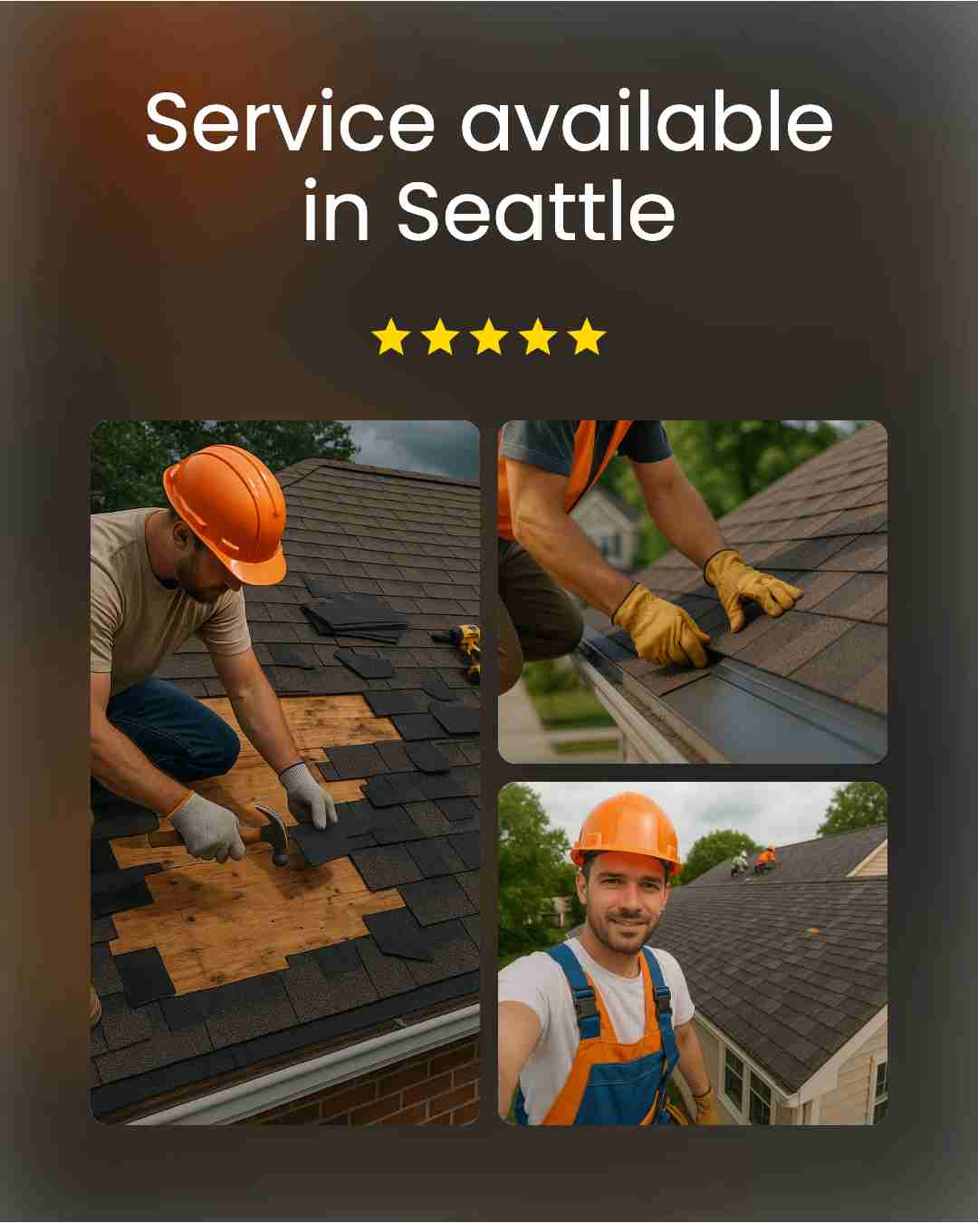
Local cues boost intent and lower friction. Try “Fast delivery in Austin,” “Pickup today near SoHo,” “Service available in Seattle,” or “Installations in Orange County.” Match the landing page to the location promise with store hours, delivery windows, and zip code coverage. Local relevance improves click likelihood and click likelihood improves conversion probability.
Deploy these patterns with simple control tests. Draft three title variants per pattern, keep the icon constant for the first round, and change one variable at a time. Track CTR for attention, conversion rate for intent match, and revenue per click for real value. Promote the winner and retire the losers quickly. Consistent testing improves performance and performance growth compounds over time.
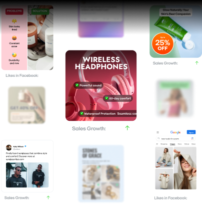
10+ push ads examples you can adapt today
Below you’ll find examples arranged by goal, so you can match copy to intent. You can use these across classic web push, in-page push, or mobile push ad inventory.
1. Value-first pricing: Build trust with a clear $9 starter plan
Use a direct line your audience can scan fast: “Starter plan $9/month. Launch in minutes. Cancel anytime. New user offer.” Keep the same price and phrasing on the landing page. Price transparency increases trust.
Why it works:
- Clear price anchors value and reduces doubt
- “Cancel anytime” lowers perceived risk
- “Launch in minutes” shows immediate utility
- Message-match from ad to page keeps confidence
How to use it in your advertising
Lead with “Starter plan $9/month” in the title. Follow with “Launch in minutes. Cancel anytime. New users only.” Use “Start free” as the CTA. Show the $9 on hero, pricing table, and checkout to avoid surprises. A/B test title variants like “$9/mo starter,” “Begin at $9,” and “From $9 monthly,” then keep the top performer by CTR and conversion rate.
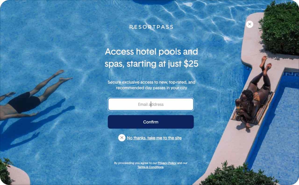
Photo source: ResortPass
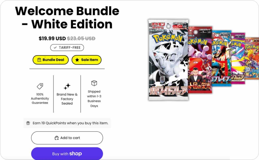
2. Welcome bundle: Convert first-time buyers with 20% off
Use a direct, scannable line: “New here Get 20% off. Claim your welcome code before midnight. See terms inside.” Keep the same wording on the landing page and checkout. First-purchase incentive increases conversion.
Why it works:
- Intro discount removes first-buy hesitation
- Midnight deadline creates urgency
- Code format feels personal and memorable
- Clear terms prevent surprises and refunds
How to use it in your advertising
Headline: “New here Get 20% off.” Description: “Claim your welcome code before midnight. See terms inside.” CTA: “Unlock code.” Show the code on the hero and in the cart, display the end time at 11:59 pm, and link to brief terms. A/B test percent vs dollar off, code vs auto-applied discount, and “new customers only” vs “first order only.” Use for e-commerce or SaaS trials to speed first conversions.
3. Local advantage: Win clicks with next-day delivery in your area
Use a direct, scannable line: “Next-day delivery in Austin. Order by 6:00 pm. Track every step. Easy returns.” Mirror the same promise on the landing page with a zip-code checker and a short shipping policy. Local promise increases relevance and reduces delivery anxiety.
Why it works:
- Location signal raises intent
- Clear cutoff time sets expectations
- Tracking pledge builds confidence
- Easy returns lower perceived risk
How to use it in your advertising
Headline: “Next-day delivery in Austin.” Description: “Order by 6:00 pm. Track every step. Easy returns.” CTA: “Shop now.” Add a small “Next-day eligible” badge and a zip field above the fold. Show a map pin or service area note on product pages. A/B test “Next-day” vs “Same-day” in select ZIPs and “Order by 2 pm” vs “Order by 6 pm,” then keep the top performer by CTR and conversion rate.
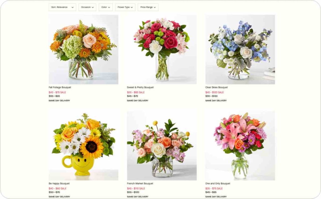
Photo source: FTD
4. Social proof hook: Convert with visible adoption at scale
Lead with proof in the title, then remove switching fear in the first line. Use: “9,000 businesses switched this year. Move in 10 minutes. Keep your domain. Support that answers.” Social proof reduces risk and speeds decisions.
Why it works:
- A big, specific count signals safety in numbers
- “10 minutes” sets a clear effort expectation
- “Keep your domain” removes migration anxiety
- “Support that answers” calms post-switch concern
How to use it in your advertising
Headline: “9,000 businesses switched this year.” Description: “Move in 10 minutes. Keep your domain. Support that answers.” CTA: “See how it works.” On the landing page, repeat the number near the hero, add logos or a rating bar, and footnote the source and date. Place a short demo or 60-second migration video beside the CTA. A/B test number formats, audience nouns, and time claims. Keep message-match tight from ad to page so the proof you promise is the proof they see.
5. New drop: Launch your fall lineup with clear scarcity and easy pickup
Use a direct line your audience can scan fast: “New fall lineup live. Limited stock alert. Sizes S to XL. Free pickup.” Repeat the same promise on the collection page, product cards, and cart. Newness drives attention, scarcity raises urgency, size range removes doubt, and free pickup lowers friction.
Why it works:
- “New” triggers curiosity and clicks
- “Limited stock” sets a real deadline
- “Sizes S to XL” confirms availability
- “Free pickup” solves delivery hesitation
How to use it in your advertising
Headline: “New fall lineup live.” Description: “Limited stock alert. Sizes S to XL. Free pickup.” CTA: “View collection.” Add a “Limited stock” badge on thumbnails, show size filters above the fold, and place a pickup locator near the CTA. Test wording like “Just dropped” vs “New fall lineup,” “Free pickup today” vs “Free 2-day shipping,” and a lifestyle image vs a product grid hero. Keep the message identical from ad to collection to product page.
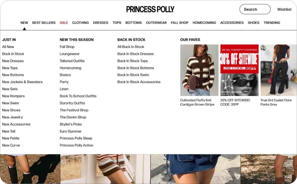
Photo source: Princess Polly
6. Price-drop recall: Recover carts with a timely 15% discount
Use a direct line that mirrors the product page: “Your saved item is cheaper. Price dropped by 15% today. It might sell out.” Keep the discount and wording identical on the PDP and in the cart. Close the loop with a single tap back to checkout.
Why it works:
- References a known item, so intent is high
- Concrete “15% today” creates urgency without hype
- Social scarcity nudges action
- Message-match from ad to page removes doubt
How to use it in your advertising
Headline: “Your saved item is cheaper.” Description: “Price dropped by 15% today. It might sell out.” CTA: “Resume checkout.” Show compare-at pricing, an in-stock meter, and the end time on the PDP. Use a dynamic audience of cart or wishlist savers from the last 7–14 days. A/B test “15%” vs “$10 off,” “today” vs a specific date, and “Resume checkout” vs “Finish order.” Avoid fake countdowns; keep the discount live through the stated window.
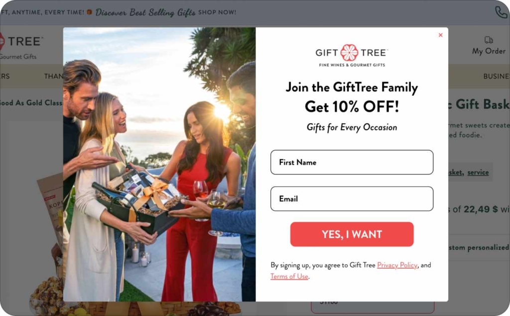
Photo source: Gifttree
7. Cart reminder with incentive: Nudge checkout with free shipping + easy returns
Use a direct line that matches the cart: “Your cart qualifies for free shipping. Finish checkout today. Free returns for 30 days.” Keep the same promise on the cart and payment screens. Incentive lowers friction; a clear deadline pushes action.
Why it works:
- Threshold crossed triggers a “don’t lose the perk” effect
- Free returns cut perceived risk
- “Today” creates a soft, honest urgency
- Message-match from ad to checkout builds trust
How to use it in your advertising
Headline: “Your cart qualifies for free shipping.” Description: “Finish checkout today. Free returns for 30 days.” CTA: “Complete order.” Show a “Free shipping unlocked” badge, a cart progress bar at 100%, and a simple returns icon on the cart page. Display delivery ETA for U.S. ZIP codes. A/B test “Complete order” vs “Finish checkout,” and “today” vs a timestamp. Avoid fake countdowns; keep the perk live through the stated window.
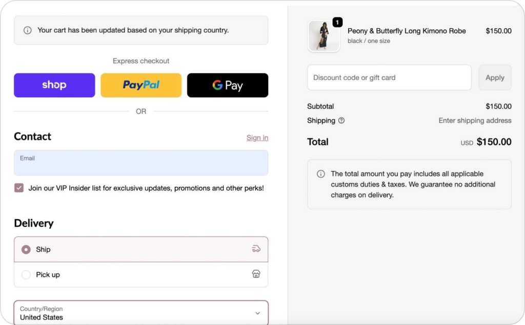
Photo source: KIM+ONO
8. Content to commerce: Educate first to lift confident purchases
Use a direct, scannable line: “How to choose the right size. Quick guide before you buy. Avoid returns, buy once.” Keep the same promise on the guide and product pages. Education reduces uncertainty and increases qualified clicks.
Why it works:
- Answers a pre-purchase question at the moment of intent
- Reduces size anxiety and return risk
- Frames you as helpful, not pushy
- Improves conversion quality and lowers post-purchase friction
How to use it in your advertising
Headline: “How to choose the right size.” Description: “Quick guide before you buy. Avoid returns, buy once.” CTA: “Read guide.” On the landing page, show a clear size chart, fit photos or a 60-second quiz, then place “Shop this size” buttons that deep-link to the correct variant. Add a short “Free returns” note near the CTA. A/B test “Read guide” vs “Find your fit,” and a static image vs a 10-second fit GIF. Keep message-match tight from push to guide to product page.
Photo source: SKIMS
9. Back-in-stock ping: Turn waiters into buyers with real scarcity
Use a direct line that mirrors the product page: “The black hoodie is back. Popular sizes restocked. Last run sold out in 24 hours.” Keep the same message and sizes on the PDP and in cart. CTA: “Grab yours.” Real restock info increases urgency and intent.
Why it works:
- Names the exact item the shopper wanted
- Confirms size availability up front
- Uses recent sellout as social proof and scarcity
- Keeps promise consistent from ad to page
How to use it in your advertising
Headline: “The black hoodie is back.” Description: “Popular sizes restocked. Last run sold out in 24 hours.” CTA: “Grab yours.” Show an inventory meter and a size selector prefilled to the shopper’s last choice. Add ship date and a simple returns note near the CTA. Target waitlist signups, product viewers, and cart abandoners from the last 30 days. A/B test “Back in stock” vs “Just restocked,” and “Popular sizes” vs the exact sizes. If stock is tight, display a real countdown tied to inventory. No fake scarcity. If sizes sell out again, show a one-click alert sign up.
10. Trial nudge: Convert expiring trials with a clear deadline + savings
Use a direct, scannable line: “Your free trial ends soon. Keep your projects live. Save 20% on annual today.” Match this message on the pricing page and checkout. Deadline plus savings drives fast plan selection.
Why it works:
- Imminent end date creates natural urgency
- “Keep your projects live” protects work in progress
- 20% annual saves money and raises commitment
- Tight message-match reduces hesitation
How to use it in your advertising
Headline: “Your free trial ends soon.” Description: “Keep your projects live. Save 20% on annual today.” CTA: “Choose plan.” Show remaining days, auto-select the recommended plan, and display the annual vs monthly price delta. Add a short guarantee line. A/B test “Save 20% annual” vs “2 months free,” and “Choose plan” vs “Upgrade now.”
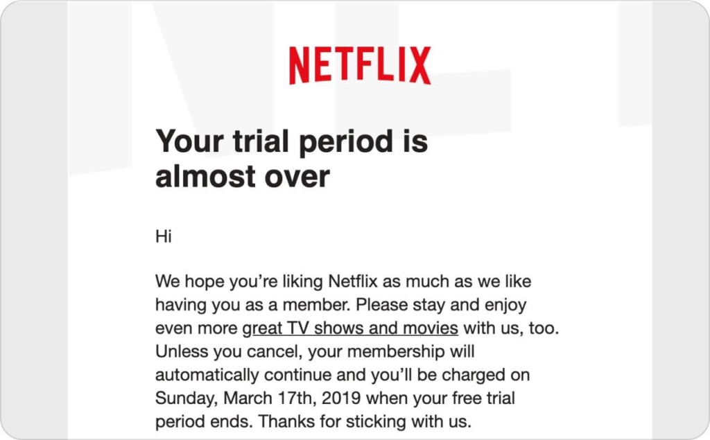
Photo source: Netflix
11. Review request: Turn recent buyers into visible proof
Use a direct line that matches the review page: “How was your order. Your feedback helps improve. Two minutes, no login.” CTA: “Leave a review.” Keep the form two steps with a star selector first. Short path lifts completion.
Why it works:
- Fresh memory increases response rate
- No-login flow removes friction
- “Helps improve” frames a clear purpose
- Closing the loop builds trust
How to use it in your advertising
Trigger the push 7–10 days after delivery or 2–3 days after a service. Deep link to a mobile-first form with the order prefilled. Route low ratings to support and high ratings to the public page. Show average rating and one recent quote near the CTA. If you offer an incentive, keep it neutral and disclosed, not tied to a positive outcome.
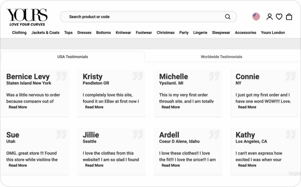
Photo source: Yours Clothing
12. Referral bonus: Turn customers into a low-cost acquisition channel
Use a direct, scannable line: “Give $10, get $10. Invite a friend. You both win when they order.” Keep the same wording on the landing page and checkout. CTA: “Copy link.”
Why it works:
- Reciprocity makes the offer feel fair
- Dual-sided reward motivates sender and friend
- Social trust beats cold ads
- Lower CAC than paid clicks
How to use it in your advertising
Headline: “Give $10, get $10.” Description: “Invite a friend. You both win when they order.” CTA: “Copy link.” Show a unique referral link, brief terms, and the reward trigger. Place the promo in your account page, post-purchase screen, order emails, and mobile wallet passes. A/B test dollar vs percent, instant coupon vs store credit, and “Copy link” vs “Share invite.” Track referrals per 100 orders, first-order AOV, and fraud flags. Keep message-match tight from push to page.
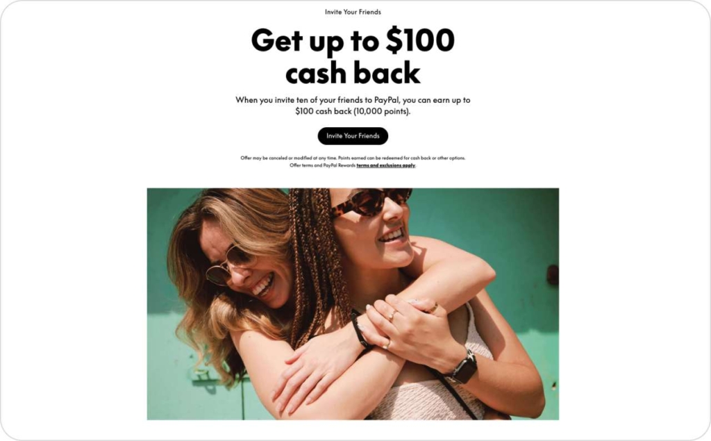
Photo source: PayPal
13. Anniversary perk: Reward loyalty at the 1-year mark
Use a clear, scannable line: “One year together. A gift for you. Thanks for being here. Extra 15% today only.” Keep the same promise on the landing page and in checkout. CTA: “Claim perk.”
Why it works:
- Recognizes loyalty and lifts repeat rate
- “15% today only” adds real urgency
- Gratitude language strengthens the relationship
- Simple perk feels exclusive and easy to redeem
How to use it in your advertising
Headline: “One year together. A gift for you.” Description: “Thanks for being here. Extra 15% today only.” CTA: “Claim perk.” Target customers at 365 days since first purchase or sign-up. Auto-apply code ANNIV15 and show the end time at 11:59 pm. Mirror the perk on your hero, cart, and checkout. A/B test percent vs dollar off and “today only” vs a 48-hour window. Add a short note for eligibility and minimums if needed.
How to create push ads with an AI ad generator
You want push ads live fast, with clean copy and on-brand visuals. Use Zeely’s AI advertisement generator to turn your product data into ready-to-run creatives in minutes. Core idea: automated ad creation with an AI script tool gives you a fast ad generator that builds conversion-focused ads without heavy lifting.
Steps
- Add your product URL or Shopify store. Zeely pulls title, images, price, and key features automatically, so you skip manual entries and start with accurate data
- Choose the format you need. Select one of 100+ static templates and choose the best one for your ads
- Generate copy and visuals with AI. Click Generate to let the AI script tool write titles, descriptions, and CTAs while picking icons or thumbnails
- Launch through Meta integration. Push the winning versions into your Meta Ads account, map your audience, set budget, and publish
When you build push ads with creative automation, you save production time, raise CTR with tighter message match, and improve ROI through faster testing. Zeely acts as a universal growth tool for your business by combining a fast ad generator, smart copy, and direct publishing in one place.
Conclusion
You now have a clear push ads playbook. Pick one intent bucket, launch three variants, and keep titles 30–45 characters with numbers. Match the landing page to the promise in the push. Track CTR for attention, conversion rate for fit, and revenue per click for value. Replace weak creatives fast and scale winners.
Clear offer increases CTR. Message match lifts conversion. Steady testing lowers cost.
If you want speed, use Zeely to draft variations, tweak copy and visuals, and publish through Meta in minutes. Start with one product URL, generate versions, and ship your first set today.