Standard digital ad sizes in 2026: IAB-aligned specs and the smallest useful set
If you’ve ever had an ad cropped or rejected, this guide breaks down the exact digital sizes that work in 2026. Zeely’s ad-creation team tests hundreds of creatives each month to keep these specs accurate and easy to follow.
Standard digital ad sizes: what to use and what to skip
You don’t need 20 banner sizes to run display ads. Most inventory is covered by a few standards: 300×250, 728×90, and 160×600 come first. Then add 300×600, 320×50 for mobile, 970×250 for premium placements, and one strong vertical unit.
Use fixed sizes when placement matters and responsive assets when you need reach. Keep text readable at small heights, design center-safe, and double-check file weight and formats before launch to avoid rejections and blurry renders.
I wrote this as a practical cheat sheet, not a spec dump. You’ll see the most common standard digital ad sizes, which ones to design first, and where they actually run. I’ll also explain how display banners differ from social formats like Stories and Reels, since they’re often mixed up. By the end, you’ll have a clear size plan you can hand to a designer and move on.
Standard digital display ad sizes in 2026: the only chart you need
These standard digital ad sizes are the formats that consistently appear across display inventory in 2026. Design this set first and you’ll cover most placements without rebuilding creatives for every campaign.
The standard digital ad sizes that cover most display inventory
This is the short list that actually delivers reach. It’s based on what platforms support at scale and what publishers reliably sell.
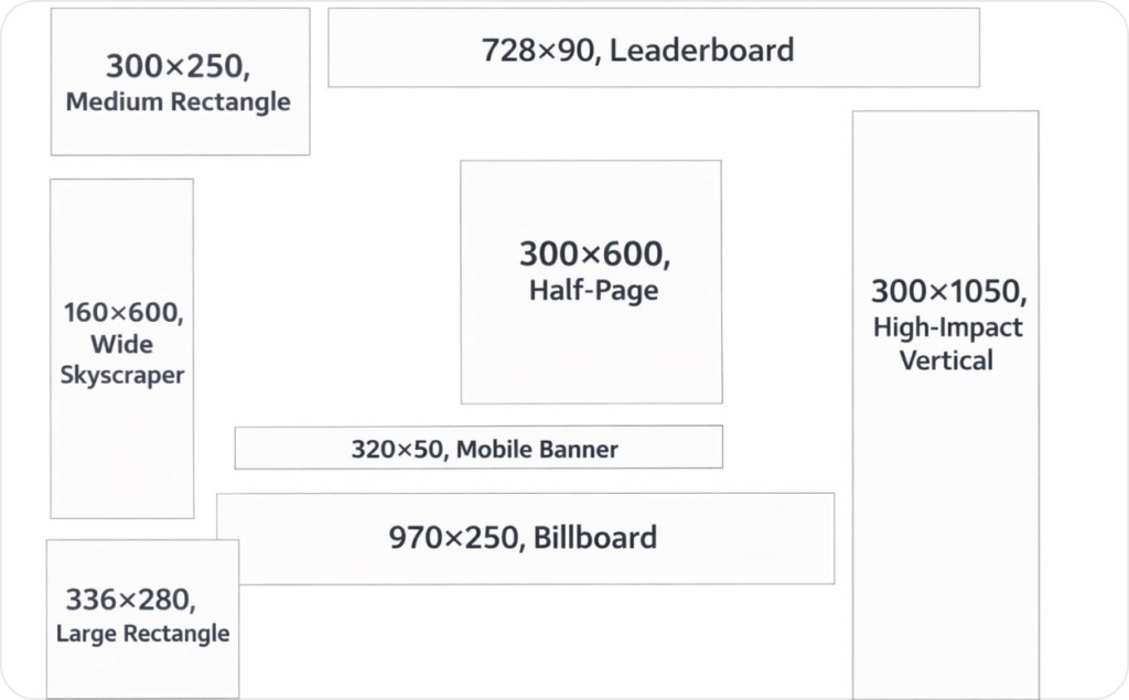
- 300×250, medium rectangle. Runs inside content, below paragraphs, and at the end of articles
- 728×90, leaderboard. Sits at the top of desktop pages and above main content.
- 160×600, wide skyscraper. Lives in the right rail or sidebar and stays visible while users scroll
- 300×600, half-page. A high-impact unit used in sidebars or embedded between content blocks
- 320×50, mobile banner. Appears at the top or bottom of mobile web pages
- 970×250, billboard. Reserved for premium header takeovers and direct publisher deals
- 336×280, large rectangle. Common inside desktop articles and content feeds
- 300×1050, high-impact vertical. Used for premium sidebar placements with strong branding goals
Google Ad Manager explicitly lists these formats among its supported and top-performing ad sizes, which means they align with how publisher inventory is structured and sold at scale. When you design around these sizes, you maximize fill, delivery consistency, and access to premium placements instead of chasing edge formats. Read now about standard digital ad sizes.
What common banner ad size names actually mean
The names sound technical, but they’re just shorthand for shape and placement.
- Medium rectangle fits naturally inside content and adapts across layouts
- Leaderboard is wide and short, built for top-of-page visibility
- Skyscraper refers to tall vertical units that stay visible as users scroll
- Half-page gives you enough space for readable copy and a clear offer
- Billboard is a wide premium format used for high-impact header placements
What is IAB and what it standardizes
If you’ve seen “IAB” next to ad sizes and wondered what it actually controls, this section clears it up. The short version: IAB sets the rules, and the New Ad Portfolio changed how those rules are applied without killing standard sizes.
IAB stands for Interactive Advertising Bureau, the industry body that defines ad standards so buyers, publishers, and platforms can work together without friction.
The IAB New Ad Portfolio, maintained by the IAB Tech Lab, replaces older creative display guidelines and shifts the focus away from rigid pixel sizes. Instead of locking everything to fixed dimensions, it standardizes aspect ratios and flexible size ranges that work across screens.
That doesn’t mean fixed banner sizes disappeared. In real buying and trafficking, standard digital display ad sizes are still widely used because publishers sell fixed slots and platforms require exact dimensions. The New Ad Portfolio sits on top of that reality. It modernizes standards for cross-screen delivery while keeping legacy units usable where inventory depends on them.
According to the IAB Tech Lab, the New Ad Portfolio is designed to support flexible, cross-device creative while simplifying how ads are built, reviewed, and delivered at scale.
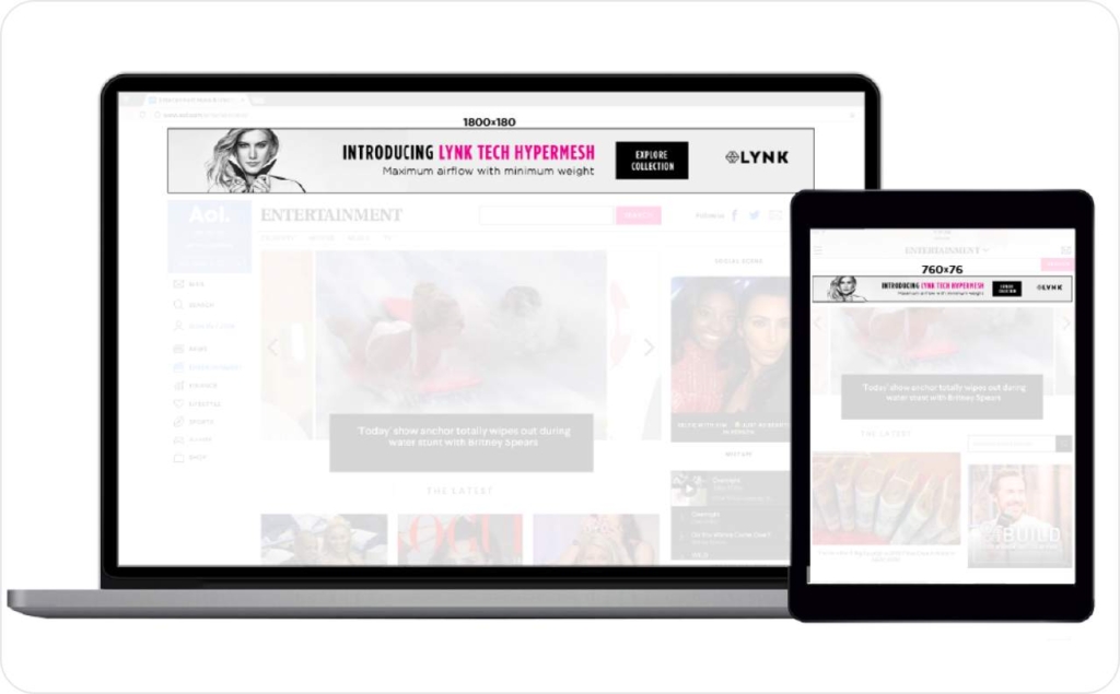
Photo source: IAB
Banner vs display vs native vs interstitial vs video
These terms are often mixed up, but they describe very different delivery models.
- Display and banner ads run in fixed slots with defined dimensions. This is where standard banner sizes still matter most
- Native ads follow a template and adapt to the surrounding content instead of using fixed pixels
- Interstitial ads take over the full screen between content states, usually on mobile
- Video ads are defined by duration and format standards like VAST or VPAID, not just size
The New Ad Portfolio ties these formats together under shared principles like LEAN and the Universal Ad Package. The goal isn’t to remove standards. It’s to make them work consistently across devices, layouts, and formats without breaking delivery.
The 10 sizes that cover most inventory and where they run
Most display inventory isn’t random. It’s built around a small set of common banner ad sizes tied to predictable placements on the page. When you understand where ads actually live, choosing the right banner sizes becomes straightforward.
Placement map: in-content, sidebar, header, footer, sticky
In-content placements sit inside the main reading flow. These ad slots usually appear after the first few paragraphs or near the end of an article, where attention is highest within the viewport. The most reliable banner sizes here are 300×250, 336×280, and 728×90 on desktop, plus 320×50 or 320×100 on mobile web.
Sidebar placements live outside the content column. They’re built for tall formats that stay visible as users scroll. This is where 160×600, 300×600, and 300×1050 consistently show up.
Header and footer placements are wide and shallow. They prioritize reach over dwell time, which makes 728×90 and 970×250 common choices.
Sticky or anchor units attach to the top or bottom of the viewport, especially on mobile. These placements favor short heights so they don’t block content.
An ad slot only performs if it’s actually seen. Google defines a display ad as viewable when at least 50% of its pixels are in view for one continuous second. That’s why size-by-placement decisions matter more than chasing every available format.

If you can only design 3 creatives, start here
If resources are tight, don’t overthink it. Start with 300×250, 728×90, and 160×600.
These three banner sizes cover in-content, header, and sidebar placements across most inventory. They map cleanly to the most common ad slots, stay within typical viewport behavior, and give you maximum delivery without fragmenting production.
Design these well and you’ll cover more inventory than teams building twice as many formats.
Standard mobile banner sizes for mobile web and in-app
Mobile inventory is simpler than desktop, but mistakes cost more because space is tighter. These standard mobile banner sizes cover most mobile web and in-app placements when used intentionally.
Mobile web banners: 320×50 vs 320×100
320×50 is the default mobile banner. It’s lightweight, loads fast, and works well for reach-focused campaigns where you want broad inventory without disrupting the page.
320×100 gives you more vertical space for a headline and a clear CTA. Use it when the message needs context, not when speed is the priority. Many publishers support both sizes, but not interchangeably, so treat them as separate banner sizes in your plan.
Mobile banners live inside a narrow viewport. Use short headlines, one CTA, and keep all critical elements inside the safe area to avoid cropping on smaller screens.
Photo source: Yahoo
Interstitial basics and when not to use them
Interstitials are full-screen units that appear between content states, most often in-app. They work when you control UX timing, such as between levels, page transitions, or clear pauses in navigation.
They fail when they interrupt reading or load without warning. That’s when users bounce and platforms limit delivery.
The IAB fixed-size specs are designed to prevent that. They define approved mobile dimensions, strict file-weight caps, and lightweight loading behavior so ads stay fast and usable across devices.
In practice, this means:
- Approved mobile dimensions like 320×50 and 320×100 for banners, and full-screen ratios for interstitial formats
- Maximum initial file weight capped at 150 KB for mobile display creatives, so ads load quickly even on slower connections
- Lightweight behavior rules that limit heavy animation, large image stacks, and blocking scripts that delay page content
These constraints aren’t arbitrary. They protect the mobile viewport, reduce load time, and keep ads from breaking the experience. When creatives exceed these limits, delivery drops or ads are rejected outright.
If you use interstitials, control timing carefully. Keep copy short, use a single CTA, and place all critical elements inside the safe area so nothing gets clipped on smaller screens. If you can’t guarantee that experience, skip interstitials and use standard mobile banners instead.
Google Display Network uploaded display ad sizes and specs
If you’re running uploaded display ads on the Google Display Network, specs matter more than creativity. Most rejections and limited delivery come from ignoring the basics.
Required and most-used uploaded sizes
These are the most common GDN image ad sizes that consistently deliver inventory:
- 300×250
- 336×280
- 728×90
- 300×600
- 160×600
- 320×50
- 970×250
This set maps to the core ad slots Google supports across publisher inventory. Skip edge sizes unless a placement requires them.
File types and limits: static, GIF, HTML5
Google Ads accepts static images, animated GIFs, and HTML5 ZIP files.
Key limits to respect:
- Static and GIF files must stay under the maximum file weight
- GIF animations must loop for a limited duration and avoid rapid flashing
- HTML5 ZIP files must follow Google’s structure rules and size limits
Why limited delivery happens: oversized files, unreadable text at small sizes, animation violations, or formats that don’t map cleanly to available inventory.
Responsive display ads vs fixed banners and Performance Max image rules
Not every campaign needs fixed pixels. Knowing when to use responsive display ads versus fixed banners saves time and prevents cropping issues.
Prioritize aspect ratios when platforms auto-render
Use fixed banner sizes when you’re buying guaranteed placements or direct deals. Pixels matter there.
Use aspect ratios when platforms auto-render ads across inventory. Formats like 1.91:1, 1:1, and 4:5 allow systems like Performance Max to adapt assets to different placements.
This is how asset groups work. You supply clean inputs. The platform handles rendering.
Minimums, safe areas, and don’t-get-cropped rules
When you use Performance Max or any responsive display format, Google renders your images into multiple placements automatically. That’s why aspect ratios and safe areas matter more than exact pixels.
Google requires these image ratios and minimums:
- 1.91:1 (landscape): minimum 600 × 314 px, recommended 1200 × 628 px
- 1:1 (square): minimum 300 × 300 px, recommended 1200 × 1200 px
- 4:5 (vertical): minimum 480 × 600 px, recommended 960 × 1200 px
To avoid cropping, Google recommends keeping all logos, headlines, and CTAs inside the center 80% safe area of the image. Anything near the edges is at risk when the system resizes or repositions assets across placements.
Two practical rules:
- If an image is too small, Google will upscale it and you’ll get blurry renders
- If key elements sit outside the safe area, they will be cropped in some placements
Design wide first, square second, vertical last. That ratio ladder covers most Performance Max and Demand Gen inventory without surprises.
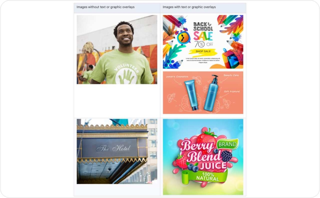
Photo source: Google Ads Help
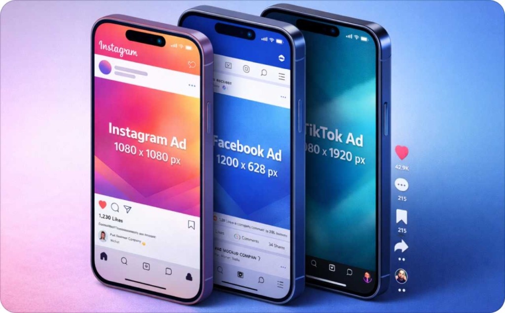
Meta Ads standard sizes by placement on Facebook and Instagram
Meta ad sizes look familiar, but they don’t behave like standard display inventory. These formats are placement-driven and vertically biased, which changes how you design and crop assets.
Feed vs Stories and Reels
In the Facebook Feed and Instagram Feed, Meta favors 1:1 and 4:5 formats.
- Use 1:1 at 1080 × 1080 px for flexibility across placements
- Use 4:5 at 1080 × 1350 px when you want more screen real estate and better engagement in-feed
Stories and Reels are different. They are full-screen and vertical by default. Here, 9:16 at 1080 × 1920 px is the standard. Anything else will be cropped or padded. With Zeely AI Instagram ads creator and Facebook ad maker, you can make amazing static and video ads, both automatically adapted to fit your social media.
Design rule for vertical placements: keep your headline, logo, and CTA away from the top and bottom UI edges. Stories and Reels add buttons, captions, and controls that can cover key content if you ignore the safe zone. Read now about Instagram story size and dimensions and Reels dimensions and aspect ratio.

Carousel vs single-image basics
A single-image ad carries one message. It works best when the offer is simple and immediate.
A carousel ad splits attention across multiple cards. Each card uses the same aspect ratios as feed placements, usually 1:1 or 4:5. Keep text minimal and consistent across cards so the story feels connected.
Social vs display clarification: standard digital ad sizes are not the same as social media image sizes. Display ads fit fixed slots on websites. Meta Ads adapt to feeds and full-screen experiences. Designing them the same way leads to cropping and weak delivery.
LinkedIn ad sizes for single image, carousel, and video
LinkedIn inventory is smaller, but expectations are higher. Ads run in a professional feed where clarity matters more than visual tricks.
Sponsored Content vs other formats
Most campaigns use Sponsored Content, which appears directly in the LinkedIn feed. This includes single image ads, carousel ads, and video ads. Other formats exist, but Sponsored Content covers the majority of inventory and intent.
Quick specs you actually need
- Single image ads: 1:1 at 1200 × 1200 px recommended
- Carousel ads: 1:1 at 1080 × 1080 px per card
- Video ads: 1:1 or 16:9, with clear framing and readable text
- Max file size: follow LinkedIn Marketing Solutions limits by format
- Design warning: avoid small text and dense layouts. What passes on Instagram often fails on LinkedIn.
LinkedIn differs from Meta in one key way. The feed is calmer, slower, and text-heavy. Ads with tiny headlines or aggressive visuals underperform quickly.
Fast workflow: one master artboard to a full size ad set
The fastest way to build a complete banner size set is to stop designing per size. Design once, then adapt. This workflow works whether you’re in Figma, PSD, or Canva, and it holds up when creatives move into trafficking.
Master layout system: grid, type scale, CTA lockups
Start with three masters:
- 1200 × 1200 square for feeds and flexible placements
- 1200 × 628 landscape for wide formats
- A tall vertical master for half-page and mobile-first layouts
Lock a simple grid, a consistent type scale, and one CTA position. Keep logos and claims center-safe so resizing doesn’t break hierarchy. From there, adapt each master to fixed banner sizes using artboards, auto-layout, or export presets instead of redesigning from scratch.
This system reduces errors and keeps text readable across sizes. It also makes last-minute swaps easy without reworking the entire set.
Troubleshooting: blurry uploads, cropping, and limited delivery
Most display issues come from the same few mistakes. Fixing them once prevents wasted spend later.
Blurry after upload: causes and fixes
If your ad looks blurry after upload, the source file is usually too small. Platforms upscale it, and quality drops. Aggressive compression, ultra-thin fonts, or the wrong color profile can make it worse.
Fix it by starting with larger masters, exporting at recommended minimums, and using thicker text weights. Always preview at actual size before upload.
Cropping and “limited” placements: causes and fixes
If your creative is getting cropped or placements show as limited, the layout isn’t safe. Key elements are too close to the edges, or the aspect ratio doesn’t match the placement.
Platforms auto-resize to fit available inventory. If your design ignores minimums or safe areas, delivery shrinks.
Fix it by keeping headlines, logos, and CTAs inside the center-safe zone and matching aspect ratios to placement types. Google’s image ad quality requirements explicitly flag blur, cropping, and layout compliance as reasons for rejection or limited delivery.
FAQ
I design for desktop web with 300×250, 728×90, and 160×600 because publishers standardize those slots across most major networks. For mobile web, 320×50 and 320×100 win on reach. In-app inventory varies, so responsive or 300×250 is safest.
For branding, I prioritize larger canvases like 970×250 or 300×600 because they buy attention and can carry a simple story. For direct response, 300×250 and 320×50 often convert better when the CTA is immediate and readable.
Yes, they behave more like asset-based systems than fixed-slot display. You upload a few aspect ratios (typically 1:1 and 1.91:1 plus vertical), and the platform crops and composes across placements. Fixed banners are still needed for guaranteed slots.
Start with 1080×1920 for 9:16 creative, then keep critical text, logos, and CTAs away from the top and bottom UI areas. I treat the middle band as “must-read” and leave generous breathing room for overlays.
Not really. Standard digital banner sizes are fixed pixels for web ad slots, like 300×250 or 728×90. Social placements are ratio-driven and auto-cropped, like 1:1 or 9:16. They overlap only when you export intentionally today.
IAB still treats a handful of fixed units as practical cross-publisher defaults, especially 300×250, 728×90, 160×600, 300×600, and 320×50. These map to common layouts and remain widely supported in 2026 trafficking systems and SSPs worldwide.
LEAN is the IAB Tech Lab’s framework for lighter, less annoying ads. In practice, it pushes you toward smaller file weights, polite animation, fast load, and fewer intrusive formats. If your creative is heavy or disruptive, delivery and viewability suffer.
Think of IAB as the shared vocabulary and Google or SSPs as the gatekeepers. IAB defines common units and behavior, but each platform enforces its own file limits, click-tag rules, and review policies. Always validate against the destination specs.
Performance is placement-driven, but 300×250 often wins on CTR because it sits in-content near attention. Tall units like 300×600 can improve viewability in side rails. Tiny banners rely on frequency, so they need ultra-simple messaging.
Viewability rises when the unit stays on screen longer, which means in-content placements and taller formats. CPM increases when inventory is scarce or the unit is high impact. If a size is uncommon, you may pay more and deliver less.
Refresh your top sizes first because they accumulate impressions fastest and fatigue sooner. A common cadence is every 2–4 weeks for 300×250 and 728×90, and every 6–8 weeks for long-tail sizes. Let CTR and CPA trends decide.
Design for the smallest height first. Keep all essential copy in the center, avoid edge-aligned CTAs, and test on a real phone screenshot. If you use responsive assets, assume aggressive cropping and prioritize a single, bold CTA.
Yes, and it’s worth offering because it increases saves and shares. I recommend a one-page PDF chart with the top 8–10 sizes, names, and best placements, plus a second page for platform notes. Keep it print-friendly and high contrast.
Yes. The fastest path is a Figma file with an auto-layout component for headline, image, and CTA, then prebuilt frames for each size. Canva and PSD templates work too, but Figma exports are usually cleaner for batches.
CTV is less standardized than web display. Most creative is 16:9 video, commonly 1920×1080, plus companion overlays or pause units defined by each publisher or platform. I treat CTV specs as placement-specific and request a spec sheet upfront.

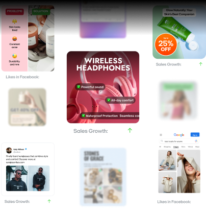
Emma blends product marketing and content to turn complex tools into simple, sales-driven playbooks for AI ad creatives and Facebook/Instagram campaigns. You’ll get checklists, bite-size guides, and real results, pulled from thousands of Zeely entrepreneurs, so you can run AI-powered ads confidently, even as a beginner.
Written by: Emma, AI Growth Adviser, Zeely
Reviewed on: February 7, 2026