Ecommerce video ads examples that show the product fast
What makes ecommerce video ads examples actually sell, not just look nice? I pulled these patterns from real product creatives, platform rules, and hands-on ad work to show you what to open with, what to test, and what to reuse across channels.
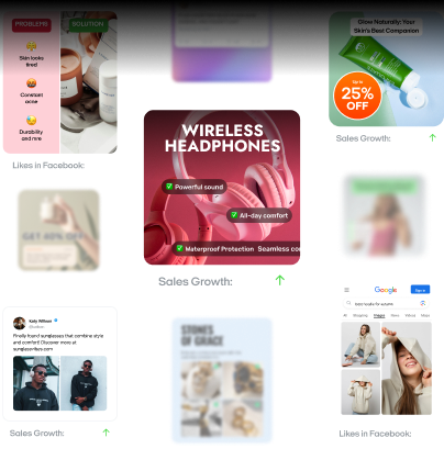
I keep a simple rule for product creative: if I can’t tell what the product is by second one, the ad is already late. Most product videos lose the sale before the pitch starts because they open with a logo, a lifestyle scene, or a line of text that says almost nothing. The best ecommerce video ads get to the product fast, show one believable benefit, and make the next click feel easy.
I keep coming back to TikTok creative best practices,Google’s ABCDs of effective video ads,Amazon’s Sponsored Products video guide,Baymard’s image resolution and zoom research, and this 2025 Journal of Marketing Analytics paper on unboxing videos. TikTok says the hook should work in the first 6 seconds and the content proposition should land in the first 3 seconds. Google says to earn attention fast, brand early, and make the next step clear. Amazon’s product-feature format lets advertisers upload 1 to 5 feature videos and can show interactive thumbnails. Baymard found that 56% of users’ first actions on product pages were to explore images, and 25% of ecommerce sites still fail on image resolution or zoom. The 2025 unboxing paper analyzed 499 YouTube viewers and found that information-seeking, entertainment, and interpersonal utility motives significantly affected purchase and word-of-mouth intent.
So when I build a library of product creatives, I don’t sort by platform first. I sort by buyer question. Show me what it is. Show me what’s in the box. Show me how it works. Show me why this one beats the other one. Show me the details I can’t touch through a screen. That is how video ads for e-commerce stop feeling random and start feeling reusable.
Not every link below is a paid placement on the page. Some are official brand videos. Some are creator-led shopping videos. I’m using them because the opening pattern is what you can actually reuse in paid creative.
Read these next:
UGC video ads for e-commerce,
E-commerce advertising guide,.
I use those guides when I need more UGC formats, stronger CTA angles, and cleaner product inputs for a fast creative tool.
Product demo ads that sell in seconds
Product demos work when the proof starts before the explanation. For ads for products that solve a visible problem, I want the first second to carry the whole promise.
First-seconds templates
- “Here’s the problem” + product touching the problem in frame
- “Watch this” + one impossible-looking proof shot
- “This does X in Y seconds” + countdown or before/after
Purple: The Raw Egg Test. The opening puts the egg and the mattress in frame right away, so the visual tension does the work. What hit: the demo is the claim. What to borrow: start with a fragile proof point, not a feature list.
BlendJet 2: The Ultimate Portable Blender. You see the product in action fast, and the benefit is obvious before any deep explanation. What hit: it sells portability through usage, not adjectives. What to borrow: if your product moves, blends, spins, sprays, or heats, show that motion instantly.
Oura Ring 4: Inside the Ring. The close product framing makes tiny hardware feel premium and understandable. What hit: it turns a small object into a big-screen hero. What to borrow: for small products, use macro shots and one plain-language performance line.
The new Dyson Airwrap TV commercial. The styling result shows up fast, and the product stays central instead of hiding behind beauty footage. What hit: the transformation arrives before the technical explanation. What to borrow: lead with the result people want to copy.
Meet the Shark FlexStyle. The twist from dryer to styler is a clean mechanical reveal. What hit: one visible product move explains the value. What to borrow: if your product changes modes, make that switch your hook.
Unboxing video ads examples that feel like proof
Unboxing works because it feels less like a pitch and more like evidence. That matters in e-commerce marketing through interactive video ads too, because the buyer wants to feel closer to the package, the materials, and the first reaction before they spend.
First-seconds templates
- Sealed box in frame + “I bought this because…”
- Knife, tear strip, or lid lift + “Let’s see if it’s worth it”
- Product reveal on first open + one honest reaction
Unboxing Galaxy S25 Series | Samsung. Samsung gets to the box and the phone fast, so there’s no warm-up fluff. What hit: the packaging reveal is clean and premium. What to borrow: if your box design is strong, make it part of the ad.
Nothing Phone 3a and 3a Pro Unboxing!. The side-by-side reveal gives the viewer a reason to keep watching. What hit: novelty plus immediate comparison. What to borrow: if you have variants, show them together from the start.
Pixel 9 Pro XL unboxing. The creator gets straight to the device, finish, and in-box contents. What hit: it answers “what do I really get?” with no detour. What to borrow: list the box contents visually, not just in voice-over.
DJI Osmo Pocket 3 unboxing. The tiny camera, big screen, and creator-combo extras make the reveal feel high value. What hit: accessories help the product feel more complete. What to borrow: if add-ons matter, reveal them early.
OnePlus 13 Unboxing!. The opening leans on first impressions, bundled extras, and tactile handling. What hit: the viewer gets an instant sense of value. What to borrow: let the hands, sounds, and packaging textures do some of the selling.
Tutorial style product video ads that answer “How?”
Tutorial creative is where I send skeptical buyers. It is one of the easiest ways to make video ads for e-commerce feel useful instead of pushy, because the ad earns attention by solving the first tiny task.
First-seconds templates
- “Here’s how to use it” + step one already happening
- “If yours keeps doing this, do this instead”
- “Three steps, ten seconds” + hands-on action
How to Apply Rare Beauty Blush | Light Medium Skin. The video opens with the product and the application question, not with brand fluff. What hit: it removes fear around overdoing the product. What to borrow: teach around the biggest beginner mistake.
Ice Cream Maker | Getting Started (Ninja CREAMi). The payoff is obvious because the machine and result are both shown clearly. What hit: the video sells outcomes while teaching setup. What to borrow: make the first tutorial step visually simple enough to imitate on mute.
Dyson Airwrap tutorial: how to get started. Dyson starts with usage, attachments, and the reason each step matters. What hit: it shortens the learning curve on an expensive tool. What to borrow: for higher-ticket items, make “easy to start” the message.
Oura Ring 4: Getting Started. The hook is practical: charge it, connect it, understand when features unlock. What hit: it answers setup questions before they become objections. What to borrow: convert support content into sales-focused ad creative.
Getting Started with Shark FlexStyle. The video quickly shows the mode change and how to begin styling. What hit: the product feels less intimidating in seconds. What to borrow: if the tool has multiple attachments, show the first one a beginner should use.
Product comparison ads that make the choice easy
Comparison creative works when buyers are close to the checkout page but still stuck in research mode. Some of the smartest comparison ads are really just compressed decision-making.
First-seconds templates
- Product A and Product B in one frame + “Which one should you buy?”
- “I tested both” + one visible difference immediately
- Price, feature, or outcome gap on-screen in the first second
Oura Ring vs. Apple Watch: What a Tech Reporter Wants You to Know. The hook is simple: two familiar products, one buying decision. What hit: the comparison starts from the buyer’s real tradeoff, not spec soup. What to borrow: compare the jobs each product does best.
Dyson Airwrap vs Shark FlexStyle. The price gap and styling result create instant tension. What hit: viewers know exactly why the comparison matters. What to borrow: make the first frame answer “why these two?”
Ruggable Washable Rugs vs Tumble Rugs. The category is easy to understand, and the side-by-side use case is practical. What hit: it compares ownership reality, not just looks. What to borrow: compare cleanup, storage, setup, or durability if those decide the sale.
Nothing Phone (3a) vs (3a) Pro: Which one to get?. The hook is tight because the products look similar but do not serve the same buyer equally well. What hit: the structure answers value for money fast. What to borrow: when models are close, frame the premium upgrade in one sentence.
Therabody Theragun Mini Gen 3 vs Mini Plus. The opening makes the decision practical instead of abstract. What hit: portability, intensity, attachments, and battery are buyer-friendly criteria. What to borrow: compare by daily use, not by engineering language.
Product detail shots that build trust
If the product can’t be held, the camera has to do the touching. This is where detail-heavy product videos earn their keep. A lot of video advertising fails because it stays too wide for too long.
First-seconds templates
- Extreme close-up + one texture word
- Macro shot + “Look at this”
- Detail shot + benefit label on-screen
Introducing the all-new AirPods 4 | Apple. Apple uses crisp close framing to make fit, case size, and finish feel tangible. What hit: tiny hardware details look easy to grasp. What to borrow: shoot the part people compare in store.
Introducing Galaxy S25 Ultra | Samsung. The hardware details and polished materials do a lot of trust-building before the copy gets busy. What hit: premium surfaces are shown like evidence. What to borrow: if your product wins on build, stay close and slow.
Oura Ring 4: Inside the Ring. The macro treatment makes sensors and finish feel premium instead of mysterious. What hit: it sells invisible tech through visible craft. What to borrow: explain hidden features with elegant cut-ins.
Engineering the Dyson Supersonic Nural hair dryer. Dyson uses component-level shots to make the product feel engineered, not generic. What hit: inner mechanics become trust signals. What to borrow: if your product has real design work inside it, show it.
Fenty Icon Lipstick | Fenty Beauty. The close product shots make shade, finish, and packaging feel desirable fast. What hit: tactile beauty details carry the sell. What to borrow: for cosmetics, texture is the feature.
E-commerce ad creatives to reuse and remix across channels
A creative library should not be a graveyard of one-off edits. It should be a working shelf. That matters even more if you use an e-commerce video ads maker or a fast commercial maker, because the real win is not one main cut. The real win is turning one shoot into six assets.
First-seconds templates
- One hero action + three text overlays for three audiences
- One reveal shot + short, medium, and long versions
- One proof moment + different CTAs for new viewers, warm viewers, and product-page use
The all-new MacBook Neo. This spot is built around a clean product reveal, quick feature framing, and a polished visual rhythm that can break into multiple smaller cuts. What worked: the product stays central, so every shot can stand on its own. What to borrow: shoot one strong hero sequence that still makes sense as a 6-second teaser, a 15-second paid cut, and a product-page explainer.
Life’s Uncomfortable Moments | Wool Runner 2 | Allbirds. This one works because it feels modular. The structure gives you several natural stopping points, so you can lift short moments without losing the point of the ad. What worked: each beat carries its own mini-payoff. What to borrow: plan your scenes like building blocks, so every few seconds can become a separate creative for testing.
MANSCAPED Presents “Hair Ballad”. This is a strong reminder that brand personality can still be remix-friendly when the concept is clear. What worked: the ad has distinct visual beats and a memorable tone, which makes it easy to pull clips for awareness, retargeting, or shorter product-first edits. What to borrow: when you have a bigger creative concept, make sure it still includes cuttable moments you can reuse outside the full version.
The Original Scrub Daddy official product video. This one is easy to repurpose because the demo keeps producing new proof points. You get use case after use case, each one simple enough to become its own short ad. What worked: the product keeps earning attention with fresh, sellable moments. What to borrow: storyboard your demo so each feature reveal can survive as a standalone clip.
Track all your moves with Oura. This example fits the remix model because it balances product focus with enough variety to cover more than one funnel stage. What worked: the footage can support both top-of-funnel curiosity and closer-to-purchase proof. What to borrow: film beauty shots and practical proof in the same session, so one shoot can feed multiple ads for products without feeling repetitive.
The library I’d build first
If you sell one hero product, start with six folders: demo, unboxing, tutorial, comparison, detail shots, and remix-ready cutdowns. Put at least three hooks in each folder. TikTok also recommends 3 to 5 different creatives per ad group and keeping a library of creative assets so you can refresh faster. That is a much better system than praying one edit carries the whole month.
I’d also keep the production bar realistic. You do not need a giant studio or a slow commercial maker. You need clear proof, clean framing, and enough footage to test two or three hooks per angle. For an e-commerce video ads maker, that is the real advantage: speed to iteration, not fake polish.
The Zeely team and I think about e-commerce marketing through interactive video ads in a simple way: make the product easier to understand before you ask for the click. Amazon’s newer product-feature format leans into interactive viewing, and that fits the same rule. Make the answer visible early, then let people explore.
If you are building your own library this week, start small. Make one demo, one unboxing, one tutorial, one comparison, and one detail cut. Then turn each into a 6-second, 15-second, and product-page version. That is how video advertising gets cheaper over time. And that is how best ecommerce video ads stop being lucky one-offs and start becoming a repeatable system. Start creating beautiful eCommerce videos that convert views into sales with Zeely AI to grow faster and sell smarter.

Emma blends product marketing and content to turn complex tools into simple, sales-driven playbooks for AI ad creatives and Facebook/Instagram campaigns. You’ll get checklists, bite-size guides, and real results, pulled from thousands of Zeely entrepreneurs, so you can run AI-powered ads confidently, even as a beginner.
Written by: Emma, AI Growth Adviser, Zeely
Reviewed on: April 21, 2026