Banner ad examples: 13 case studies that turn glances into clicks
Can your banners capture attention in seconds? Zeely AI presents 13 case studies proving how smart design turns casual views into real clicks.
Banner ad examples don’t win by accident. The best pair a sharp hook, benefit-forward copy, and one clear CTA, then fit perfectly into GDN sizes like 300×250, 728×90, 160×600, and 970×250. And it’s worth getting right: digital banner ad spend was forecasted to hit US$185.67B in 2025, so even small lifts compound fast. In this guide, you’ll learn what banner ads are, what actually makes them convert, and see annotated cards that spell out the visual cue, offer, results, and why each ad works.
What are banner ads?
Confusing every web ad with a “banner” leads to bad choices. A banner ad is a visual display unit that runs on websites and apps, most often across the Google Display Network. It sits in fixed placements like header, sidebar, or in-content blocks. Standard ad sizes include 300×250, 728×90, 160×600, and 970×250. Creatives ship as static images or animated/interactive assets. Strong banners follow a simple layout: Brand for recognition → Hook to stop the scroll → Benefit that answers “why click?” → CTA that tells users what to do.
What makes a good banner ad?
Great banners are simple and deliberate: a clear hook, a benefit that answers “why click?”, and one CTA. The rest — visual hierarchy, contrast, readable type, and honest proof, just clears the path to that button.
Message architecture — clear hook → benefit-forward copy → single CTA
Lead with a clear hook that names the gain or removes the pain. Keep it under eight words so it reads at a glance. Follow with benefit-forward copy that explains why the click helps right now. Avoid features unless they prove the benefit. Close with a single CTA. Two or more buttons split attention and depress CTR.
Visual hierarchy — guide the eye to the button
Design the frame so the eye moves: hook → benefit → contrast/button. Make the hook the largest element, the benefit secondary, and the logo supportive. This visual hierarchy creates a short path to action and prevents detail from competing with the CTA. Place supporting art where it won’t interrupt that path.
Contrast, readability, and safe margins
Legibility drives clicks. Aim for a text-to-background contrast ratio of 4.5:1. Use short lines and generous leading so small sizes hold up. Maintain safe margins, about 8–16 px inside the edges, so nothing feels cramped or gets trimmed in responsive crops. Add a soft overlay on busy photos to protect readability.
Button craft that reads “click me”
Buttons should look touchable without cues. Use a solid fill, rounded rectangle, and roomy padding. Keep the label concrete: verb + object, like “Reserve table,” “Get quote”. Place the button near the benefit line and give it visual weight. In HTML5, include hover and focus states for clarity and accessibility.
Value prop, social proof, and urgency
State one strong value prop — price, speed, guarantee, or exclusivity. Reinforce it with social proof like ratings, counts, or trusted badges. Use urgency only when it’s real and verifiable. Honest scarcity can lift action; fake timers erode trust and brand equity.
Image vs illustration vs motion
Use product images when realism sells the offer — food, fashion, travel. Use illustration for abstract outcomes like security, automation, or savings. Add motion when a quick build clarifies value. Win attention in the first second, then end on a frame where the CTA is visible. Keep loops around 15 seconds and file sizes lean.
Text length and density
Fewer words win. Aim for 12–24 words across the entire ad. One short headline, one short support line, one button. If you need more, you likely need a different format. Dense copy turns into blur at 300×250 and 728×90.
Price and promotions
Show price when it removes friction, for example, “From $29,” “Flat $49 install”. Show promos when they are simple and time-bound, like “25% off today,” “2 months free”. Put the promo in a badge and keep the CTA clean. Avoid stacking codes, tiers, and legal lines in one frame.
Accessibility that scales
Write alt text that states the offer and action, not “image of.” Use readable weights and avoid long ALL-CAPS lines. Don’t rely on color alone to communicate meaning. Limit flashing to safe thresholds and keep motion smooth to reduce fatigue.
Brand guidelines and consistency
Respect brand guidelines for logo clear-space, tone, and color. Keep the logo present but not dominant. Maintain a consistent type scale and spacing system across sizes so variants feel related. Consistency builds recognition and supports E-E-A-T.
Layout and export hygiene
Work on an 8-px grid and check safe margins after every resize. Export crisp assets: PNG/JPG for static, GIF/HTML5 for animated. Compress carefully so text edges stay sharp. For RDAs, preview every size and fix crops that hide hooks or CTAs.
Ship-ready recap
A strong banner presents a clear hook, delivers benefit-forward copy, and ends with a single CTA. The visual hierarchy leads to the button, supported by readable type, real proof, and honest urgency. When those parts align, the ad earns attention without yelling.
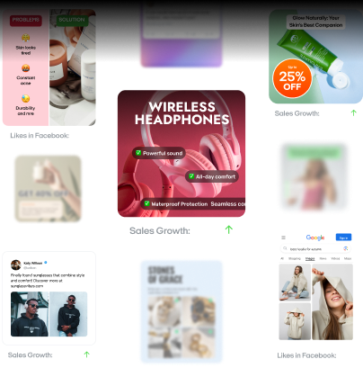
Clickable Banner Ads Examples
These real banners show how hook → benefit → single CTA plus clean design lift CTR and intent. Each card breaks down visual cue, offer, why it worked, and the key metric to watch, so you can copy the winning pattern and adapt it to your size and placement.
1. The New Yorker: Clarity-first subscription with low-friction trial
This banner series packaged The New Yorker’s value in one glance: a limited-time offer that pairs 12 weeks for $6 with a free tote and a clear “Cancel anytime” promise. The on-brand, minimalist layout reduced cognitive load and told prospects exactly what they get and what it costs, no hunting, no guesswork.
Results:
- Clear value perception at a glance, increasing propensity to click
- Lower perceived risk due to explicit cancellation policy
- Reinforced brand trust through consistent, on-brand design
- Strong offer salience from “Limited time offer” + price anchor
Why it worked:
It stacked value + risk reversal + simplicity. The price anchor did the math fast, the tote added a physical sweetener, and “Cancel anytime” neutralized commitment anxiety. The clean, on-brand execution channeled attention to one CTA, winning interest through clarity, not complexity.
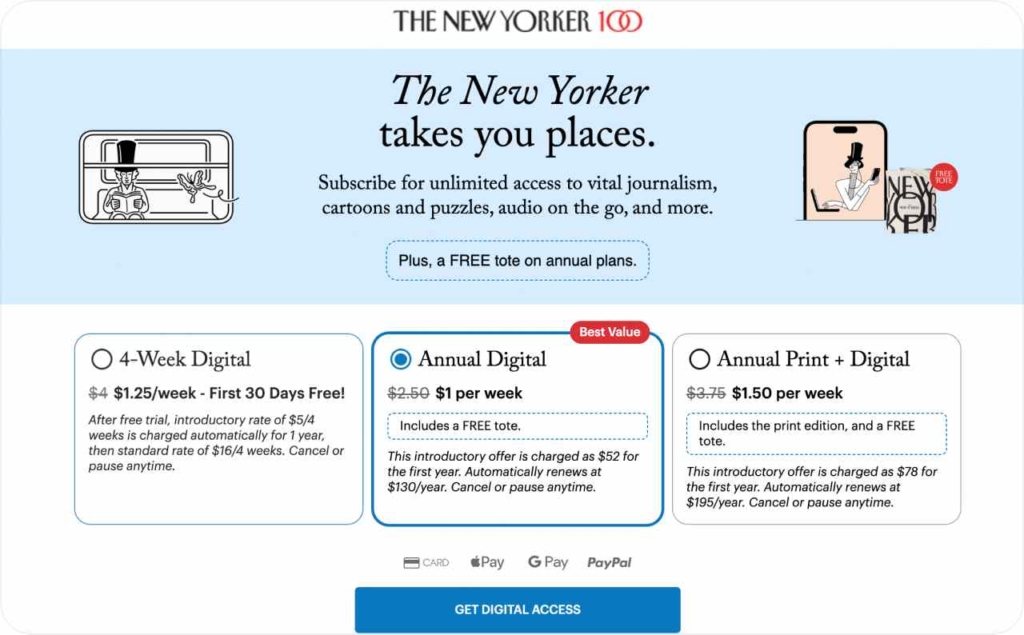
Photo source: The New Yorker
2. ZeroBounce: Free list clean that sells deliverability
This banner made the offer unmistakable: clean your email list for free to improve deliverability and clicks. The relevant visual reinforces the outcome, while the brand name itself, ZeroBounce, acts as a built-in value proposition and proof of intent. A single, direct CTA keeps the path to action short.
Results:
- Immediate value perception from the word “Free,” lifting click propensity
- Clear link between action and outcome
- Low-friction lead capture via freemium entry point
- Reinforced credibility through brand–benefit alignment
Why it worked:
It solved a painful problem in one line, list hygiene, and tied it to a concrete benefit: better deliverability and more clicks. The brand name doubled as the promise, the image matched the task, and the focused CTA removed ambiguity, turning curiosity into trials.
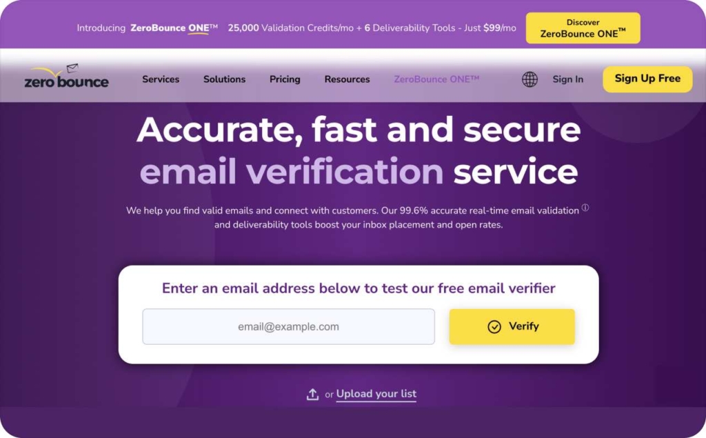
Photo source: ZeroBounce
3. Audible: Credibility-led offer with celebrity proof
This banner pairs a high-trust creative, Michelle Obama’s audiobook, with a crystal-clear discount: get 3 months for $0.99/month.. The recognizable cover art signals product fit instantly, while the price anchor frames strong value. A single, direct CTA keeps the path to action short.
Results:
- Fast trust transfer from celebrity/author recognition
- Strong value perception via the introductory discount
- Clear category cue that reduces ambiguity
- Higher click propensity from proof + price anchor pairing
Why it worked:
It combined authority with clarity. The artwork made the medium unmistakable, and the focused message funneled attention to one CTA, turning recognition into intent.
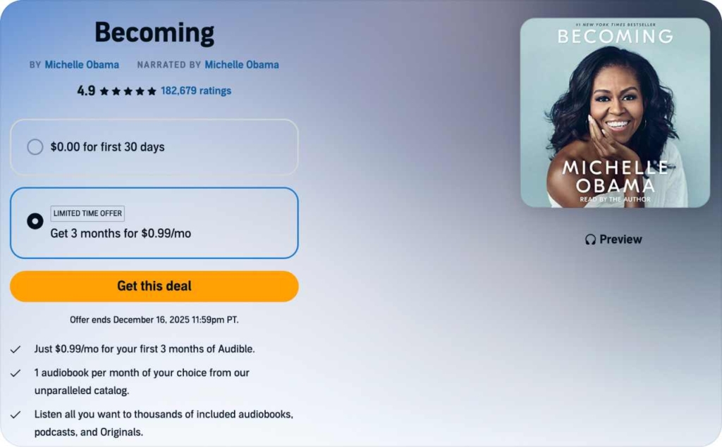
Photo source: Audible
4. LivePlan: Outcome-first planning with in-product proof
This banner leads with credibility: a clear dashboard screenshot that shows the product at work. The copy is direct and quantified — “Create a strong business plan in half the time with twice the impact.” The message promises speed and results, while a single CTA invites prospects to explore the offer and platform.
Results:
- Instant product understanding from the in-app dashboard visual
- Strong value perception via quantified claims
- Higher intent from action verbs tied to outcomes
- Lower friction to click with a clear, singular CTA
Why it worked:
It paired product proof with a measurable value prop, reducing uncertainty and signaling real capability. The copy framed benefits, not features, and the focused CTA kept attention on one next step, turning curiosity into evaluation.
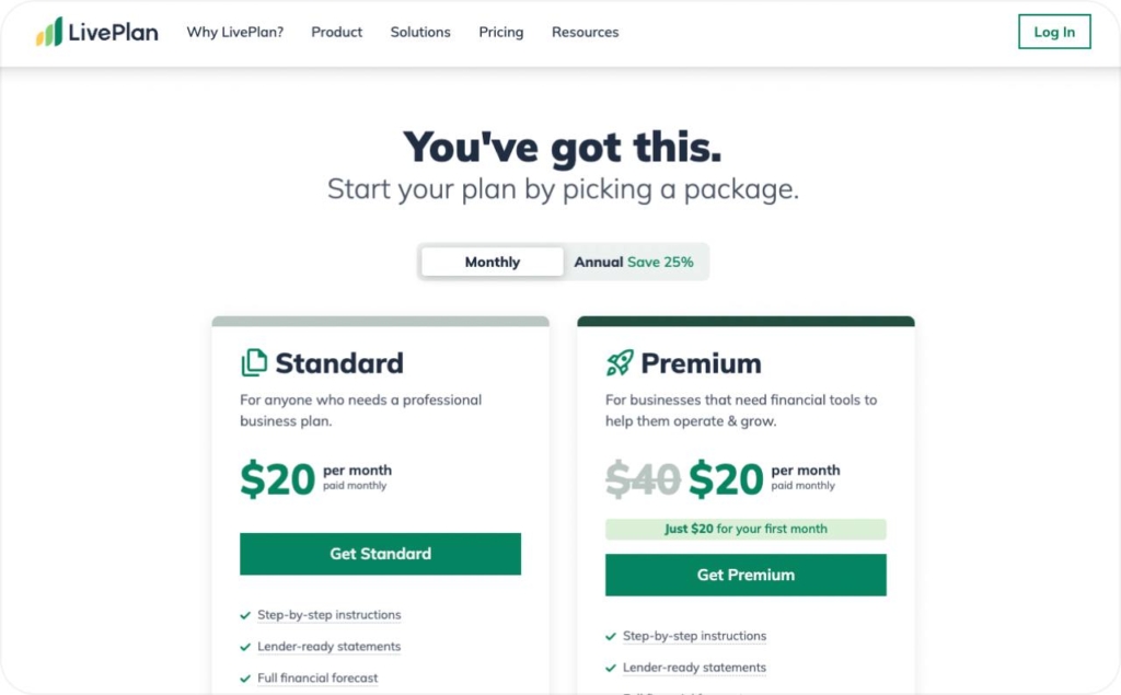
Photo source: LivePlan
5. CallRail: Strong trial CTA, weak value story
This banner nails the CTA — a high-contrast button with an active verb and a free 14-day trial that lowers risk. But the small body text above the button is hard to read on some screens, and the ad never states a unique value proposition, leaving “Why CallRail?” unanswered.
Results:
- Clear affordance and reduced friction from the free-trial CTA
- Actionable verb increases click propensity
- Readability issues from small explanatory copy on smaller displays
- Low differentiation because UVP isn’t surfaced
Why it worked:
The ad converts curiosity into action with a decisive, low-risk CTA, but it underleverages CallRail’s core payoff. Elevate the UVP into the headline, add a proof point, and increase text size for legibility to boost intent and clicks.
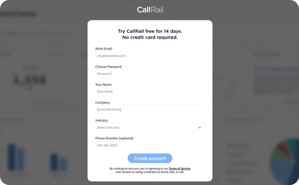
Photo source: CallRail
6. Liberty University: Community-first visual, hybrid-value reassurance
This banner leads with feeling: a left-side photo that signals belonging and campus life, instantly separating Liberty from “online-only” schools. The copy tackles the core objection head-on — online flexibility without losing physical campus advantages, and funnels attention to a single, confident CTA.
Results:
- Immediate emotional resonance from a simple, community-oriented visual
- Reduced skepticism by addressing the online-college drawback directly
- Clear hybrid value prop
- Higher click intent through reassurance and one decisive CTA
Why it worked:
It paired emotional proof with risk reversal. By answering the toughest question first — “Will I miss the real university experience?” the ad earned trust and guided prospects toward action without clutter.
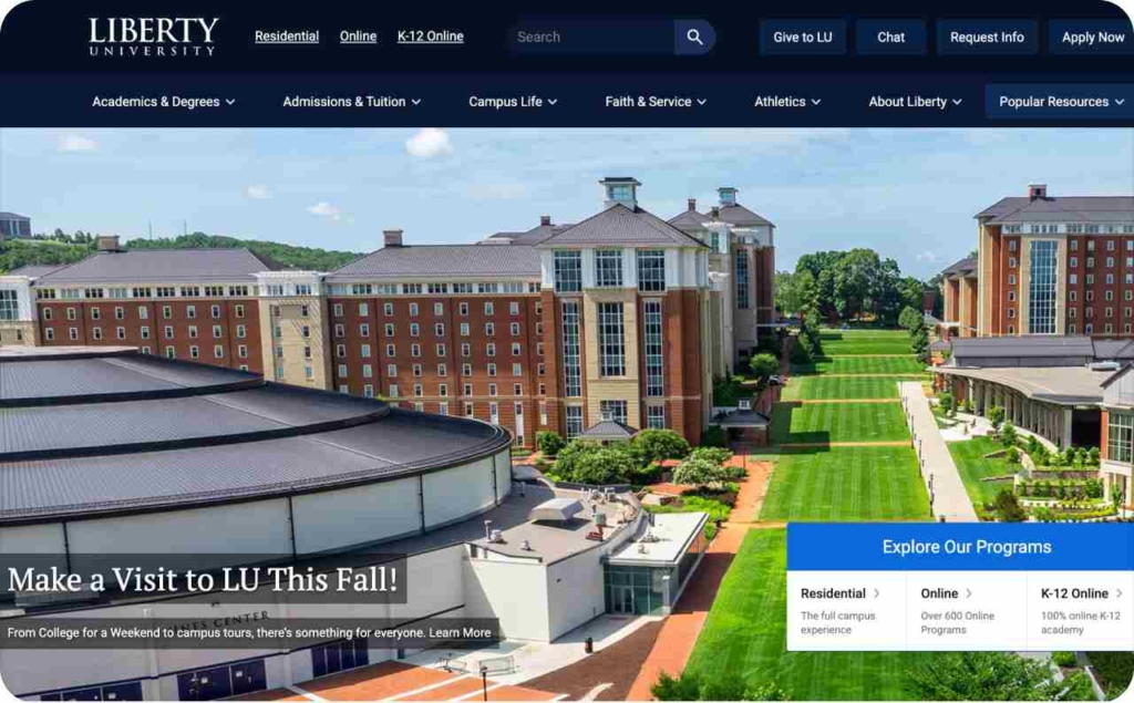
Photo source: Liberty University
7. AutoZone: Pain-point trigger with localized intent
This banner meets drivers at the exact moment of need — the dreaded check engine light. The copy acknowledges the stress and positions AutoZone as the fast path to a fix. Geotargeting adds the nearest store’s address and hours, removing guesswork and shortening the path from worry to action. A locality-tuned CTA keeps the decision simple.
Results:
- Instant relevance by mirroring a common pain point
- Higher local intent from visible store address and hours
- Lower friction: users know where and when to go, before clicking
- Stronger click propensity from problem→nearby solution framing
Why it worked:
It pairs situational specificity with proximity proof. That combination converts attention into action, turning anxiety into a clear next step without extra copy or clutter.
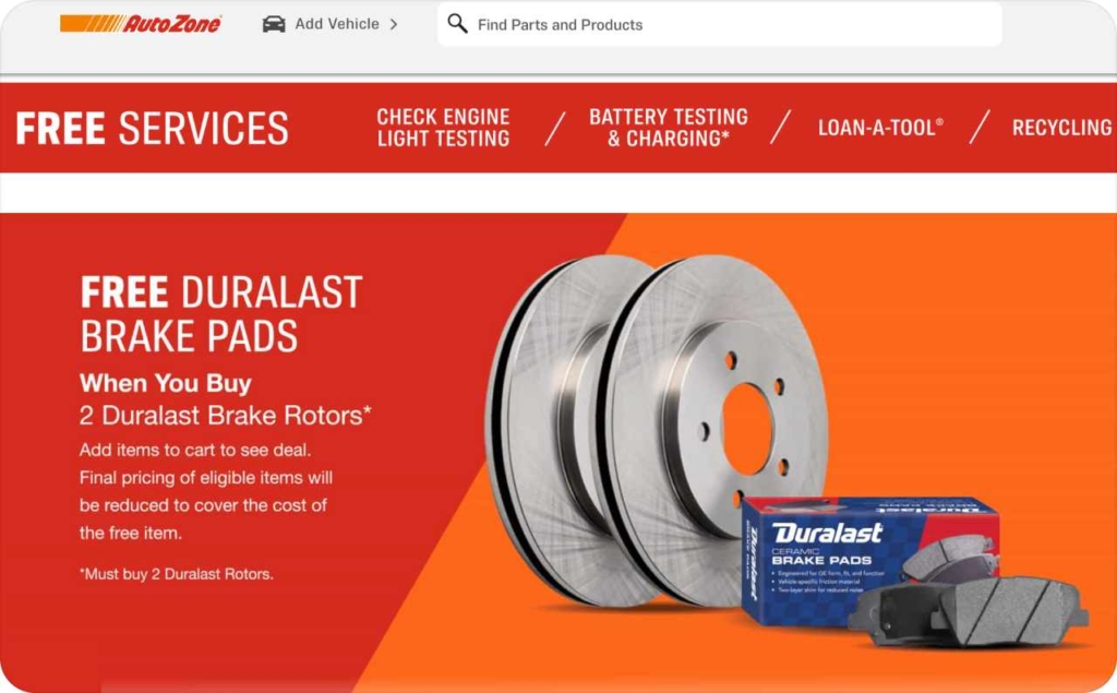
Photo source: AutoZone
8. Ridge: Parallel comparison that makes the upgrade obvious
This banner tells a one-second story with a side-by-side visual: bulky, uncomfortable carry versus a sleek, modern wallet. The headline frames the outcome, and a single CTA closes the loop. The comparison does the selling, no extra copy needed.
Results:
- Instant comprehension from a before/after visual
- Strong value perception via clear, tangible contrast
- Reduced evaluation time; users grasp the benefit at a glance
- Higher click propensity from a focused “upgrade” frame
Why it worked:
Parallel comparison turns abstraction into evidence. It leverages contrast and gain framing — ditch discomfort → get sleek utility, while a clean layout and single CTA keep attention on the decision. Simple, visual, undeniable.
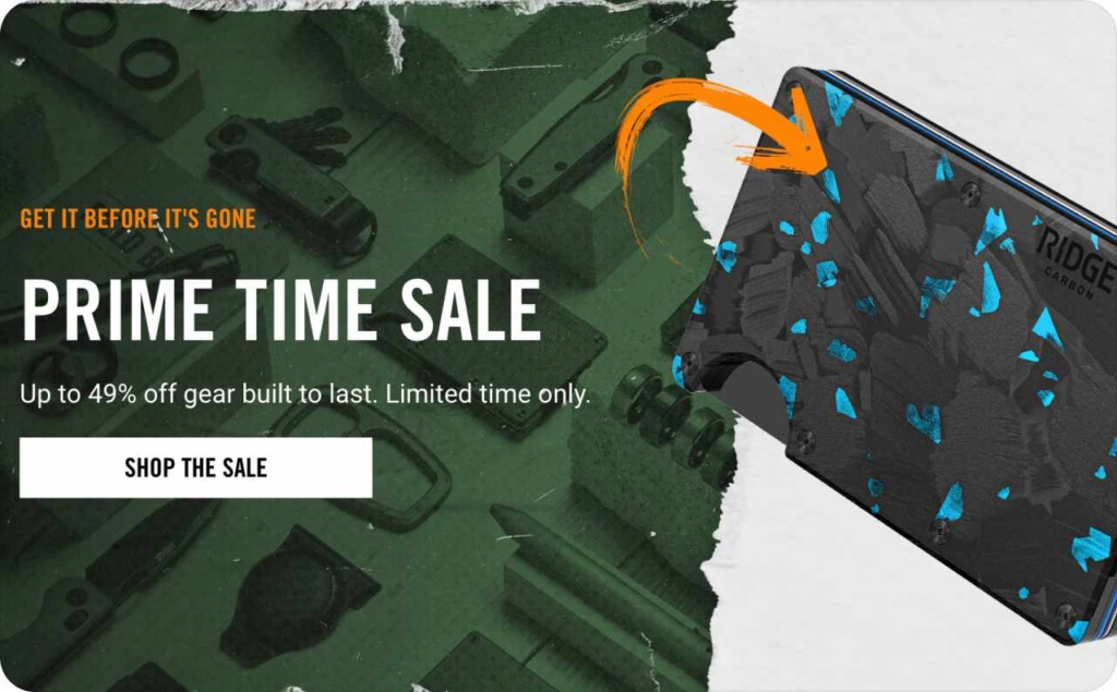
Photo source: Ridge
9. Apple: Minimalist contrast with instant-clarity CTA
Apple’s banner keeps the message weightless: light, simple design that surfaces competitive strengths fast, then lands on a frictionless CTA — “Apply in minutes.” Black-and-white contrast pulls the eye, concise copy and graphics carry the meaning, and direct comparison snaps focus to what the audience cares about most.
Results:
- Faster comprehension from minimalist layout and tight copy
- Higher salience via strong black-and-white contrast
- Increased action intent from time-boxed CTA
- Clear differentiation through direct, side-by-side comparisons
- Stronger brand recognition via consistent visual language
Why it worked:
It leverages cognitive fluency — low visual noise, high contrast, and a single promise, so users grasp value instantly. The CTA sets a speed expectation, comparison frames the win condition, and Apple’s disciplined design system turns attention into action without extra persuasion.
Photo source: Apple
10. Amazon: Values-aligned shopping that spotlights small businesses
This banner ties the purchase to purpose: shop small on Amazon. The creative highlights independent sellers and frames Amazon as the easiest way to support them at scale. Clear copy answers the shopper’s request and a direct CTA channels that intent. Trust markers reinforce credibility while assortment imagery signals breadth without clutter.
Results:
- Higher click propensity from values alignment
- Increased product discovery through curated small-business assortments
- Brand trust lift by positioning Amazon as an enabler, not just a marketplace
- Merchant goodwill via visibility for independent sellers
Why it worked:
It converted identity and values into action. By pairing cause-based messaging with instant availability and recognizable trust signals, the banner met a common shopper intent — “support small businesses”, and made the next step effortless with one focused CTA.
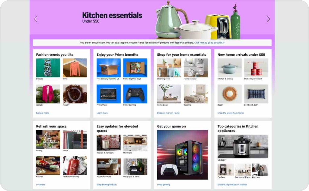
Photo source: Amazon
11. GoToMeeting: Assumed awareness with an underpowered final frame
This banner leans on brand familiarity and a trial CTA without stating a unique selling proposition. If it began as an animation, the static end-state drops the value story. You can’t assume viewers saw earlier frames; the final frame must carry the USP and CTA.
Results:
- Clear next step for brand-aware users
- Weak pull for cold audiences due to missing value prop
- Message loss when animation is skipped, blocked, or skimmed
- Opportunity lift if the last frame states benefits
Why it worked:
Familiar brand + trial can convert warm traffic, but attention is episodic. Make the end frame self-sufficient: headline with the USP, benefit-forward copy, and a single, high-contrast CTA. Animation is optional; clarity on the stop frame is mandatory.
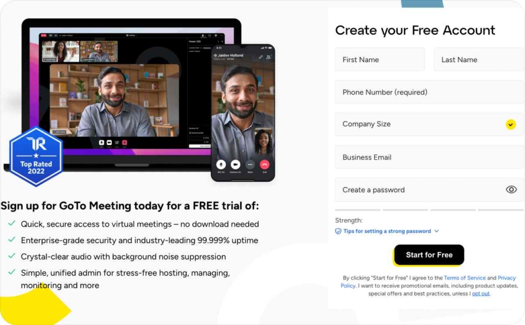
Photo source: GoToMeeting
12. Ezoic: Vague promise, mismatched visual, state the product and payoff
The banner leans on a space motif and a fuzzy line — “Balance visitor experiences & revenue.” For users who don’t already know Ezoic, the ad never says what the product is or what outcome to expect. A generic “Learn more” CTA asks for curiosity the ad hasn’t earned.
Results:
- Low relevance from off-topic imagery
- Weak intent because the headline hides the UVP and use case
- Reduced CTR: users won’t click without knowing what Ezoic does
- Cognitive load up; trust and clarity down
Why it worked:
The abstract space motif created a noticeable pattern break, buying a split second of attention in crowded placements. The broad “experience & revenue” line framed Ezoic as both user- and monetization-minded — language that warm, brand-aware publishers could decode without extra detail. A calm, low-pressure CTA matched early-stage evaluation behavior, inviting exploration rather than commitment. Combined with strong contrast and a simple layout, the ad achieved brand recall and gentle intent-building even if it didn’t maximize cold-audience clarity.
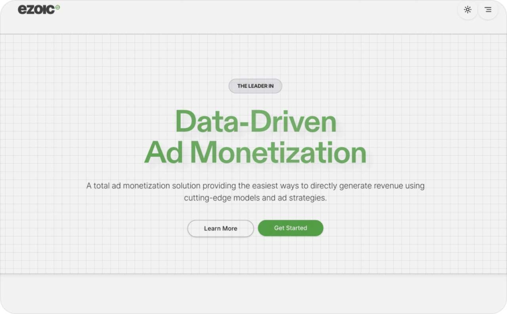
Photo source: Ezoic
13. Capital One: Big-number salience with low-pressure CTA
This banner makes 5X do the heavy lifting. A bold, oversized numeral anchors the value prop — a savings rate 5× higher than the national average, while a calm “Explore 360 Checking” CTA invites exploration without pressure. Seasonal basketball cues tie copy and imagery to timely interest, boosting relevance and recall even for non-clickers.
Results:
- Instant value recognition from the oversized 5X price anchor
- Strong ad recall even without clicks
- Friction-free engagement via low-pressure “Learn more” CTA
- Context lift from basketball-season alignment with headline/visuals
Why it worked:
It used visual hierarchy to spotlight a single metric, then paired it with a soft CTA that respects consideration behavior in finance. The seasonal tie-in provided cultural context, while the price anchor encoded the offer in memory, turning a glance into brand-level persuasion.
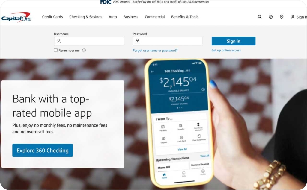
Photo source: Capital One
Why you need an AI ad generator for banner ads creation
Zeely is an AI online ad generator built to ship automated ad creation for static banner ads fast. The Zeely app turns a product, headline, and goal into ready-to-run creatives sized for common placements, so you publish more ads with less effort.
What the Zeely app does
Zeely automates static banner production. You provide inputs, and the system generates on-brand layouts with clear hooks, benefit-forward copy, and single CTAs.
Benefits
- Save time: Generate multiple banner variants in minutes with 100+ proven templates, cut design cycles and launch faster
- High-converting ads: AI assembles proven patterns, improving clarity and click intent
- Boost ROI: Rapid iteration lets you test winners weekly, reduce wasted spend, and scale what works
- Automated ad creation: Drag-and-drop editing, auto-sized assets keep teams moving
- Scalable advertising: One brief → dozens of size/offer combinations for campaigns across placements and audiences
- Meta & Shopify friendly: Export assets and specs tailored for Meta placements; pull product info from Shopify to create offer-ready banners in a click
- On-brand consistency: Templates lock colors, type, and logo spacing, so every variant reinforces brand trust
- Insights-ready workflow: Name, tag, and UTM your creatives for clean testing and simple reporting
Manual banner production slows campaigns and limits testing. An AI ad generator removes the bottleneck, so you publish more high-converting ads, learn faster, and boost ROI with confidence.
Conclusion
The pattern is repeatable: clear hook, benefit-forward copy, single CTA, supported by contrast, safe margins, and proof. The swipe box showed how different industries turn that structure into results — price anchors, risk reversal, values alignment, local intent, and in-product proof. To scale wins, publish more variants and test 2–3 each week; watch CTR, CVR, and cost per action.
Want the fastest path from idea to launches? Use Zeely, an AI ad generator that automates static banner creation, keeps designs on brand, and readies sizes for GDN. Generate variants in minutes, iterate, and boost ROI with a steady testing cadence. Your next high-performer is a template away, spin it up in Zeely and ship today.