Snapchat safe zones explained for ads
Why does a 9:16 Snapchat ad still lose its headline, logo, or CTA under the UI? I’m Emma from Zeely, and I pulled Snap’s current safe-zone rules, format specs, and creative checks into one guide that helps teams build ads that look right before they spend.
A Snapchat safe zone is the part of your creative that stays clear of Snapchat’s UI, so your text, logo, product shot, and disclaimer do not get covered.
Snap’s current rules vary by format:
- Single Image or Video Ads need the top 150px and bottom 330px clear
- Story Ad tiles need 175px at the top and 269px at the bottom
- Collection Ads need 150px at the top and 450px at the bottom
- Commercials need 150px clear on both ends
I pulled this guide together from Snap’s live business docs so you can build ads on Snapchat that look right before you spend.

What Snapchat safe zones are and why they matter
A Snapchat safe zone is the usable part of the frame that stays clear of interface overlap. Snap defines safe zones as areas within your ad creative that should remain clear of key content like text, logos, hero imagery, or legal disclaimers, because Snapchat’s interface can cover them with the brand name, headline, call-to-action pill, or progress bar.
Ads on Snapchat are full-screen and fast-moving. You do not get much time to recover from a weak first frame. If your main promise is hidden, the ad may still deliver, but the message gets weaker before the viewer even decides whether to keep watching.
The most important rule is simple: the safe zone protects meaning, not just approval. In practice, the elements that should stay inside the visible center of the frame are your opening hook, logo, hero product, legal text, price, offer, and any visual proof that explains the ad quickly. Snap also warns advertisers not to place critical graphics, logos, messaging, visual indicators, or legal language outside Snapchat ad safe zones.
Snapchat ad specs and visible area basics
Before you think about safe zones, start with the canvas. Snap’s ad formats page says Sponsored Snaps, Single Image or Video Ads, Story Ads, Collection Ads, and Commercials all use a vertical 9:16 aspect ratio, with 720×1280 listed as the required resolution for the main formats.
That gives you the answer to another high-intent question: “What size is a Snapchat ad?” Most Snapchat ad formats should begin as a 9:16 vertical creative. But that still is not the whole job.
A 9:16 file only tells you the outer frame. It does not tell you where the safe, readable area lives once the app adds interface elements, feed labels, progress indicators, tiles, or attachments. That is why a creative that looks perfect in a design file can still look crowded or covered on mobile.
Snap’s ad formats page also makes clear that different placements serve different jobs. Single Image or Video Ads can run in Stories and Spotlight. Story Ads include a branded tile in Discover. Collection Ads let people browse products. Commercials are built for non-skippable reach in curated content. Each one uses the same vertical language, but not the same visible pressure on the frame.
This is also where teams get tripped up when they repurpose an Instagram or TikTok asset. Same shape does not mean same UI. TikTok’s own in-feed ad documentation says its safe zone changes based on dimension, caption length, and added formats like anchors, which is another reminder that vertical creative needs platform-specific spacing, not blind reuse.
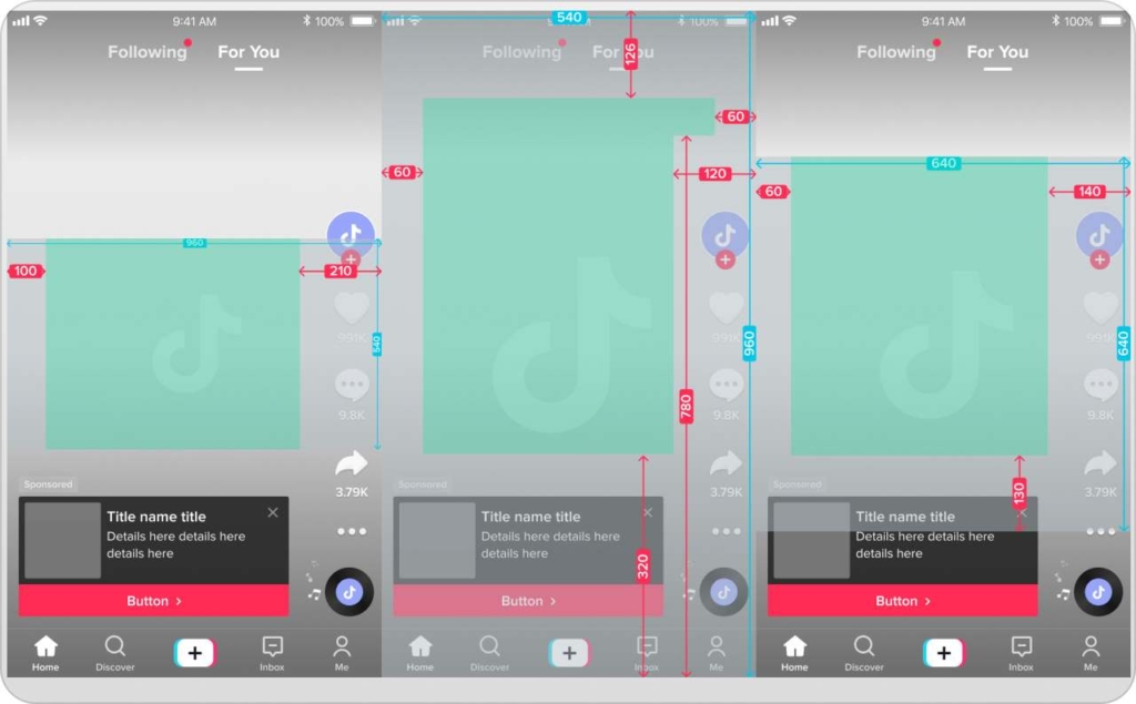
Safe zones by format on Snapchat
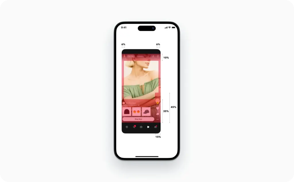
For Single Image or Video Ads, Snap says to keep the top 150px and bottom 330px free of important content. This is the default rule most advertisers should know first, because Snap recommends Single Image or Video Ads for new advertisers and uses them across Stories and Spotlight placements.
For Story Ad tiles, the spacing changes. Snap’s current Story Ad guidance says the tile should keep 175px clear at the top and 269px clear at the bottom. That matters because the tile is the click driver in Discover, and if the branding or headline sits too close to the edge, the creative can look messy before the story even opens.
For Collection Ads, the bottom buffer gets much larger. Snap’s safe-zone guidance says to leave 150px clear at the top and 450px clear at the bottom. That bigger lower buffer exists because Collection Ads need room for the product tile layout and CTA treatment. For ecommerce brands, this is the most common reason a price, product crop, or offer line feels too low in the frame.
For Commercials, Snap says to leave 150px clear at both the top and bottom. Commercials are less forgiving if you rely on edge-based text blocks, because they are built for polished, premium placements and need a cleaner center-weighted layout.
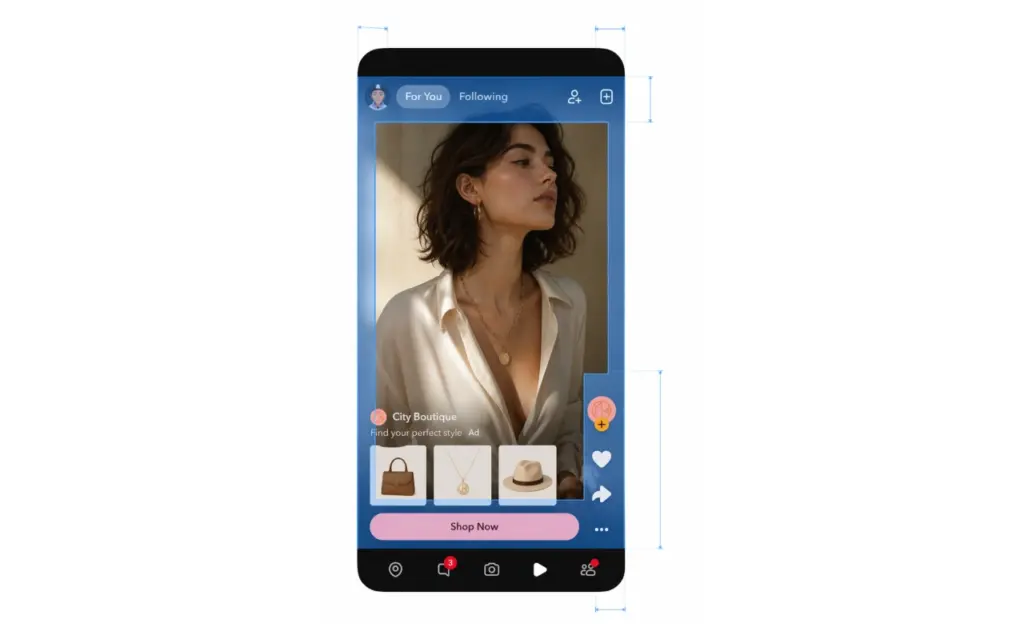
For Sponsored Snaps, the creative still starts from a 9:16 base, but the ad format also includes message design elements like a branded chat background, chat message, and optional auto-response. Snap says Sponsored Snaps reach people directly in the Chat tab, so the way your message is framed feels different from a Story or Spotlight placement. That is another reason not to assume one master export works everywhere without a check.
This is the easiest way to remember the format-specific rules:
- Single Image or Video Ads: top 150px, bottom 330px clear
- Story Ad tiles: top 175px, bottom 269px clear
- Collection Ads: top 150px, bottom 450px clear
- Commercials: top 150px, bottom 150px clear
Where to place text, logos, products, and disclaimers
The best Snapchat ad layout is usually center-led and slightly top-weighted.
Put your main hook in the center band of the frame, a little above the midpoint. That gives it room to breathe and keeps it clear of the bottom UI. It also leaves space for product, offer, or motion cues below the message without forcing the whole ad down the screen.
Keep your logo small, early, and inside the safe area. Snap’s best-practices guide says to establish brand moments before the two-second mark, but not to open on a static frame that only shows a logo or product shot. That is a useful balance: brand early, but do not waste the first beat.
For ecommerce creatives, put the hero product in the visual center, then move price, discount, or social proof slightly above the lower danger zone. This is even more important in Collection Ads, where the lower part of the screen has to coexist with product browsing behavior. Snap’s ad format page positions Collection Ads as a format built to help shoppers browse and buy, which is why the product should lead the frame, not compete with low-placed text.
Do not place disclaimers at the bottom edge. Snap explicitly includes legal disclaimers in the list of elements that should stay out of UI overlap. If you need legal copy, raise it into the visible lower-middle area, simplify it, and keep it readable on a phone.
Attachments change the layout too. Snap’s deep-link and app-install documentation warns advertisers to avoid putting important elements in the top 150px and bottom 330px, because bottom cards and call-to-action treatments reduce usable space. In plain English, the CTA or attachment preview really can reduce the visible design area.
So where should text go in a Snapchat ad for best visibility? In the center and upper-middle part of the frame. Where should logos go? Inside the safe area, not glued to the top edge. Where should legal copy go? Above the lower buffer, not inside it. That one rule fixes a surprising number of weak Snapchat ads.
Common Snapchat safe-zone mistakes and quick fixes
The most common mistake is thinking aspect ratio equals safety. It does not. A 9:16 file can still fail on Snapchat if your critical content sits in the covered zones.
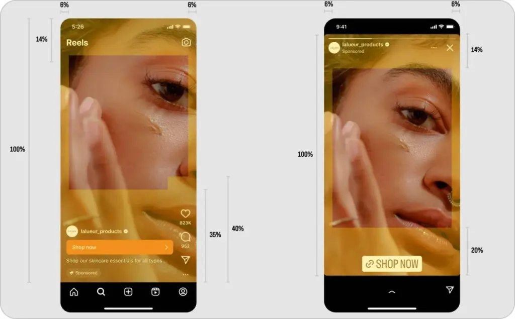
The second mistake is reusing an Instagram Story or TikTok ad without checking how Snapchat handles overlays. Meta’s current recommendation system increasingly favors original posts on Instagram, with 75% of recommendations now coming from original content, which is one reason so many teams build for Reels first. But a creative built for one app’s interface can still feel off on another. TikTok’s ad docs say safe zones can shift with caption length and anchor use, while Snap gives fixed format-specific buffers. Same vertical canvas, different pressure points.
The third mistake is putting the CTA, product, and offer line in the same low area. On Collection Ads in particular, that creates visual traffic where the format already needs room.
The fast fixes are usually simple:
- Move the headline higher, into the upper-middle band
- Shrink the logo and pull it inward
- Raise price or legal text above the lower buffer
- Reframe the product so the focal point stays central
- Re-check the layout after adding the website or app-install attachment
If you are troubleshooting a creative that looks cropped or covered on mobile, start there. You often do not need a full redesign. You just need to pull the important elements back into the safe zone.
Snapchat safe zone vs Instagram and TikTok
Can you reuse the same vertical ad for Snapchat, Reels, and TikTok? Sometimes. But only when the creative is simple, center-weighted, and not dependent on bottom captions, dense CTAs, or product tiles.
Snapchat needs its own safe-zone template because its format rules are explicit and vary by placement. TikTok also uses safe zones, but its official docs say the boundaries can change with captions and additional formats. Instagram does not publish one identical ad-safe rule set for every context in the same way, so teams often rely on internal templates and testing instead.
That means the safest workflow is not “one export everywhere.” It is “one master 9:16 creative, then platform-specific spacing.” Build the core visual once, then adapt the text, branding, and lower-frame layout for each app.
Instagram Reels also have dimensions and aspect ratios. If your ad uses only a product shot and one short headline, you may get away with a shared base file. If it includes a CTA card, a multi-line offer, legal copy, or ecommerce tiles, build a Snapchat-specific version. That is the clean answer to “Snapchat safe zone vs Instagram Story safe zone” and “Snapchat safe zone vs TikTok safe zone.” Same family, different layout rules.
How to check your Snapchat creative before launch
The fastest way to know whether your snap ad is actually safe is to preview it on a phone, not just on a desktop canvas.
Snap lets advertisers preview approved ads by scanning a Snapcode, and its creative tools also let you review details before launch. That matters because live device view is where UI overlap becomes obvious. A layout that looks balanced in a design tool can feel cramped once the app adds real interface layers.
My preflight check is simple:
- Export the creative in the right snap format.
- Upload it with the correct attachment type.
- Preview it on mobile.
- Check the first frame, the CTA state, and the lower third.
- If two layouts are close, test both instead of debating them.
That is also the answer to “Are third-party Snapchat safe-zone checker tools accurate?” They can help during design, but Snap’s own format rules and mobile preview are the real source of truth.
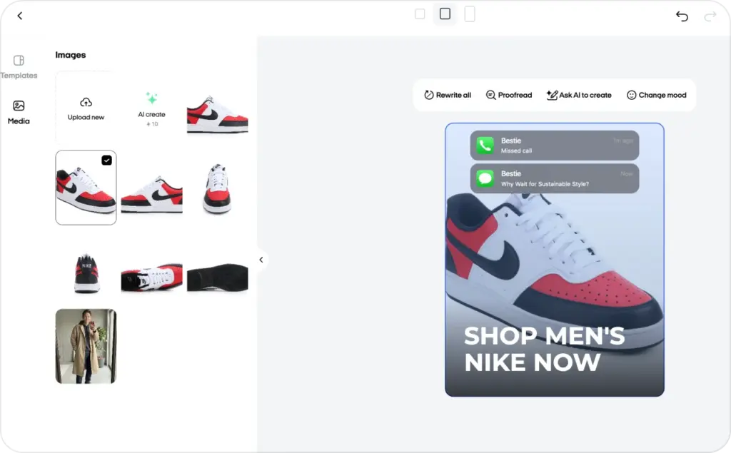
How I’d use Zeely to build Snapchat-safe creative faster
If I were turning this into a repeatable team workflow, I’d use Zeely after the layout rules are clear.
Zeely’s Batch mode lets you create multiple static ad variations for one product at once, which is useful when you want several Snapchat-safe versions of the same campaign without rebuilding each design from scratch.
Template ad is the other useful piece here. Zeely template ad starts from a ready-made layout that you can fine-tune, including the caption and visual details, which makes it practical for moving text upward, resizing a logo, or testing a cleaner lower-third composition. Try Zeely today and make your first project.
So the workflow I’d use looks like this:
- Build one Snapchat-first master template
- Keep the hook and product in the visible center
- Generate several variants in Batch mode
- Use Template ad to fine-tune spacing and hierarchy
- Run one last mobile safe-zone check before launch
FAQ
It is the visible area that stays clear of Snapchat UI so your important elements do not get covered. The exact safe zone depends on the format.
Most major Snapchat ad formats use a vertical 9:16 aspect ratio, with 720×1280 listed in Snap’s current specs for the main ad types.
It can, but critical text should not sit in the lower danger zone. On many formats, that is where Snapchat UI or attachment elements reduce visibility.
You can reuse the core concept, but not always the exact spacing. Snapchat has format-specific safe-zone buffers, so the final layout should be checked and adjusted for Snapchat.
Place it in the center or upper-middle part of the frame, not close to the bottom edge, and preview it on mobile before launch.

Emma blends product marketing and content to turn complex tools into simple, sales-driven playbooks for AI ad creatives and Facebook/Instagram campaigns. You’ll get checklists, bite-size guides, and real results, pulled from thousands of Zeely entrepreneurs, so you can run AI-powered ads confidently, even as a beginner.
Written by: Emma, AI Growth Adviser, Zeely
Reviewed on: May 6 2026