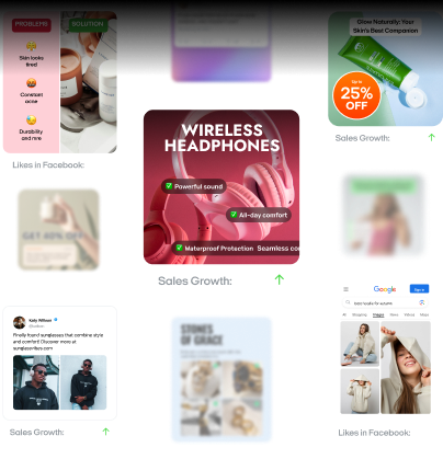
Static ads examples: 12 inspiring designs and campaign examples
Searching for ad design inspiration? Zeely AI showcases 12 static ad examples and campaigns that prove simple visuals can still deliver outstanding marketing results.
You’ve probably heard the narrative: video is king. But in 2026, static ads will still be driving real results and not just as filler. According to recent research, 56% of digital marketers still rely on static creatives as a core part of their media mix, and static image ads account for 40% of all global display impressions.
If your cost-per-click is climbing and your team’s drowning in production cycles, static ads might be the solution you’ve been overlooking.
So what is a static ad, exactly? It’s a single, unchanging image paired with a clear message and a strong call-to-action. Think: promo banners, text-over-image posts, UGC stills, or mobile-optimized display ads. And when built right, they’re not only easier to test, but faster to scale.
The best part? With ZeelyAI, you can skip long design timelines and generate scroll-stopping static ad creatives in minutes. ZeelyAI’s AI-powered design engine will instantly deliver polished visuals and tailored copy ready to launch across social platforms, display networks, and beyond.
Types of static ads and where they work best
Static ads remain a core part of digital advertising. They’re fast to produce, easy to test, and effective across platforms. When matched to the right context, static formats can outperform even video especially in top-of-funnel campaigns.
This section explores four high-performing static ad types, aligned to specific platforms, goals, and audiences. Each includes a creative blueprint, brand example, and practical tips you can apply.
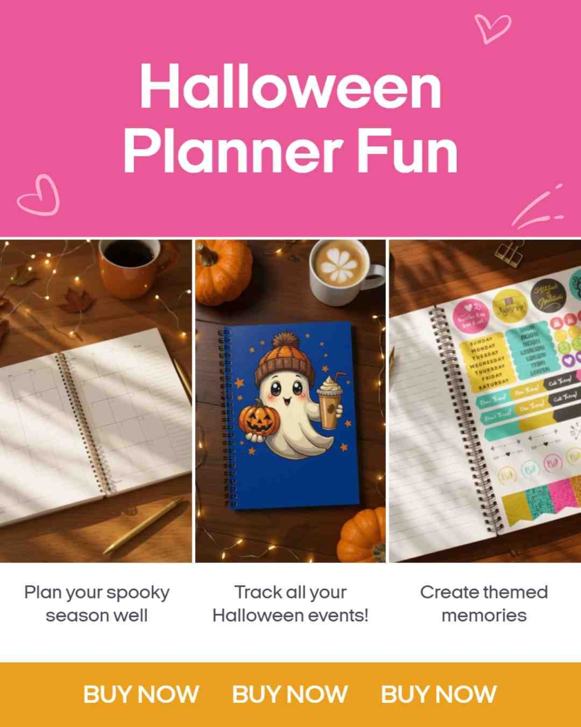
1. Product-centric image ads
A product-centric image ad is a type of static ad that showcases your product with a clean, high-quality photo usually on a neutral or lightly branded background. There’s no animation, no text-heavy layout just a visual that makes the product the hero. This format works best when you want people to instantly understand what you’re selling and how to buy it.
It’s designed for speed. People scroll fast especially on mobile and this format helps them stop, see, and act in seconds.
Best for:
- E-commerce, retail, and DTC brands
- Flash sales, restocks, and product launches
- Mobile-first platforms: Instagram, Facebook, Pinterest, TikTok, GDN
Why it works:
- Minimal distractions = clear value proposition
- Optimized for quick scanning on mobile
- Great for highlighting price, CTA, and product in under 3 seconds

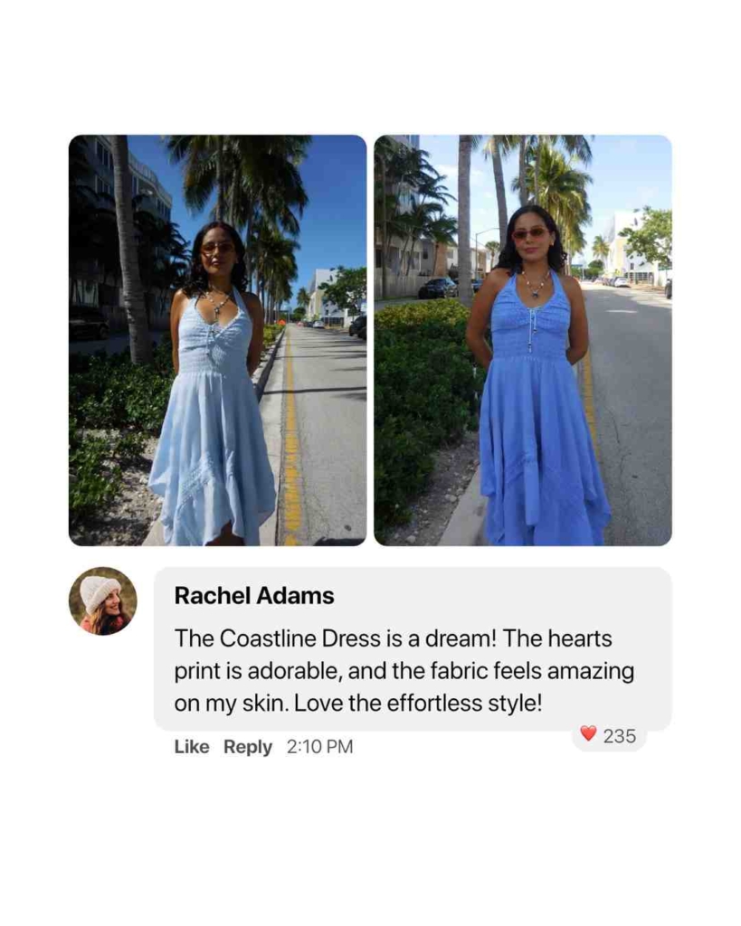
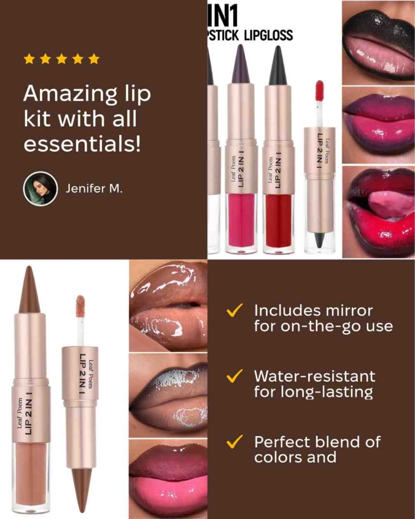
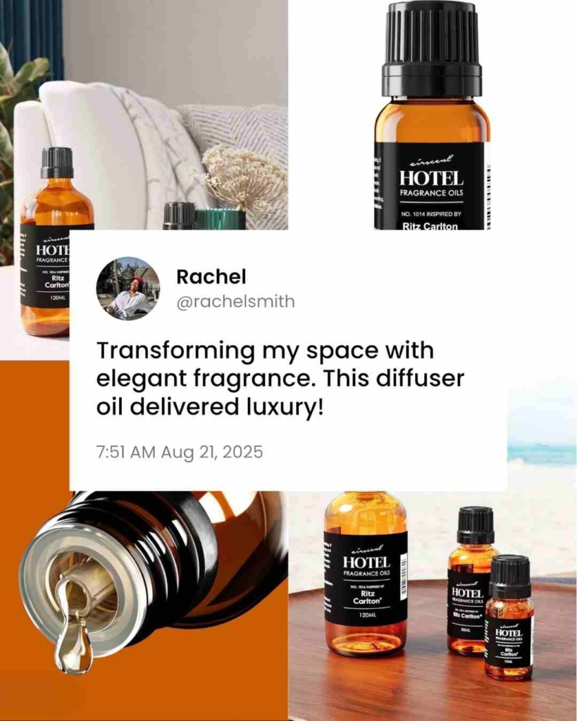
2. Testimonial or review-based ads
Testimonial or review-based ads are a type of static ad you can use in online marketing. They show real customer reviews, 5-star ratings, and photos to make your brand look trustworthy. These ads work because of social proof, when you see other people happy with a product, you feel more confident buying it too.
Best for:
- New brands that need to build trust fast
- Mid-funnel remarketing: People who’ve visited your site but haven’t bought yet
- Best on: Facebook, Instagram, LinkedIn, Pinterest
Why it works:
- People believe other customers more than brands
- Perfect for retargeting — gives that last push to convert
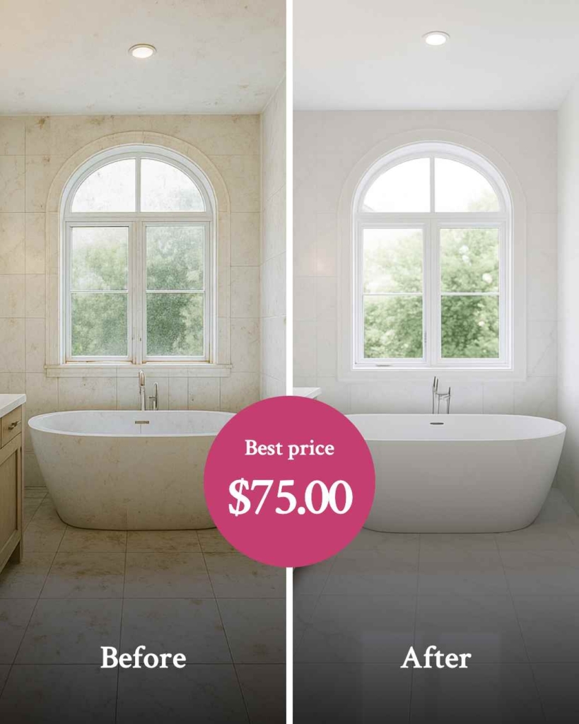
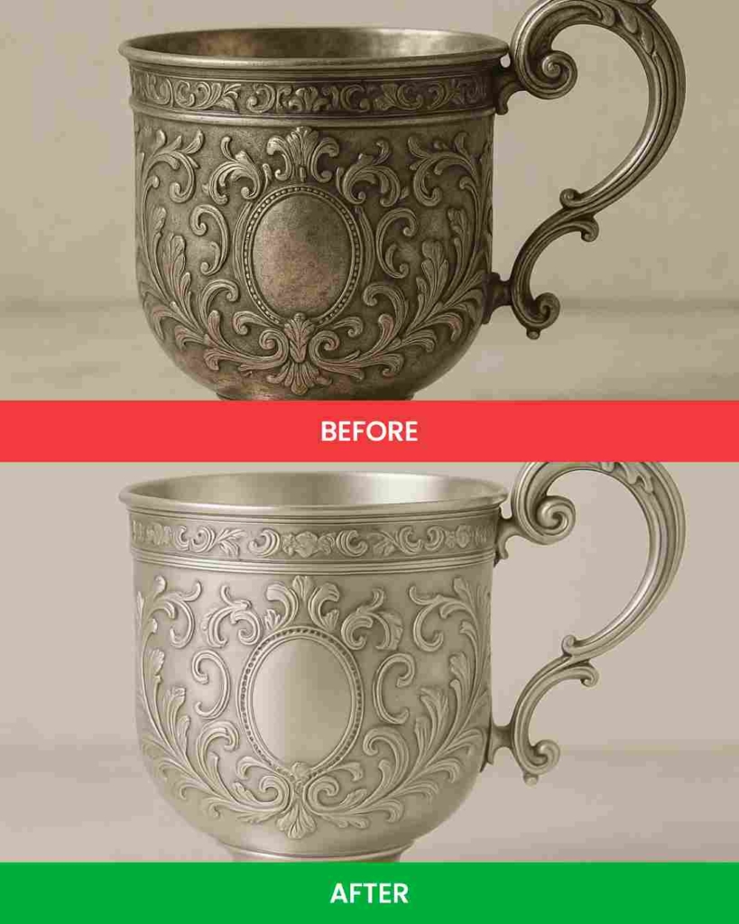
3. Before and after ads
Before and after ads are static ads that show two images — one from before using your product and one from after. They work by instantly showing the transformation, so people can see the results without reading a long explanation.
Best for:
- Beauty
- Fitness
- Home improvement
- SaaS (software that improves results or processes)
- Best on: Facebook, Instagram, Pinterest, LinkedIn
Why it works:
- Delivers instant visual storytelling
- Triggers curiosity and draws attention to the outcome
- Makes results feel real and achievable
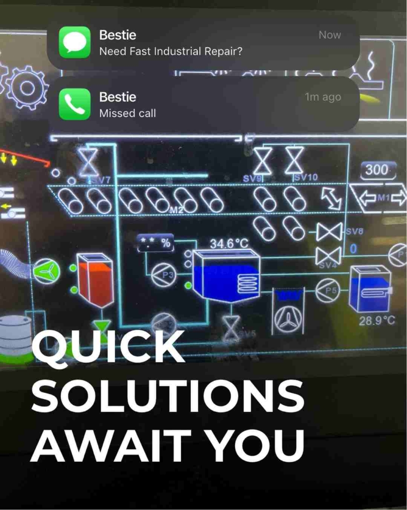
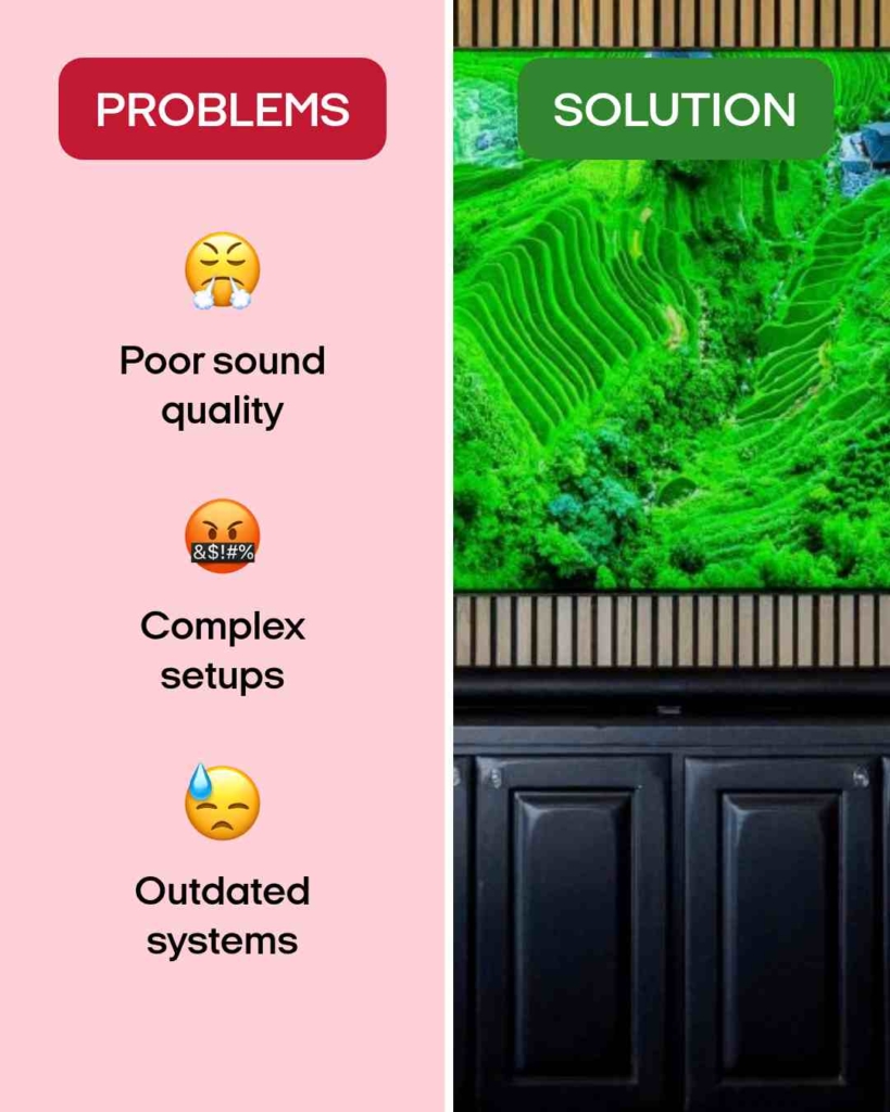
4. Problem-solution ads
Problem solution ads work by showing a problem first and then giving the answer right away. People see the problem, realize it’s something they face, and then see how your product or service can fix it. This approach makes the ad feel personal and relevant, which keeps people looking.
These ads take the viewer from feeling stuck to seeing a clear solution in just a few seconds. They work well because the audience quickly understands both what you offer and why it matters to them.
Best for:
- Ads for SaaS products, services, and tools
- Teaching new audiences what you do quickly
Why it works:
- The “problem → solution” style grabs attention fast
- Helps people recognize their own struggles
- Shows exactly what to do next
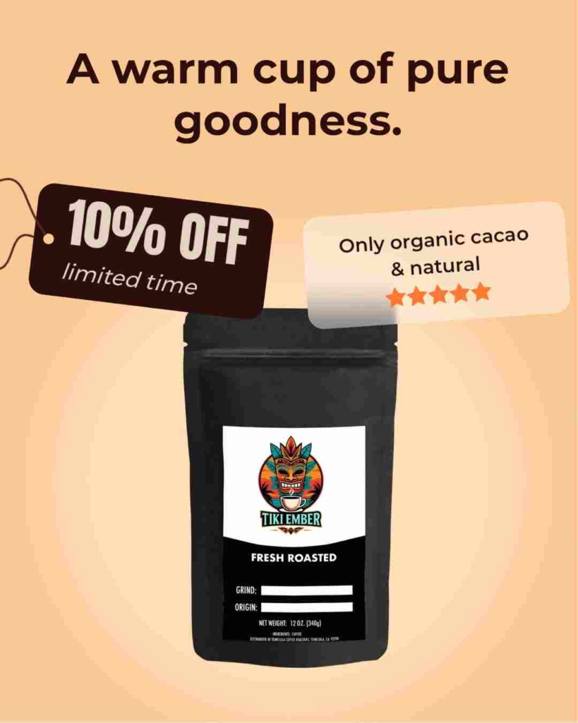
5. Offer-based ads
Offer-based ads work by leading with a special deal, discount, or bonus. The focus is on giving people a reason to act right now. This makes the ad feel urgent and rewarding at the same time.
These ads clearly show what people will get if they click or buy, such as a percentage off, a free trial, or a limited-time offer. By putting the benefit front and center, they make the decision easier and faster for the viewer.
Best for:
- E-commerce products and seasonal sales
- Driving quick actions from warm audiences
- Promoting time-sensitive deals
Why it works:
- Creates urgency and excitement
- Appeals to people’s desire for savings or added value
- Makes the next step clear and tempting

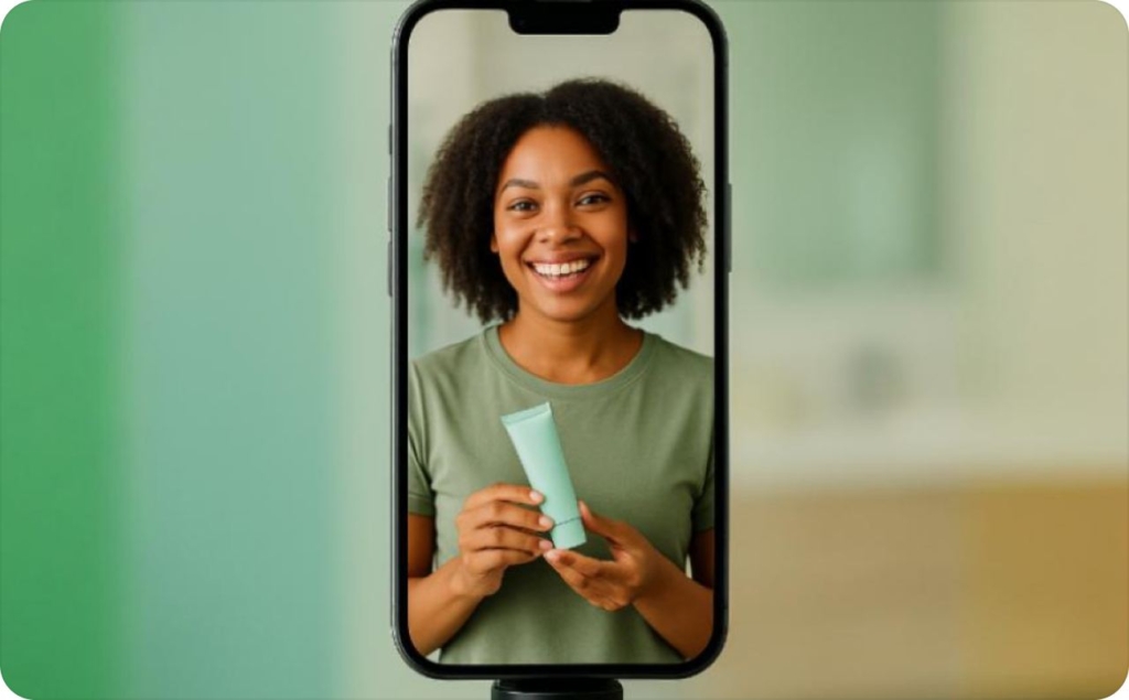
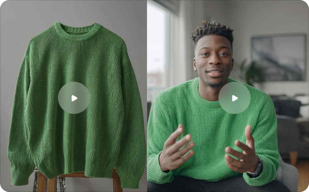
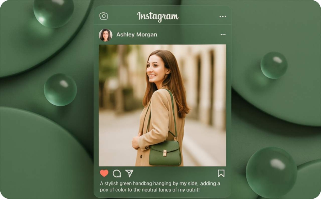
6. UGC-styled static ads
UGC-styled ads look and feel like they were made by real customers. They often show casual photos, screenshots, or short testimonials. This style makes the ad feel more genuine and trustworthy.
These ads copy the look of real social media posts, so they blend in with the feed instead of looking like a polished commercial. Viewers feel like they’re hearing from a friend, not a brand.
Best for:
- Building trust with new audiences
- Promoting products with strong reviews or happy customers
- Increasing engagement on social media platforms
Why it works:
- Feels authentic and relatable
- Builds social proof through real experiences
- Stands out from overly polished ads by looking natural
12 proven static ads examples and creative analysis
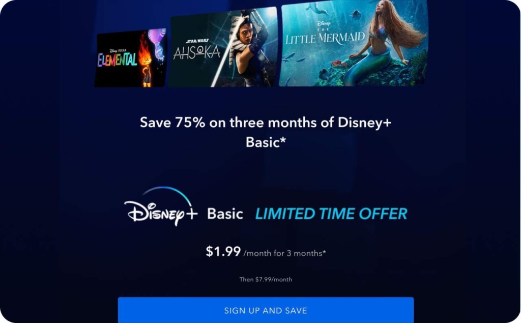
1. Disney+
Idea: Use scarcity + visual dominance to convert warm audiences in a retargeting phase. By removing distractions and focusing only on a time-limited discount, Disney+ taps into loss aversion “I don’t want to miss this deal” and cognitive ease. The bold blue background not only aligns with brand colors but also isolates the offer visually, ensuring it stands out in a chaotic feed.
Visual: Static Meta feed ad, bold blue background, white CTA button, “3 months for $1.99” headline.
Messaging: Clear urgency, minimal distraction, straight to the offer.
Why Effective: Visual urgency + clarity made it highly scroll-stopping; retargeting-focused; +38% mobile ROAS vs. video.
Platform: Meta feed + Limited-time promo banner
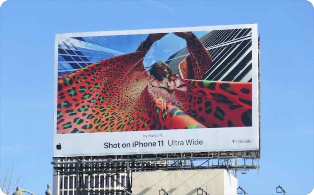
2. Apple
Idea: Reinforce brand prestige through visual minimalism. The billboard-style layout turns a small Pinterest placement into a large-scale visual experience, evoking outdoor brand campaigns. This creates an aspirational feel, positioning the iPhone not just as a product but as a cultural icon. The almost text-free execution signals confidence — the image alone is enough to sell.
Visual: Lifestyle image in billboard format with only four words of copy.
Messaging: Premium, aspirational, image-led storytelling without CTA.
Why Effective: Doubled saves vs. carousel; large visuals and minimalism conveyed brand quality and aspiration.
Platform: Pinterest + Billboard-style visual
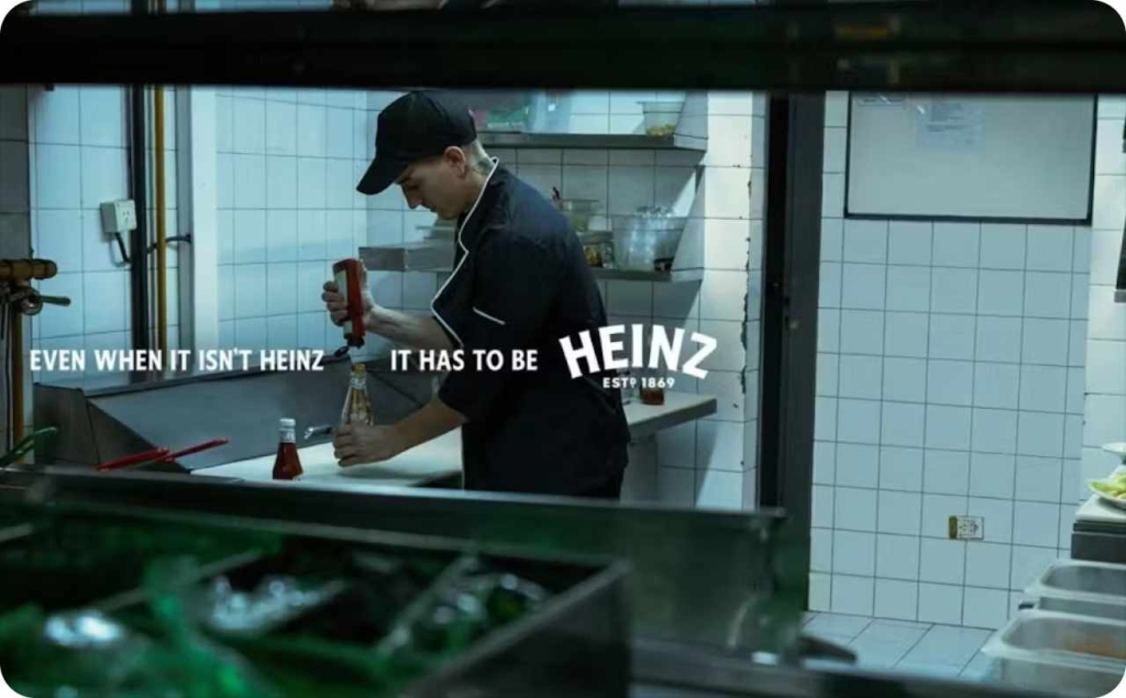
3. Heinz
Idea: Expose a real consumer pain point: restaurants refilling Heinz bottles with cheaper ketchup. The campaign dramatizes this “fraud” to highlight Heinz’s unmatched taste and trust. By flipping a shady behind-the-scenes practice into a bold public statement, Heinz positions itself as the only ketchup worth demanding.
Visual: A restaurant worker surreptitiously pouring non-Heinz ketchup into a Heinz bottle, captured from a voyeuristic point of view.
Messaging: “If it’s not Heinz, it’s not ketchup.” A reminder that anything else is an imitation, reinforcing Heinz as the gold standard.
Why Effective: This print ad uses social-listening insights to spotlight deceptive practices by eateries, reinforcing Heinz’s superior quality. It resonates through a realistic, slightly cheeky visual with strong trust-building power.
Platform: Print, out-of-home, and digital static placements on Instagram and Facebook.
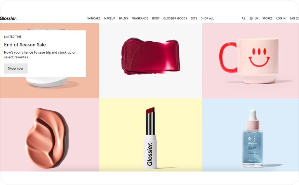
4. Glossier
Idea: Leverage peer influence and relatability to drive conversions in beauty. By imitating organic, creator-led content, the ad bypasses the “ad filter” audiences often have. The casual selfie + curiosity hook “Why I switched to this” makes the user feel they’re overhearing a personal recommendation, activating social proof and intrigue without overt selling.
Visual: Soft-lit selfie with casual overlay text “Why I switched to this.”
Messaging: Feels like a friend’s recommendation, not an ad.
Why Effective: 1.8x more engagement than branded visuals; authenticity builds curiosity and trust.
Platform: Instagram + Creator UGC format
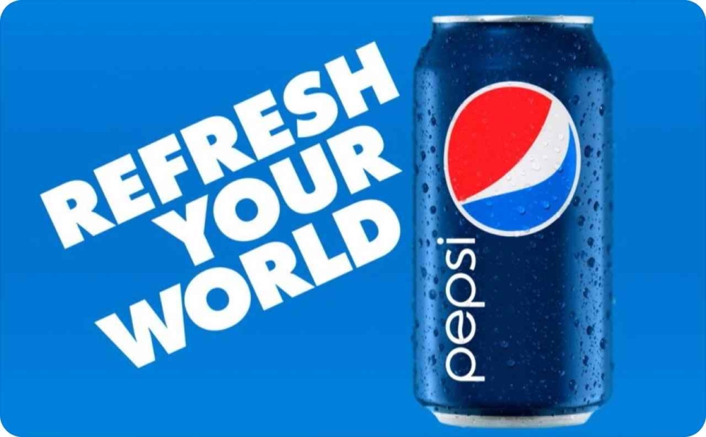
5. Pepsi
Idea: Deliver instant sensory impact in a premium, high-reach placement. The YouTube Masthead is prime real estate — here, Pepsi uses a power color (red), product condensation imagery, and an action-oriented tagline to create thirst appeal. It relies on emotional suggestion over rational persuasion, ideal for impulse-driven CPG categories.
Visual: Static masthead image with frosty Pepsi can, “Refresh your world”
Messaging: Short, emotional suggestion to drive trial.
Why Effective: 1.5x higher brand recall vs. animation; bold color dominance works in large formats.
Platform: YouTube Masthead + Billboard energy
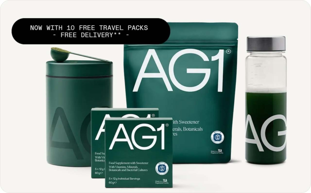
6. Athletic Greens
Idea: Combine urgency, tangible reward, and product visibility to convert mobile scrollers. On mobile, attention spans are shorter, so AG leads with a clean product visual, adds a high-value freebie, and sets a hard deadline “Today only”. This layering of incentive + scarcity prompts immediate action rather than passive interest.
Visual: White background, AG1 pouch, “Now with 10 free travel packs.”
Messaging: Product + bonus offer + urgency in minimal layout.
Why Effective: 22% CPA drop; high clarity and urgency ideal for mobile users.
Platform: Facebook mobile + Offer banner
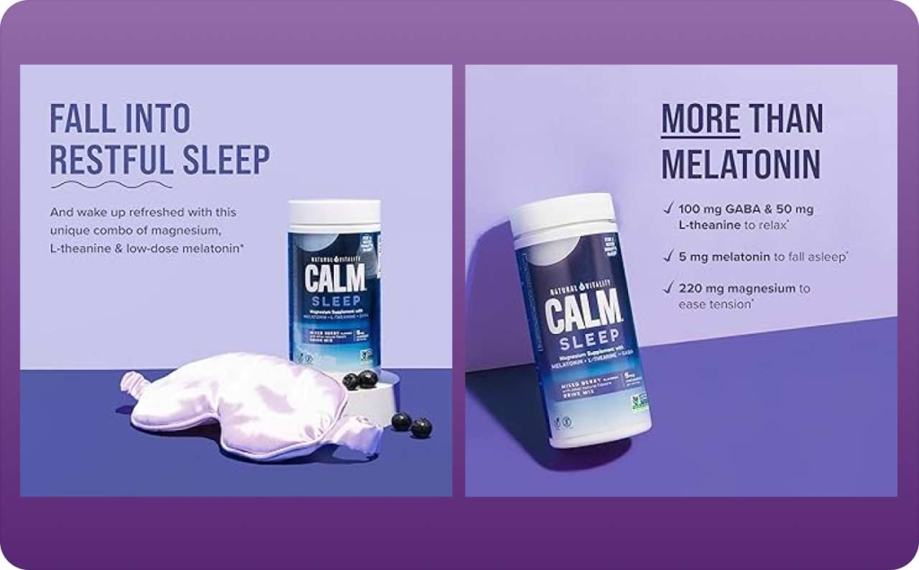
7. Calm
Idea: Align emotional promise with visual mood for a subconscious connection. The ad’s gradient and soft typography evoke the feeling of calm before the product is even tried. By making the design itself an extension of the product benefit, it creates harmony between form and function, which enhances believability and persuasion.
Visual: Tranquil gradient with soft white text: “Fall asleep faster. Try Calm tonight.”
Messaging: Promise tied to emotional experience, not just features.
Why Effective: 30% higher CTR than generic wellness ads; visual tone matched message.
Platform: Google Display + Emotional simplicity
8. Allbirds
Idea: Use material storytelling and sustainability messaging to connect with values-driven buyers. The close-up sole texture not only signals quality and comfort but also acts as a metaphor for transparency. By pairing it with the phrase “Carbon neutral, naturally,” the ad condenses product function, tactile appeal, and ethical positioning into one frame.
Visual: Close-up eco-friendly sneaker sole, “Carbon neutral, naturally.”
Messaging: Texture and sustainability in one glance.
Why Effective: 2.1x swipe-ups vs. motion ads; tactile visuals + values-based copy resonate fast.
Platform: Meta Story static + Eco visual focus

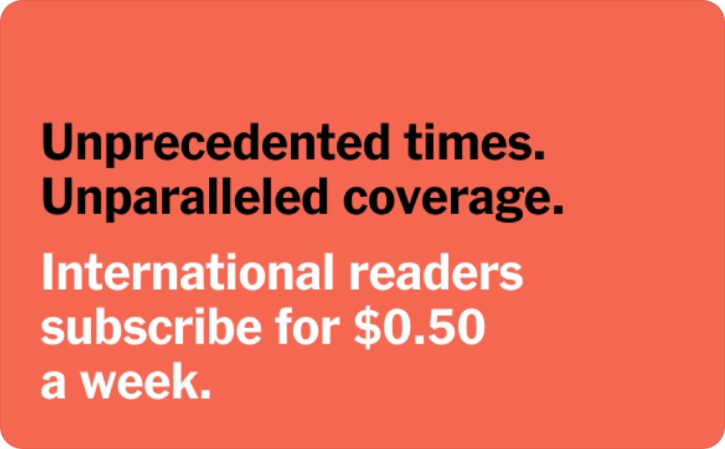
9. The New York Times
Idea: Build trust through familiarity and value framing. By showing the actual news interface, NYT reminds users they already know and trust the experience. Pairing this with a micro-price $0.50/week reframes the subscription as a negligible cost for something of high daily value, making the decision feel low-risk and high-return.
Visual: Article layout screenshot, “Real stories. Real impact. $0.50/week.”
Messaging: Leverages credibility of real product experience.
Why Effective: 19% higher signups; interface mimicry builds trust.
Platform: LinkedIn + Subscription CTA
10. Fenty Beauty
Idea: Engage curiosity and specificity by highlighting the micro-details that matter to beauty buyers — texture, color accuracy, and shade naming. The macro shot feels intimate and tactile, while the precise shade label “420 Warm” appeals to users seeking a personalized, inclusive match. This detail-first approach encourages closer inspection.
Visual: Macro of foundation texture labeled “420 Warm.”
Messaging: Precision shade info + curiosity from close-up detail.
Why Effective: 46% higher engagement vs. styled flatlays; feels organic to platform.
Platform: Instagram Feed + Product macro
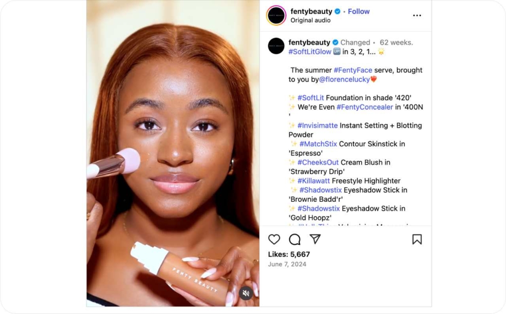
Photo source: @fentybeauty on Instagram
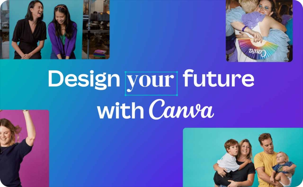
11. Canva
Idea: Eliminate purchase uncertainty by showing the end product upfront. By leading with a visual grid of templates, Canva lets prospects instantly understand what they’ll get, removing friction from the decision-making process. It also subtly hints at variety and customization, appealing to both need and desire.
Visual: Grid of resume templates with headline “Land your next job — free with Canva.”
Messaging: Removes uncertainty by previewing exactly what user gets.
Why Effective: Bounce rate -28%, session time up; visuals of use cases drive action.
Platform: Google Display + Template utility ad
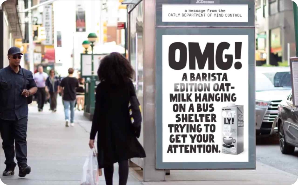
12. Oatly
Idea: Prevent ad fatigue with meta-humor and self-awareness. By joking about the ad itself “This ad was supposed to be clever”, Oatly positions itself as relatable and transparent, aligning with modern consumers’ skepticism toward marketing. This breaks the pattern of polished wellness visuals, earning attention through personality rather than perfection.
Visual: Oat milk with cheeky copy “This ad was supposed to be clever.”
Messaging: Self-aware, personality-driven disruption of ad norms.
Why Effective: 2.4x more saves/shares; humor cuts through wellness ad sameness.
Platform: Pinterest + Lifestyle satire ad
What makes a great static ad
1. A single, clear message
Clear message static ads work best when they share one simple idea a viewer can understand in a single glance. Lead with the main benefit or offer, place it in a bold, visible spot, and guide the eye to the call-to-action. Keep the design uncluttered: skip extra words, distractions, or competing messages.
Use strong visuals, short copy, and a clean layout so the value stands out right away. Studies show that static ads with one clear message can boost click-through rates and conversions because people instantly know what to do next.
2. Strong visual hierarchy
A strong visual hierarchy is the way your ad’s design shows viewers what matters most at a glance. It is the order of importance for elements like the headline, product image, offer, and call-to-action.
In a good static ad, the main message is largest or most eye-catching, while supporting details are smaller or placed lower. Colors, sizes, and placement work together to guide the eye from the primary focus to the next step. This structure makes your ad clear, memorable, and easy to understand.
With Zeely AI, you can create stunning AI static ads in seconds — no professional shooting or hours of editing required. You can create static ads with an AI ad generator, which generates scroll-stopping static ads that look polished and professional, helping you launch campaigns faster and grow your business with ease.
3. Eye-catching imagery
Eye-catching imagery is what stops the scroll and makes someone notice your ad. It is the visual hook that draws the eye before any words are read. This could be a sharp photo of your product, a smiling person using it, or a bold graphic that fits your style.
Bright colors, clear details, and balanced composition help your image stand out. When your picture connects with the viewer’s emotions and matches your message, your static ad becomes more memorable and more likely to inspire action.
4. Minimal, impactful text
Your static ad should speak loudly with just a few words. A short, benefit-driven headline catches attention faster than a long sentence. Add only the essential details that help the viewer understand the offer and move toward the call-to-action.
Choose power words that create urgency or curiosity, and keep your language simple. The less your audience has to read, the more likely they are to notice, remember, and act on your message.
5. Consistent branding
When your ad instantly feels like it’s from your brand, you build trust and recognition. Use your logo, colors, and fonts in a way that matches your other marketing materials.
Keep your visual style steady, even if the ad’s creative concept changes. This consistency makes your brand easy to spot in a busy feed and helps people connect the message directly to you. Over time, this strengthens both brand recall and loyalty.
6. Strong call-to-action
Once you’ve caught someone’s attention, guide them to the next step. A strong CTA uses clear, direct words like “Shop now,” “Sign up,” or “Get started.” Make it stand out through placement, color, or size so it’s impossible to miss. The goal is to make the action simple and appealing, turning attention into clicks, sign-ups, or purchases.
7. Optimized for placement
Where your ad appears shapes how it should look. A static ad for a social media feed needs bold visuals and short text that stand out as people scroll. A banner ad might work better with a clean design and a clear call-to-action button. Always consider the platform’s size, format, and user behavior.
Make sure text stays readable, images stay sharp, and nothing important gets cropped. When your design fits the placement, your message feels natural in the space and gets more attention.
Final thoughts and actionable takeaways
Static ads continue to prove that simplicity and strategy outperform flash when built right. From crisp visual hierarchies to direct CTAs, the best-performing examples we explored share a common thread: they’re designed with clarity, tested with purpose, and optimized relentlessly.
If you remember one thing, let it be this: every static ad is a performance experiment. The brands that win aren’t lucky. They’re testing fast, learning faster, and doubling down on what delivers.
Ready to apply these insights? Start with the checklist, test your next variation, and turn static ad inspiration into real, measurable results.