26 advertising techniques examples and how famous brands use them
Curious why certain ads stick in your mind while others disappear instantly? Zeely AI has studied real advertising techniques examples to reveal the psychological triggers and creative tactics brands rely on to stand out.
Every memorable ad starts with one thing: a clear technique that makes it stick. The best marketers use patterns that connect emotion to action. Google Business notes, in 2025, 62 % of UK viewers say YouTube helps them decide what to buy — a reminder that visuals + persuasion still dominate.
You’ll see advertising techniques and examples built around that kind of clarity: storytelling, contrast, repetition are simple moves that make people stop, remember, and act. These examples of advertising techniques aren’t trends. They’re tools you can use today — human, usable, and proven. Want a step-by-step to put these into practice? See our quick guide to creating high-converting ads in minutes.

26 advertising techniques examples that still work
Here, we’ve grouped advertising techniques and examples that still work today. Not theory. Not trends. Just the clearest, most proven ways to hold attention and move someone closer to yes, especially when 42% of video marketers say short-form video delivers the highest ROI.
1. Color psychology: Emotion, recognition, and action in one hue
Color psychology uses specific hues to influence emotion and behavior. In advertising, color is a cue. A minimalist display ad might use a single signature hue, think Tiffany’s robin-egg blue or Coca-Cola’s red, to set mood before the viewer even reads a word. The color anchors emotion, primes action, and builds instant recognition across every frame.
Why it works:
- Color triggers emotion faster than words
- Consistent palettes build instant recognition
- Emotion boosts recall and click-through rates
How to use it in your advertising:
Choose one dominant tone that mirrors your brand’s emotion — blue for calm, red for energy, yellow for optimism. Use it to highlight calls-to-action, product frames, or transitions. Keep supporting colors minimal so your key hue does the work of guiding focus and memory.
Real example: Tiffany & Co. “Tiffany Blue”
Tiffany built global recognition around a single shade. Every touchpoint, packaging, banners, digital video, reinforces that specific blue, creating a calm, premium association that lasts far beyond the ad. It’s one of those examples of advertisement techniques where emotion sells long before the words do.
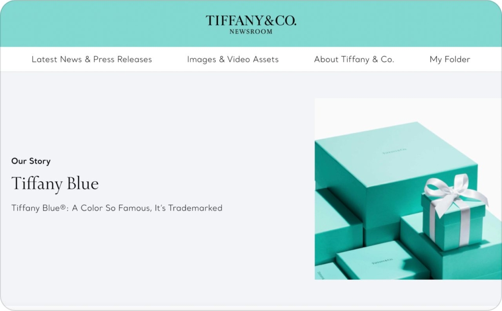
Photo source: Tiffany & Co
2. Rule of thirds and golden ratio: Place key elements where the eye lands
The rule of thirds and the golden ratio are classic layout techniques that guide visual flow. They work by positioning important elements, like a product, headline, or face, where the human eye naturally rests first. Instead of centering everything, these grids create tension and balance that pull the viewer in.
Why it works:
- Intentional asymmetry feels natural and engaging
- Aligning visuals along thirds or curves creates visual harmony
- Strategic placement holds attention longer and drives faster interaction
How to use it in your advertising:
Before designing, divide your frame into thirds. Place your focal element where those lines meet, then use supporting visuals to lead the eye toward your CTA. For motion or video ads, keep the main action on these visual “hot spots” to maintain rhythm and clarity.
Real example: Volkswagen “Think Small”
Volkswagen’s iconic print ad placed its tiny Beetle high and off-center, breaking convention yet perfectly following the rule of thirds. The generous white space framed the car as the hero while guiding attention down to the witty copy. It’s one of those advertising techniques examples that proves restraint and placement can be more persuasive than volume or color.
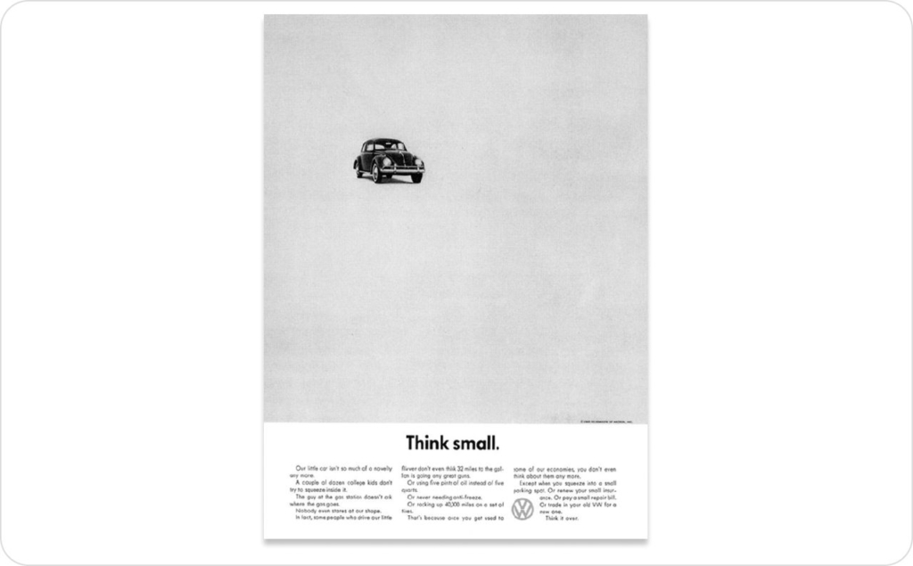
Photo source: Volkswagen “Think Small”
3. Focal point: One visual anchor, zero distractions
A strong ad gives the eye somewhere to land. The focal point technique centers on a single dominant element, like an image, product, or shape, and clears away anything that competes with it. When attention has one clear target, comprehension happens instantly.
Why it works:
- The eye seeks clarity and single focus
- Too many highlights cause confusion and drop-off
- One clear focal point boosts recall and engagement on the main CTA
How to use it in your advertising:
Decide what your viewer should notice first, then make sure nothing else steals that moment. Reduce secondary visuals, blur or desaturate the background, and use light or contrast to spotlight the core element. In digital ads, test one focal point per frame for maximum impact.
Real example: Absolut “Bottle Silhouette”
Absolut built an entire campaign around a single shape. Every ad used it as the visual anchor, with creative variations that never lost focus. That consistent center point made the bottle instantly recognizable, even without a label. It’s one of those advertising technique examples where discipline and simplicity turn repetition into brand power.
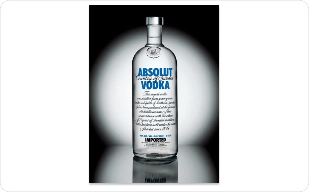
Photo source: Absolut “Bottle Silhouette”
4. Typographic hierarchy: Lead the eye with size, weight, and rhythm
Typographic hierarchy uses contrast in size, weight, and spacing to show what matters most. A clear headline grabs attention, subheads add context, and short body lines make the message feel digestible. When type is organized, the reader doesn’t have to think, they just follow.
Why it works:
- Strong hierarchy guides the eye and clarifies meaning fast
- Readable type helps users absorb key points in seconds
- Clear typography boosts recall and retention, especially on mobile
How to use it in your advertising:
Keep one dominant headline, one supporting line, and minimal text beyond that. Test contrast ratios — a larger, bolder font up top; lighter, shorter copy below. Use alignment and spacing to create rhythm rather than clutter. Always preview on mobile: if it reads clearly at arm’s length, your hierarchy works.
Real example: The Economist “Lightbulb” campaign
The Economist’s minimalist ads used sharp typographic contrast — bold red headlines over white space, to make intelligence feel effortless. The layout led the reader from the witty headline to the logo in seconds. It’s one of those advertising technique examples where design clarity becomes brand personality: smart, fast, and impossible to miss.
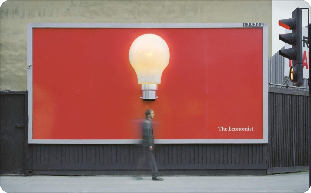
Photo source: Paul Belford Ltd
5. Minimalism: One idea per frame
Minimalism is the art of saying more by showing less. In advertising, it means stripping everything down to a single, clear message — one image, one emotion, one action. Clean layouts with open space and precise copy make the idea feel intentional, confident, and easy to grasp.
Why it works:
- The brain trusts what it understands instantly
- Calm, focused layouts hold attention longer
- Minimalism sharpens perception and lifts click-through rates
How to use it in your advertising:
Center your creative around one focal point — a product, phrase, or feeling. Use neutral backgrounds and limited color palettes to let that element breathe. Remove anything that competes for focus. The less noise you include, the more authority your message carries.
Real example: Adidas “Impossible Is Nothing”
Adidas’s campaign paired short, punchy headlines with striking portraits on clean backgrounds. Each ad delivered a single thought, resilience, belief, or grit, with no clutter. The simplicity made the message universal and instantly shareable. It’s one of those advertising techniques examples where minimalism turns confidence into design.
6. Body language: Posture and expression signal tone
Body language is one of the most persuasive visual techniques in advertising because people read emotion faster than text. A slouched posture conveys vulnerability, while open arms signal confidence or invitation. Facial expressions carry tone — joy, defiance, curiosity, long before the copy explains it. In video and stills alike, those cues make messages feel human, not staged.
Why it works:
- People naturally mirror the emotions they see
- Genuine movement and expression trigger empathy and trust
- Authentic body language deepens connection and keeps viewers engaged
How to use it in your advertising:
Choose gestures that match the story you’re telling. For empowerment, use upright, forward motion; for warmth, softer angles and eye contact. Test variations in expression across thumbnails or stills, even subtle posture shifts can change click-through and watch time.
Real example: Always “#LikeAGirl”
Always reframed what it means to do something “like a girl” by letting body language tell the story. Instead of polished poses, the ad showed real movement, sprinting, shouting, celebrating, expressions of strength that felt unscripted. That honesty struck a chord, driving high engagement and share rates. It remains one of the clearest examples of persuasive advertising techniques where natural gestures carried more power than any headline.
7. Direct gaze: Straight-to-camera stops the scroll
The direct gaze technique uses eye contact to create instant connection. When a subject looks straight into the camera, it feels personal, as if the ad is speaking directly to the viewer. That split-second moment of recognition interrupts scrolling behavior and holds attention long enough for the message to land.
Why it works:
- Eye contact instantly signals confidence and honesty
- A direct gaze creates intimacy and trust with the viewer
- Even a still image with clear eyes can boost attention and watch time
How to use it in your advertising:
Use a direct gaze for ads that need immediate impact — launches, offers, or calls to action. Pair it with simple backgrounds to keep focus on the face. In video, break the fourth wall with a single look toward the lens at key moments to re-engage viewers.
Real example: Calvin Klein “#MyCalvins”
Calvin Klein’s campaign used striking portraits of models and creators looking straight into the camera, stripped of heavy styling or distraction. That gaze made the viewer part of the frame, not an observer, but a participant. The approach drove high thumb-stop rates and became a defining persuasive technique in advertising example, proving that confidence and clarity outperform overproduction.
8. Three-quarter gaze: Approachable, less confrontational
The three-quarter gaze positions the subject looking slightly off-camera rather than straight into it. This subtle shift changes the entire mood: it feels candid, natural, and quietly confident. The viewer sees someone absorbed in a moment, not performing for them, creating intrigue and emotional ease at the same time.
Why it works:
- A slight turn softens intensity and feels natural
- It signals authenticity and invites viewer connection
- The three-quarter gaze builds warmth and trust without pressure
How to use it in your advertising:
Use the three-quarter gaze for stories about transformation, calm, or aspiration. Frame the face toward the light source for a sense of openness, and pair it with gentle motion or neutral backgrounds. Test both stills and short loops, the goal is a natural pause, not a posed stare.
Real example: L’Oréal beauty campaign sets
L’Oréal’s beauty visuals often feature models glancing slightly past the camera, expressions calm and assured. This indirect gaze invites viewers to observe rather than feel observed, a softer kind of confidence. It’s one of those persuasive techniques in advertising examples where subtle direction makes the image feel real, relatable, and effortlessly elegant.
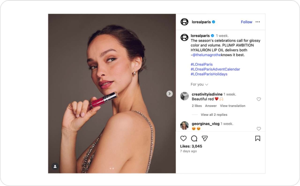
Photo source: @lorealparis on Instagram
9. POV: Embody the user
The POV technique places the viewer inside the action. Instead of watching someone else use the product, they feel like they’re the one holding it, tasting it, or moving through the scene. This first-person angle builds immersion and emotional ownership — the viewer experiences the product, not just observes it.
Why it works:
- Seeing from a first-person view creates immersion
- Mirror neurons make viewers feel part of the action
- This perspective boosts engagement, watch time, and intent to try
How to use it in your advertising:
Use first-person shots to demonstrate experiences: opening a package, swiping a feature, or stepping into a space. Keep movements natural and camera transitions smooth to avoid feeling staged. For social video, short POV clips work well as teasers that invite the viewer to “step in.”
Real example: GoPro “Million dollar challenge”
GoPro’s global campaign crowdsourced first-person footage from users worldwide — cliff jumps, waves, mountain runs, all seen through their eyes. The result was pure immersion: every viewer could imagine holding the camera themselves. It’s one of those examples of persuasive techniques in advertising where experience becomes the message, and participation drives brand love.
10. Behind the scenes: Show the process, not just the polish
The behind-the-scenes technique humanizes a brand by revealing what happens before the final shot. It could be creators testing ideas, the setup before a product reveal, or a quick look at how something is made. This approach replaces polish with personality, showing the people and process that make the brand real.
Why it works:
- Transparency builds emotional closeness and trust
- Real effort and imperfection make brands feel human
- Authentic behind-the-scenes moments spark curiosity and connection
How to use it in your advertising:
Film short, candid clips from your workspace, studio, or factory floor. Keep lighting natural and narration conversational. Use captions to highlight moments of creation, like “shot on set,” “first test,” or “before the launch.” The goal isn’t perfection; it’s relatability.
Real example: Ben & Jerry’s factory and flavor stories
Ben & Jerry’s regularly gives audiences a peek into its production floor — real employees, real ingredients, and real laughter. Instead of hiding the process, the brand celebrates it, turning transparency into part of its identity. These behind-the-scenes glimpses make the brand feel approachable and trustworthy, a textbook persuasive advertising techniques example where showing the makers behind the product makes people care more about the result.
11. Anthropomorphism: Give personality to the product
Anthropomorphism assigns human traits, voices, emotions, or faces, to objects or brands. It turns something inanimate into a character the audience can relate to. When done well, it builds emotional familiarity fast: viewers stop seeing a product and start seeing a “someone.”
Why it works:
- People connect emotionally with human-like characters
- Giving a product personality triggers empathy and memory
- Consistent character storytelling strengthens recall and long-term affection
How to use it in your advertising:
If your product has a simple form, experiment with giving it life — a voiceover, a face, or a personality trait. Keep the tone aligned with your audience: playful for mass markets, subtle for premium brands. Test short-form content first; small emotional cues often outperform full character arcs.
Real example: M&M’s the spokescandies
M&M’s transformed its candy pieces into a recognizable group of characters, each with distinct voices and personalities. Over the years, those animated “spokescandies” became the emotional core of the brand, carrying humor and relatability across every campaign. The result was lasting recognition and affection, proving this advertising technique example can turn even simple products into cultural icons.
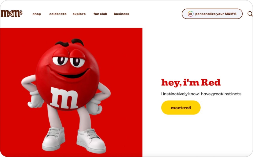
Photo source: M&M
12. Emotional appeal: Use feeling to make it unforgettable
Emotional appeal taps into universal human feelings, for example, joy, awe, pride, nostalgia, relief, to make ads memorable. Instead of focusing on features or price, it centers on emotion first, message second. The goal isn’t just to inform but to make people feel something real and lasting.
Why it works:
- Emotion shapes both memory and decisions
- Meaningful reactions make ads more memorable and shareable
- Emotional storytelling builds stronger, longer-lasting brand loyalty
How to use it in your advertising:
Identify the core emotion that matches your message — joy for celebration, relief for solutions, awe for innovation. Use sound, pacing, and imagery to evoke that feeling before any text appears. Avoid manipulation; authenticity is what turns emotion into trust.
Real example: John Lewis’ Christmas campaigns
John Lewis’s holiday ads are built on emotion, not product shots. Each year, the retailer tells a simple human story — an unexpected friendship, a small act of kindness, a moment of connection, set to a familiar song. That formula consistently drives massive engagement and cultural relevance, proving this example of persuasive advertising techniques works because it values feeling over selling.
13. Storytelling: Turn information into a journey
Storytelling transforms facts into something people remember. Instead of listing features or benefits, it builds a sequence — a beginning, a moment of tension, and a resolution that delivers the brand’s message. Whether in 6 seconds or 60, a good story gives shape to meaning and keeps viewers watching until the end.
Why it works:
- Stories trigger empathy and curiosity
- Viewers invest emotion and attention when following a narrative
- Storytelling connects logic and feeling, making brands relatable and credible
How to use it in your advertising:
Start with a clear setup, move into transformation, and close with resolution. Keep the pacing tight, every frame or line should move the story forward. Anchor it in real human moments, not slogans.
Real example: Google “Year in Search”
Google’s “Year in Search” turns raw data into emotional narrative. Each video stitches together the world’s biggest questions, hopes, and discoveries from the past year, told entirely through real searches. Without ever naming a product, Google positions itself as part of people’s lives and memories. It’s a persuasive technique in advertising that shows how storytelling can transform statistics into something deeply human.
14. Association: Borrow meaning from the world around you
The association technique connects a product with a lifestyle, environment, or cultural moment that carries its own meaning. Instead of describing what a product does, it shows where it belongs, aligning it with the values, aspirations, or energy of a particular world.
Why it works:
- People understand brands through the contexts they appear in
- Associating with aspirational settings transfers meaning and emotion
- Context turns products into part of a larger, more valuable story
How to use it in your advertising:
Choose a setting or subculture your audience already identifies with. Show the product naturally inside that world, not as a guest, but as something that belongs there. Use tone, sound, and visuals that match the environment’s authenticity. Avoid exaggeration; the power comes from alignment, not imitation.
Real example: Red Bull “Stratos”
Red Bull’s Stratos project redefined what the brand stood for. By sponsoring Felix Baumgartner’s record-breaking space jump, Red Bull linked itself with courage, innovation, and the limits of human achievement. The event became global proof of its slogan, “gives you wings,” turning an ad into a cultural milestone. It’s one of those advertising techniques examples that shows how borrowing the right context can make a brand feel limitless.
15. Symbolism and metaphor: Turn ideas into visuals people instantly get
Symbolism uses familiar images or objects to represent bigger ideas, like freedom, innovation, unity, confidence. Metaphors do the same through creative comparison, translating complex concepts into visuals people can understand in seconds. Instead of telling your message, this technique shows it through imagery that carries meaning on its own.
Why it works:
- The brain favors quick, symbolic connections
- Metaphors fuse emotion and logic into a single, memorable image
- Symbolism deepens storytelling and rewards viewers for understanding
How to use it in your advertising:
Start with your core message, then ask: what object, shape, or scene feels like that idea? Use subtle repetition or contrast to make the symbol recognizable. Keep it simple enough to read instantly but layered enough to reward a second look. The best metaphors make people pause, not because they’re confused, but because they connect.
Real example: WWF “Before It’s Too Late” campaign
WWF used powerful visual metaphors to highlight environmental loss, like a melting iceberg shaped as an hourglass or an animal silhouette fading into smoke. Each image communicated urgency and fragility without a single line of copy. The campaign became globally recognizable and emotionally resonant, a defining advertising techniques example showing how visual symbolism can move people to act faster than facts ever could.

Photo source: WWF
16. Bandwagon or social norm: Show that “people like you” already do it
The bandwagon technique builds persuasion through belonging. It shows that others already use and trust the product. By framing the brand as a shared choice, not a risk, it turns adoption into affirmation: joining in feels natural, not forced.
Why it works:
- People follow social cues to decide what’s trusted or popular
- Validation from others reduces hesitation and builds confidence
- Collective behavior acts as proof that the choice is worth making
How to use it in your advertising:
Use visible scale to signal participation. Show everyday people, not just influencers, using the product naturally. Phrases like “trusted by millions” or visuals showing repeat use build reassurance. Keep it honest; the goal is genuine credibility, not inflated claims.
Real example: McDonald’s “Billions Served” campaign
McDonald’s made social proof its signature message. The simple “Over 99 Billion Served” line turned customer volume into a trust signal — proof that eating there was the norm, not the exception. It reframed popularity as reliability, making the brand feel both universal and approachable. It remains a timeless advertising techniques bandwagon example, showing how scale itself can be persuasive.
17. Scarcity and FOMO: Make attention feel limited
The scarcity technique plays on urgency — the sense that something valuable won’t be around for long. It can be time-bound, quantity-limited, or event-based. The aim isn’t pressure; it’s momentum. People value what feels rare, and that perception drives quicker action.
Why it works:
- Limited access creates urgency and desire
- FOMO drives quicker decisions and stronger attention
- Real scarcity boosts engagement by turning delay into risk
How to use it in your advertising:
Use real, verifiable scarcity, like short windows, small batches, or seasonal releases. Pair urgency cues with clarity: show exactly what’s expiring and when. Test countdown timers or “only X left” overlays on product pages and ads, but keep tone transparent. Authentic urgency converts; fake scarcity erodes trust.
Real example: Supreme limited product drops
Supreme turned scarcity into a brand signature. Each release happens quietly, in tiny quantities, and disappears within minutes. That mix of exclusivity and unpredictability transformed a streetwear label into a global phenomenon. Fans now treat every drop like an event — proof that real limitation can create loyalty as powerful as the product itself. It’s a defining example of persuasive advertising techniques where demand is built through anticipation, not advertising spend.
18. Logical appeal: Persuade with proof, not promises
The logical appeal technique uses facts, demonstrations, or data to make a clear, rational case for a product. It shows how something works and why it works better, often through measurable outcomes or side-by-side comparisons. Instead of emotion, it leans on evidence, giving people confidence that their choice is smart.
Why it works:
- Logic and proof make brands feel credible and honest
- Demonstrating real performance informs rather than sells
- Transparency builds trust, especially for high-value decisions
How to use it in your advertising:
Lead with a claim you can back up. Use product demos, stats, testimonials, or certifications as your narrative tools. Keep visuals clean so the logic stays visible, numbers and cause-and-effect sequences should be easy to follow. Clarity, not complexity, is what convinces.
Real example: Volvo Trucks “Epic Split”
Volvo showcased precision engineering through a simple demonstration: Jean-Claude Van Damme performing a full split between two reversing trucks. No slogans, no exaggeration, just proof of control and stability. The spot went viral worldwide, driving huge increases in brand awareness and trust. It’s a textbook persuasive technique in advertising example showing that evidence, when shown creatively, can be more powerful than any tagline.
19. Comparative advertising: Clarify superiority through contrast
Comparative advertising highlights what makes a product better by placing it side by side with an alternative. It doesn’t attack competitors; it clarifies differences, like price, quality, performance, or innovation, so the viewer can see the advantage clearly and decide confidently.
Why it works:
- The brain understands contrast faster than explanation
- Side-by-side comparisons make strengths instantly clear
- Honest comparison builds credibility, recall, and trust
How to use it in your advertising:
Pick a single differentiator, not everything you do better. Use side-by-side visuals, A/B scenarios, or direct demonstrations that make the comparison obvious without sounding combative. Keep tone factual and confident; the goal is clarity, not confrontation.
Real example: Pepsi “The Pepsi Challenge”
Pepsi invited people to blind taste-test its cola against Coca-Cola and filmed their reactions. The campaign didn’t rely on slogans; it let real choices tell the story. That honest comparison redefined Pepsi’s brand as bold and confident, sparking decades of conversation. It’s a lasting example of persuasive techniques in advertising that proves inviting comparison can win loyalty, if you can back it up.
20. Bribes and incentives: Reward action, repeat loyalty
The bribes and incentives technique uses tangible rewards, for example, discounts, prizes, bundles, or instant wins, to motivate immediate response. It turns curiosity into participation by offering something extra for taking action now, not later. When structured well, it can spark both first-time trials and repeat engagement.
Why it works:
- Rewards trigger satisfaction before purchase
- People act faster when they feel they’re gaining value
- Clear, relevant incentives boost conversions and repeat visits
How to use it in your advertising:
Tie rewards to simple, measurable actions, like scan a code, make a purchase, or share a post. Keep the reward aligned with the brand experience. Be transparent about odds, limits, and timing so the incentive builds excitement, not skepticism.
Real example: Starbucks “Star Rewards” loyalty program
Starbucks built a long-term incentive loop through its app-based loyalty system. Every purchase earns stars that can be redeemed for free drinks and exclusive offers. The structure rewards frequency, not just one-time participation, turning small daily habits into ongoing loyalty. It’s one of those advertising techniques examples where incentives evolve from a short-term trigger into a sustained relationship — proof that the best rewards create behavior, not dependency.
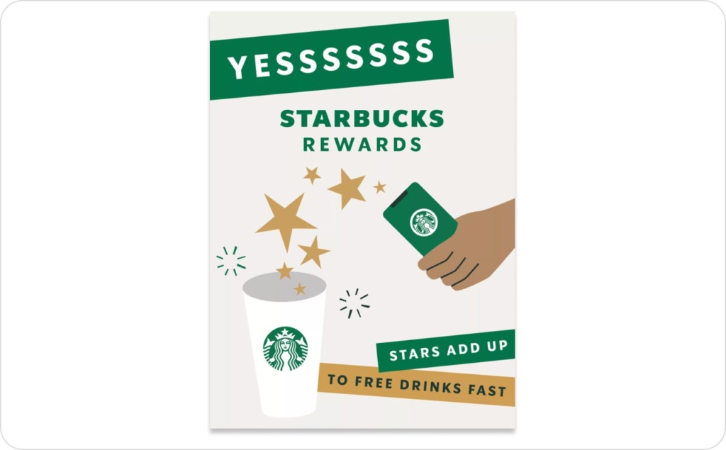
Photo source: Starbucks
21. Endorsements: Borrow trust from credible voices
The endorsement technique uses well-known figures — celebrities, athletes, or respected experts, to transfer their credibility, popularity, or authority to a brand. It works because audiences already trust the person, and that trust extends to the product they’re seen using or supporting.
Why it works:
- Admired figures transfer trust and credibility to the brand
- Endorsements simplify choices through social validation
- They blend aspiration with reassurance, appealing to both heart and mind
How to use it in your advertising:
Pick endorsers whose values align naturally with your brand. Authenticity matters more than fame. Let them speak or act in their own tone rather than reciting scripts, modern audiences can spot forced partnerships instantly. Integrate endorsements into storytelling instead of relying on them as the sole message.
Real example: Nespresso George Clooney campaign
Nespresso’s long-running partnership with George Clooney turned a coffee brand into a lifestyle symbol. Clooney’s effortless charm and sophistication mirrored the product’s promise of refined simplicity. The campaign worked because the pairing felt natural, not promotional and strengthened Nespresso’s positioning in the premium market. It’s a standout advertising techniques example showing how authentic alignment between endorser and brand can elevate both beyond the product itself.
22. Influencer marketing: Build trust through relatable voices
Influencer marketing leverages creators with loyal, niche audiences to share products through their own authentic lens. Unlike celebrity endorsements, influencers feel accessible, they speak to followers as peers, not as distant figures. Their recommendations blend seamlessly into everyday content, making brand mentions feel organic rather than intrusive.
Why it works:
- Relatable voices feel more genuine and trustworthy
- Smaller influencers build deeper, more consistent engagement
- Authentic use of a product turns influence into real social proof
How to use it in your advertising:
Choose influencers whose audience overlaps naturally with your target market. Give them creative freedom to express the product in their own tone and format. Focus on long-term partnerships over one-off posts, sustained visibility builds real influence. Measure engagement quality, not just reach.
Real example: Daniel Wellington influencer watch campaign
Daniel Wellington grew from a small watch startup into a global brand almost entirely through influencer partnerships. By gifting watches to creators who shared minimalist, aspirational photos, the brand built organic awareness without traditional media spend. The approach turned social feeds into a living catalog — a clear persuasive advertising techniques example of how authenticity at scale can outshine any paid campaign.
23. Social proof: Let your customers do the convincing
Social proof relies on the simple idea that people trust other people more than brands. It uses reviews, testimonials, user photos, and case studies to show that real customers already love and recommend the product. Instead of telling audiences why you’re good, it shows proof that others agree.
Why it works:
- Peer feedback feels authentic and unbiased
- Positive experiences reduce risk and build instant trust
- Genuine user advocacy is more persuasive than any ad copy
How to use it in your advertising:
Highlight real names, faces, and data where possible. Showcase verified reviews, user-generated photos, or quick video snippets of customers using the product. Avoid over-polishing, the less scripted it feels, the more believable it becomes. For digital ads, rotate fresh testimonials regularly to maintain authenticity.
Real example: Booking.com verified reviews system
Booking.com built its brand on transparent feedback. Every review comes from a verified stay, giving travelers confidence that the opinions are real. By showing honest ratings and experiences, both good and bad, the brand turned transparency into its biggest trust signal. It’s a powerful persuasive advertising techniques example that proves credibility scales best when it’s earned, not staged.
24. Landmarks and pop culture: Connect with moments people already care about
The landmarks and pop culture technique links a brand to events, trends, or cultural touchpoints that audiences instantly recognize. It could be a live sports final, a viral meme, or a national holiday, anything that’s part of the shared conversation. When done well, it feels timely and clever rather than opportunistic.
Why it works:
- Cultural alignment makes brands feel instantly familiar
- Shared moments create emotional connection and relatability
- Joining real conversations drives authentic engagement
How to use it in your advertising:
Keep your creative process agile so you can respond to cultural moments quickly. Match the tone of the event — humor for lighthearted trends, empathy for serious ones. Make sure the link feels natural to your product or values. Timeliness without authenticity can backfire.
Real example: Oreo “Dunk in the Dark”
During the 2013 Super Bowl blackout, Oreo posted a simple tweet: “You can still dunk in the dark.” It was witty, brand-relevant, and perfectly timed, earning viral reach and praise for real-time creativity. The post proved how cultural awareness can outperform big-budget campaigns. It’s a classic advertising techniques example of how being present in the moment can make a brand feel alive.
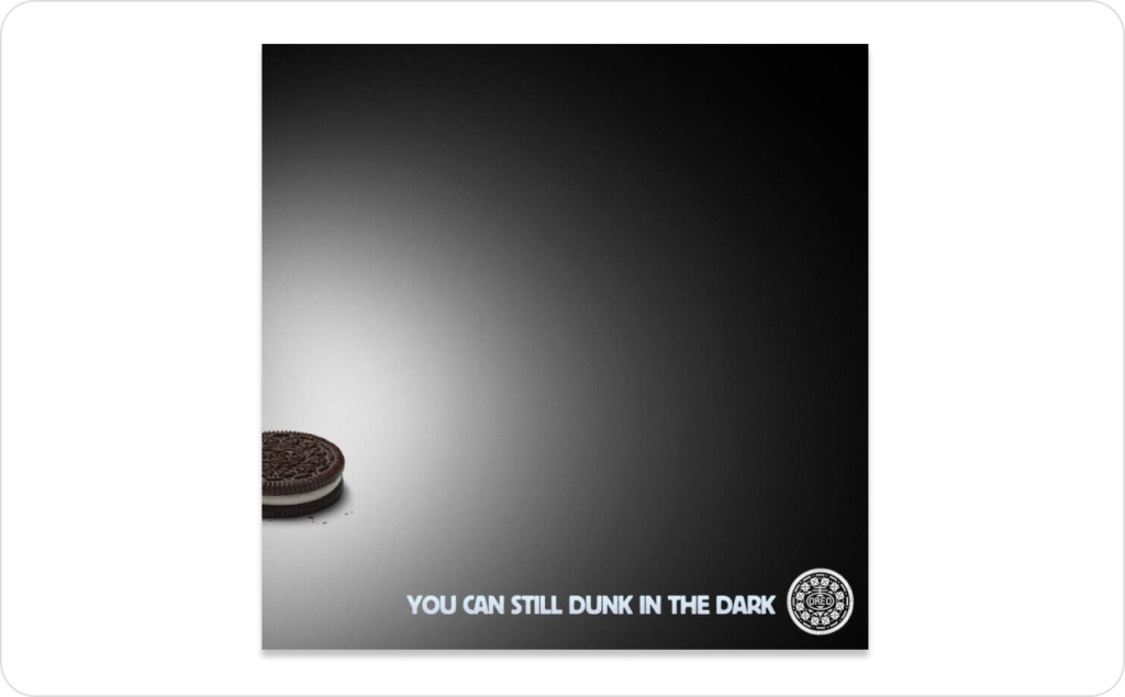
Photo source: Oreo on X
25. Animation and motion graphics: Use movement to grab and hold attention
Animation adds motion, rhythm, and personality to static visuals. It can simplify complex ideas, highlight product features, or create visual novelty that makes people stop scrolling. From subtle logo loops to full 2D or 3D motion spots, this technique turns information into energy. For formats that adapt content on the fly, see dynamic video ads.
Why it works:
- Movement instantly attracts visual attention
- Animation simplifies complex or abstract ideas
- Motion increases engagement, retention, and shareability
How to use it in your advertising:
Use animation to reveal, emphasize, or transition, not to decorate. Keep sequences short and purposeful. In digital ads, test micro-animations, like blinking icons or kinetic type, that cue interaction. For social or programmatic video, design loops that hold attention without sound.
Real example: Headspace animated mindfulness campaigns
Headspace built its visual identity around soft, playful animation that mirrors calm and approachability. The motion explains abstract mental health concepts through color and character, instantly recognizable and emotionally warm. It’s a standout advertisement technique and example case where motion design became brand language, proving that animation can make even stillness feel engaging.
26. Mobile-first and accessibility: Design for how people actually watch
The mobile-first, accessibility-focused technique ensures every ad is built to perform on small screens and for diverse audiences. It prioritizes clarity, readability, and inclusivity — large tap targets, safe zones for text, high contrast, and captions that make sense even with sound off. The goal: reach more people by making every interaction easy.
Why it works:
- Mobile-first design meets audiences where they actually watch
- Clear, accessible visuals keep attention in fast-scroll feeds
- Strong UX boosts engagement, watch time, and brand trust
How to use it in your advertising:
Design every creative for vertical or square formats first. Keep copy short, visuals bold, and essential text within mobile-safe margins. Always burn in captions and test contrast for legibility. Include alt text or descriptive elements where possible — accessibility isn’t just ethical, it’s strategic.
Real example: Spotify “Sound Off” campaign
Spotify’s mobile ads are designed to work perfectly without sound, using captions, color contrast, and dynamic motion to convey rhythm visually. The approach respects how people actually scroll, while staying true to the brand’s energy. It’s a smart example of advertising techniques where accessibility isn’t an afterthought; it’s the reason the creative performs.
How to choose the right advertising technique
With marketing budgets holding steady at just 7.7% of company revenue, according to the Gartner CMO Spend Survey 2025, every creative choice has to work harder. This table helps you match your goal to the most effective advertising techniques and examples, so every campaign stays focused, measurable, and worth the spend.
| Goal | Best techniques to use | When to use them | Example cue | Outcome to expect |
| Instant recognition | Color psychology, Minimalism | Building brand identity or visual consistency across platforms. | “Use one brand color to anchor emotion and guide focus.” | Stronger recall, brand cohesion, and higher CTR. |
| Visual clarity & flow | Rule of thirds, Focal point, Typographic hierarchy | Designing clean, balanced layouts for digital or print. | “Place the product off-center and use headline hierarchy to guide the eye.” | Longer visual engagement and faster comprehension. |
| Human connection | Body language, Direct gaze, Three-quarter gaze | Ads that rely on emotion, empathy, or authenticity. | “Show natural gestures or direct eye contact to build trust.” | Higher dwell time and emotional resonance. |
| Immersion & participation | POV, Behind the scenes | When you want audiences to feel involved or “inside” your story. | “Film from first-person view or show how something’s made.” | Increased watch time and brand intimacy. |
| Emotional storytelling | Emotional appeal, Storytelling, Association | For narrative or brand-building campaigns. | “Tell a human story that links product to real emotion or culture.” | Stronger brand loyalty and shareability. |
| Creative symbolism | Symbolism and metaphor | When explaining abstract or social ideas visually. | “Show your concept through a simple metaphor or symbolic image.” | Deeper recall and audience engagement through meaning. |
| Social validation | Bandwagon, Social proof, Influencer marketing | When you need to prove popularity or reliability. | “Highlight real users or creators already using your product.” | More trust, reduced hesitation, higher conversion. |
| Urgency & motivation | Scarcity and FOMO, Bribes and incentives | For limited offers, launches, or promos. | “Add countdowns or clear reward prompts for quick action.” | Faster click-throughs and short-term conversion lift. |
| Rational persuasion | Logical appeal, Comparative advertising | When data or proof matters most. | “Demonstrate results or side-by-side comparisons.” | Builds credibility, reduces purchase hesitation. |
| Trust & influence | Endorsements, Influencer marketing | When reputation transfer can speed belief. | “Use a respected voice or relatable creator in the message.” | Stronger brand association and higher perceived value. |
| Cultural relevance | Landmarks and pop culture, Association | To connect with trending topics or shared events. | “Link your message to a live cultural or viral moment.” | Higher engagement, organic reach, and brand likability. |
| Visual novelty | Animation and motion graphics | To simplify complex ideas or stand out in scroll environments. | “Add short looping motion or animated transitions.” | Better retention and share rates. |
| Universal accessibility | Mobile-first and accessibility | For campaigns meant to reach broad audiences or global markets. | “Design vertical-first, high-contrast ads with captions.” | Greater reach, usability, and watch time across devices. |
Tip: Start by defining your main goal — awareness, emotion, proof, or action, then pick one primary technique and test variations.
The most effective ads combine one emotional hook with one clarity enhancer.
Why use an AI ad generator: Clarity at the speed of creativity
Every memorable ad in this list works because of one thing: clear technique. But clarity takes time — hours of design, copywriting, and testing most small teams simply don’t have. That’s why Zeely exists. It’s an AI advertising generator and business growth app built for SMBs, marketers, and e-commerce owners who want ads that perform like the big brands without needing a big team.
The real-world problems Zeely solves:
- No design skills. Zeely’s AI static ad creator for static ads builds layouts using proven techniques like color psychology, hierarchy, and focal points, automatically balanced and brand-ready
- Low budgets. Create low-cost ads that still look premium. The AI optimizes assets for reach and return, not waste
- No time. What took hours now takes minutes. Zeely auto-writes, designs, and sizes your ads for every platform in one flow
- Complex campaigns. The app removes guesswork, guiding you through storytelling, targeting, and testing without jargon
- Low conversions. Zeely’s AI tracks performance in real time, refines your visuals and copy, and learns what drives clicks and sales
- Scaling struggles. Duplicate winning creatives, adapt them for new formats, and grow faster without creative fatigue
- Wasted ad spend. Smart performance insights cut losses early, every dollar works harder, every impression counts
Zeely turns proven advertising techniques and examples into action, making clarity, emotion, and design flow available to anyone. It’s not theory; it’s execution made effortless.
Start creating ads that actually convert. Try Zeely AI ad generator that turns proven creative principles into measurable growth in minutes.