Ad creatives: 13 tips for ads that convert
Learn how to create ad creatives from one clear buyer moment, then turn that idea into static, video, and UGC-ready ads. This guide shares 13 practical ad creative tips for sharper hooks, cleaner visuals, stronger CTAs, and easier creative review.
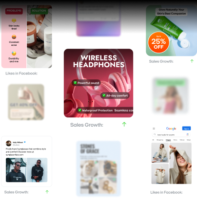
An ad creative is the actual asset people see in a campaign: the image, short video, UGC-style clip, headline, caption, offer, and call to action. Some teams still search for ads creatives, but the cleaner term is ad creatives. Either way, the work is the same. You’re building the first piece of the customer’s path.
This guide is not about creative automation. It is not a broad explanation of ad formats or campaign metrics. It is a practical guide on how to create ad creatives from a clear idea, shape that idea for real people, and prepare stronger versions for testing.
Strong ad creatives usually start smaller than people expect. You don’t need five messages, ten product claims, or a crowded layout. You need one buyer moment, one promise, and one visual that makes the idea easy to understand.
Use this guide to:
- Turn one product benefit into a clear ad concept
- Write hooks that sound specific, not generic
- Create static, video, and UGC ad creatives from one idea
- Build high-converting ad creatives without overloading the design
- Use creative optimization as a simple review habit, not a separate production system

How to create ad creatives from one buyer moment
Before you write copy or choose visuals, name the moment your ad is entering.
A person is not just “looking for a skincare product.” They may be getting ready for work and noticing dry skin again. A founder is not just “interested in better ads.” They may need fresh creatives for a weekend sale. A fitness app user is not just “health-conscious.” They may be trying to restart after falling off their routine.
That moment gives your ad creative a real scene.
A broad message says, “Get a promo.”
A sharper message says, “Get your weekend promo before lunch.”
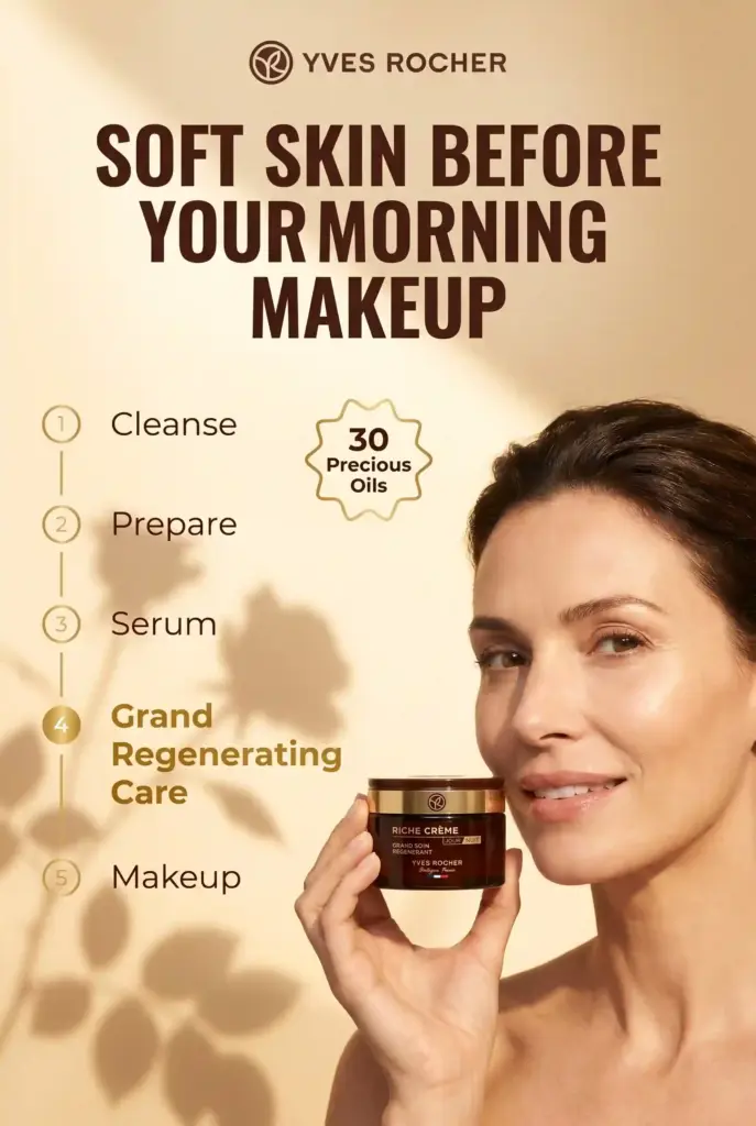
A broad message says, “Hydration for dry skin.”
A sharper message says, “Soft skin before your morning makeup.”
The second version feels easier to picture because it gives the reader a setting, a need, and a reason to care.
Start every ad creative brief with these four lines:
- Buyer moment: What is happening in the customer’s day?
- Main problem: What feels annoying, slow, risky, or unclear?
- Product role: How does the product help in that moment?
- Next step: What should the person do after seeing the ad?
That small brief keeps the ad focused before design begins.

13 ad creative tips for high converting ad creatives
The best ad creative tips are not tricks. They are small decisions that make the message easier to see, read, and believe.
1. Start with the situation, not the product
Most brands want to open with the product. That makes sense internally, but it often feels flat to the buyer. The customer cares about what the product fixes, saves, simplifies, or changes. Start there. Instead of opening with:
“Meet our new meal planning app.”
Try:
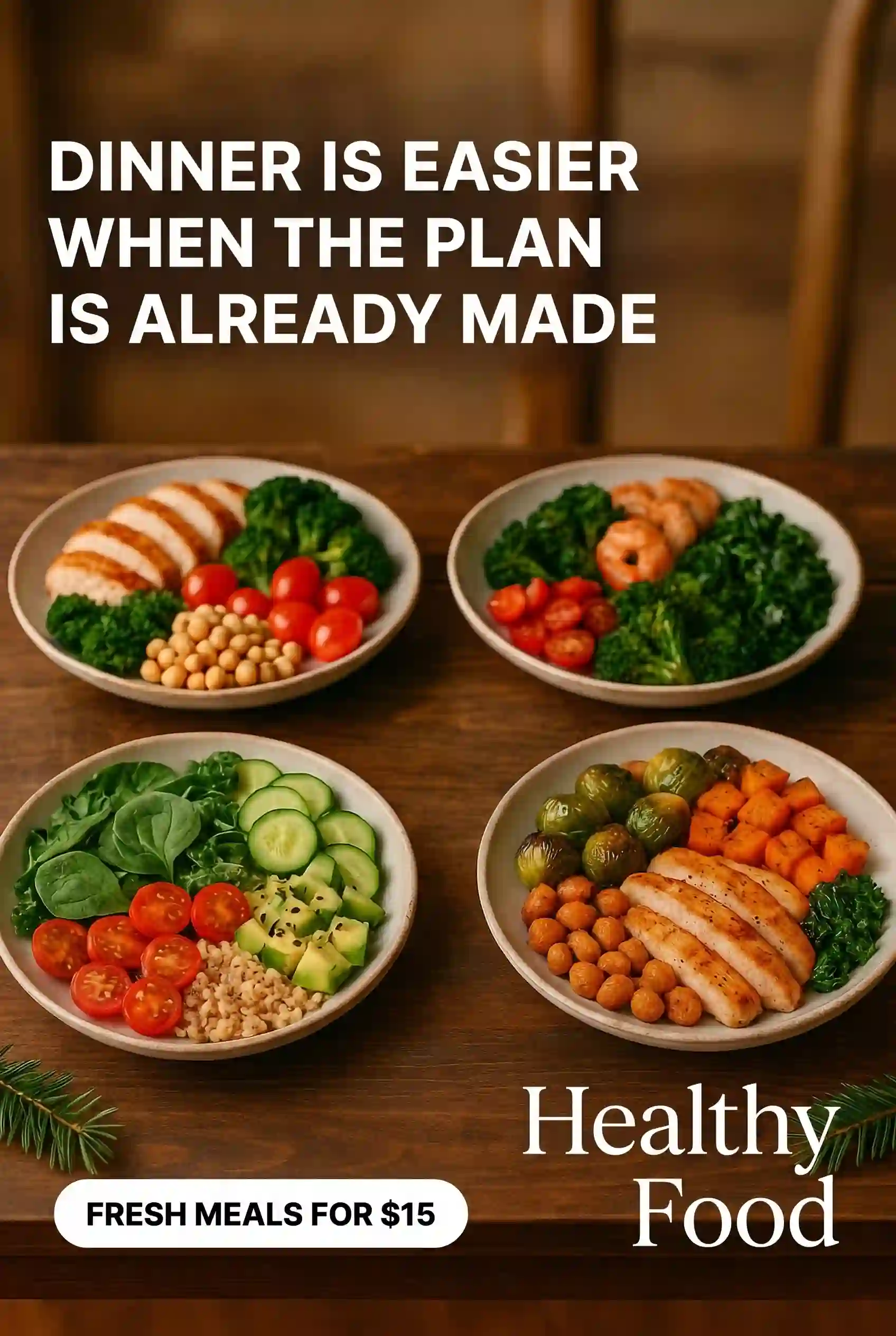
“Dinner is easier when the plan is already made.”
The product still appears. It just enters after the customer recognizes the situation.
For ecommerce, this could be a messy drawer before a storage product appears. For an app, it could be a repeated task before the tool makes it simpler. For a local service, it could be the annoying problem the customer wants gone.
When the situation feels familiar, the product earns its place.
2. Turn one benefit into one promise
A weak ad tries to carry the whole sales page. A strong ad carries one promise.
Choose the benefit that matters most for this audience and build the creative around it. If you sell a productivity tool, don’t list reminders, boards, templates, and team comments in one small ad. Pick one result.
For example:
“Plan tomorrow in five minutes.”

That line is simple, but it gives the viewer something concrete. It also gives the visual a job. You can show a messy task list becoming a clean plan. You can show a creator closing a laptop earlier. You can show a before-and-after phone screen.
One benefit creates one promise. One promise creates one clean ad.
3. Write the hook before the headline
A headline names the idea. A hook earns the pause.
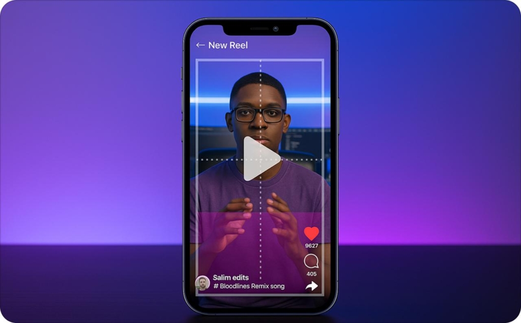
For static ads, the hook might be the first line of text on the image. For video or UGC, it may be the first spoken sentence. For a carousel, it is the first card.
A hook should sound like it belongs in the buyer’s day.
Weak hook:
“New skincare for sensitive skin.”
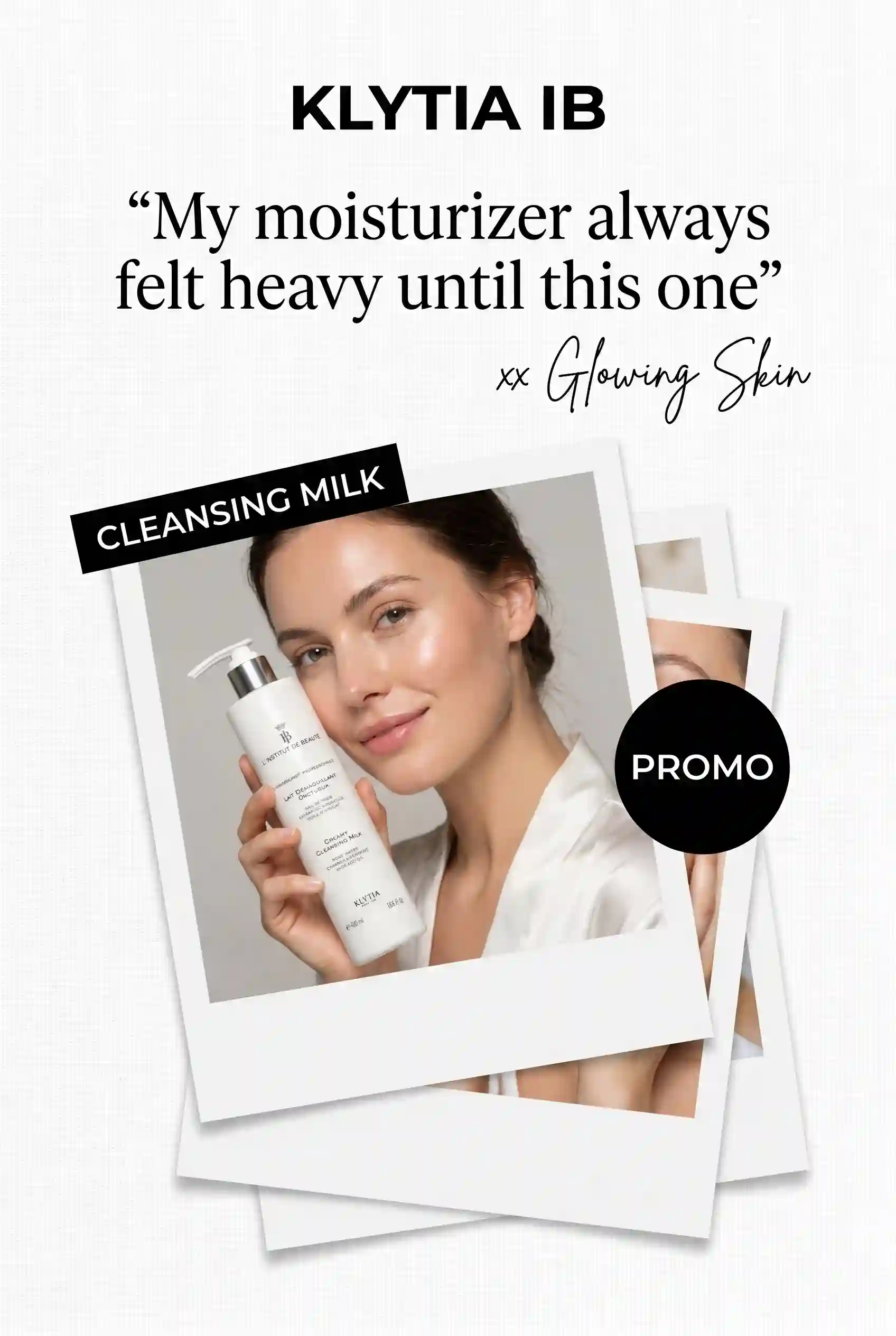
Better hook:
“My moisturizer always felt heavy until this one.”
TikTok’s 2025 performance creative guidance recommends opening with a hook, showing the unique selling point, and ending with a clear CTA. It also notes that the hook should be prioritized early, especially in the first few seconds of a video.
Don’t make the hook clever at the cost of clarity. Clever gets noticed. Clear gets understood.
4. Make the first visual explain the idea
People should understand the ad before they finish reading it.
That does not mean every ad needs a huge product photo. It means the first image, frame, or scene should match the message.
If your ad says “cleaner weekly planning,” don’t show a generic laptop. Show the messy calendar becoming manageable. If your ad says “better sleep for side sleepers,” don’t show only a pillow box. Show the actual sleeping position.

Use visuals that answer:
- What is the problem?
- What is changing?
- Where does the product fit?
- What should the viewer notice first?
The visual should reduce the work, not add more work.
5. Use product context instead of product isolation
A product on a plain background can work for ecommerce catalogs, but many ad creatives need more context.
Context helps people imagine the product in their own life. That can be a person using it, a familiar room, a phone screen, a small routine, or a before-and-after scene.
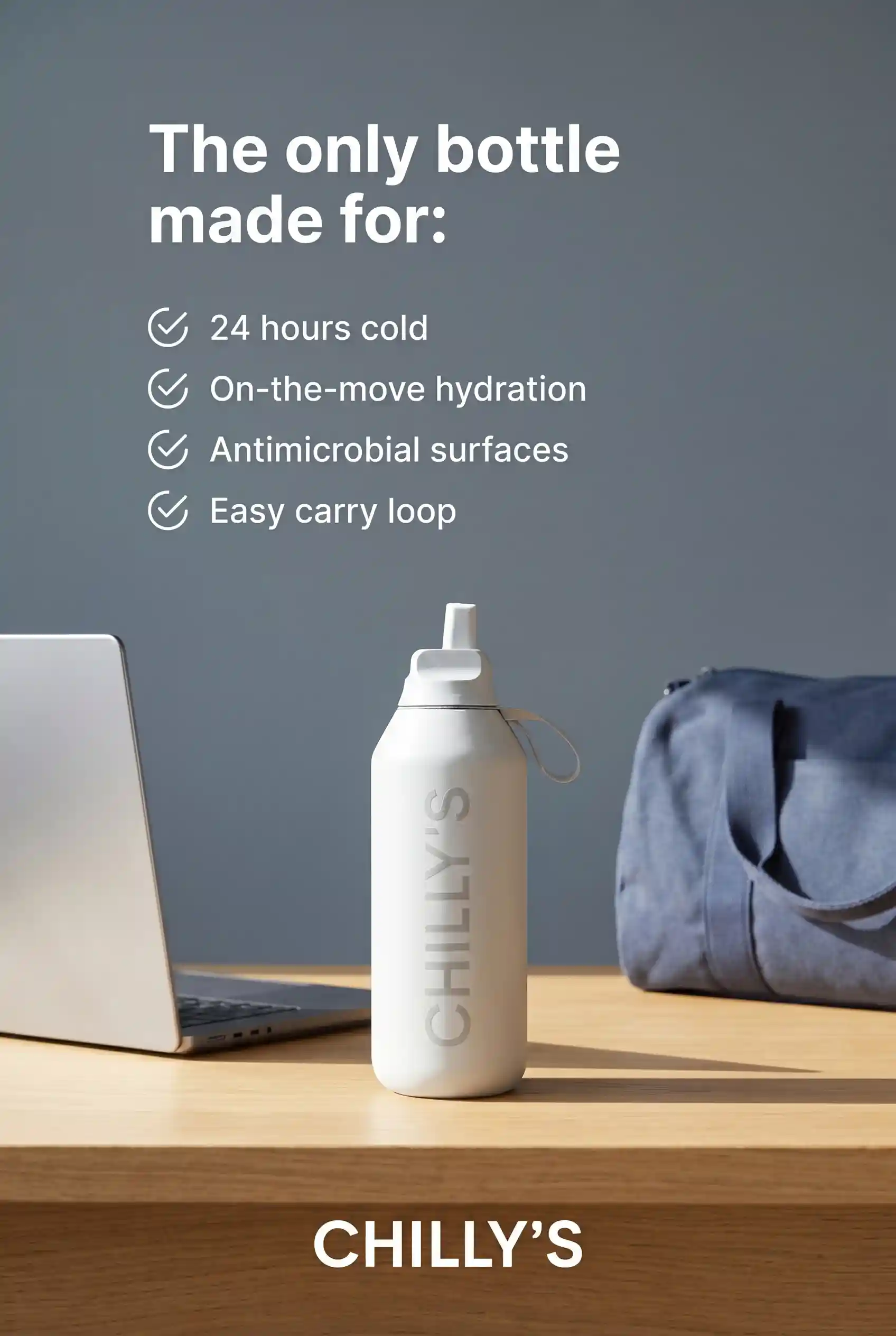
For example, a water bottle ad can show the bottle on a desk beside a laptop and gym bag. A scheduling app can show a founder creating an appointment link between meetings. A dog product can show the leash, the owner’s hand, and the calmer walk.
The goal is not decoration. It is faster understanding.
When the viewer sees the product in use, the promise becomes easier to believe.
6. Keep copy short enough for a phone screen
Ad copy should pass the thumb test.
Open the creative on a phone. Hold it at a normal scrolling distance. If the text feels crowded, the ad needs less copy or larger type.
For most mobile-first ad creatives, aim for:
- One hook
- One short supporting line
- One CTA
- One product or proof cue
A static ad does not need three paragraphs. A video does not need every feature in the first five seconds. A UGC script does not need to explain the full product before showing it.

Short copy works because it respects how people browse. They glance first. They decide second. They read only if the creative gives them a reason.
7. Show proof without making the ad feel crowded
Proof helps, but too much proof can make an ad look desperate.
Choose one proof point that matches the promise. If the ad is about comfort, use a short customer line. If it is about speed, show the before-and-after timing. If it is about ease, show the product being used in one simple step.
Good proof can look like:
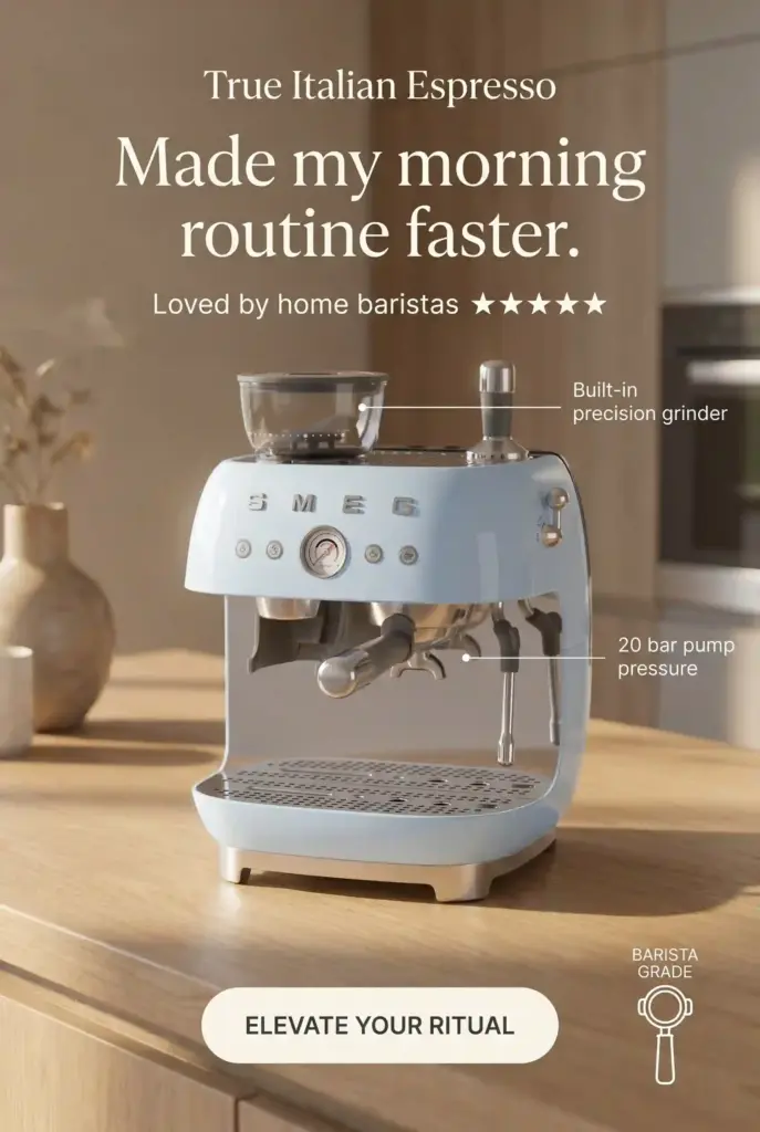
- “Made my morning routine faster.”
- “1,000+ five-star reviews.”
- “Before: 42 unread tasks. After: one clear plan.”
- “Used by small businesses launching weekly ads.”
- “Creator demo with the product on screen.”
Avoid stacking too many badges, ratings, reviews, and claims in the same small space. The viewer should feel reassured, not buried.
8. Let the CTA match the level of intent
Not every viewer is ready to buy right away.
A cold audience may need “See how it works.” A warmer visitor may respond to “Shop the bundle.” Someone who already compared options may be ready for “Start free” or “Book today.”
Match the CTA to the ad’s promise.
If the ad shows a product routine, use a CTA like “Shop the routine.”
If the ad explains a tool, use “See how it works.”
If the ad promotes a limited offer, use “Get the offer.”
If the ad shows a quick template, use “Create your first ad.”

The CTA should feel like the natural next sentence.
9. Build one idea into three creative angles
Before choosing a final ad, create three angles from the same product promise.
This helps you avoid the first idea trap. The first version is not always the strongest one. It is just the easiest one to write.
For example, the product promise is:
“Create better ads faster.”
You could test:
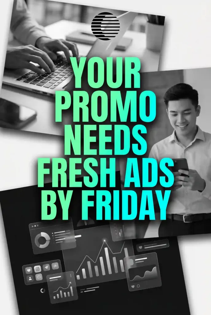
- Problem angle: “Your promo needs fresh ads by Friday.”
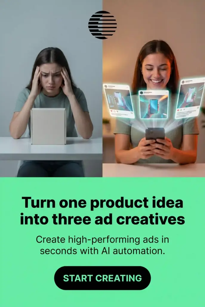
- Result angle: “Turn one product idea into three ad creatives.”
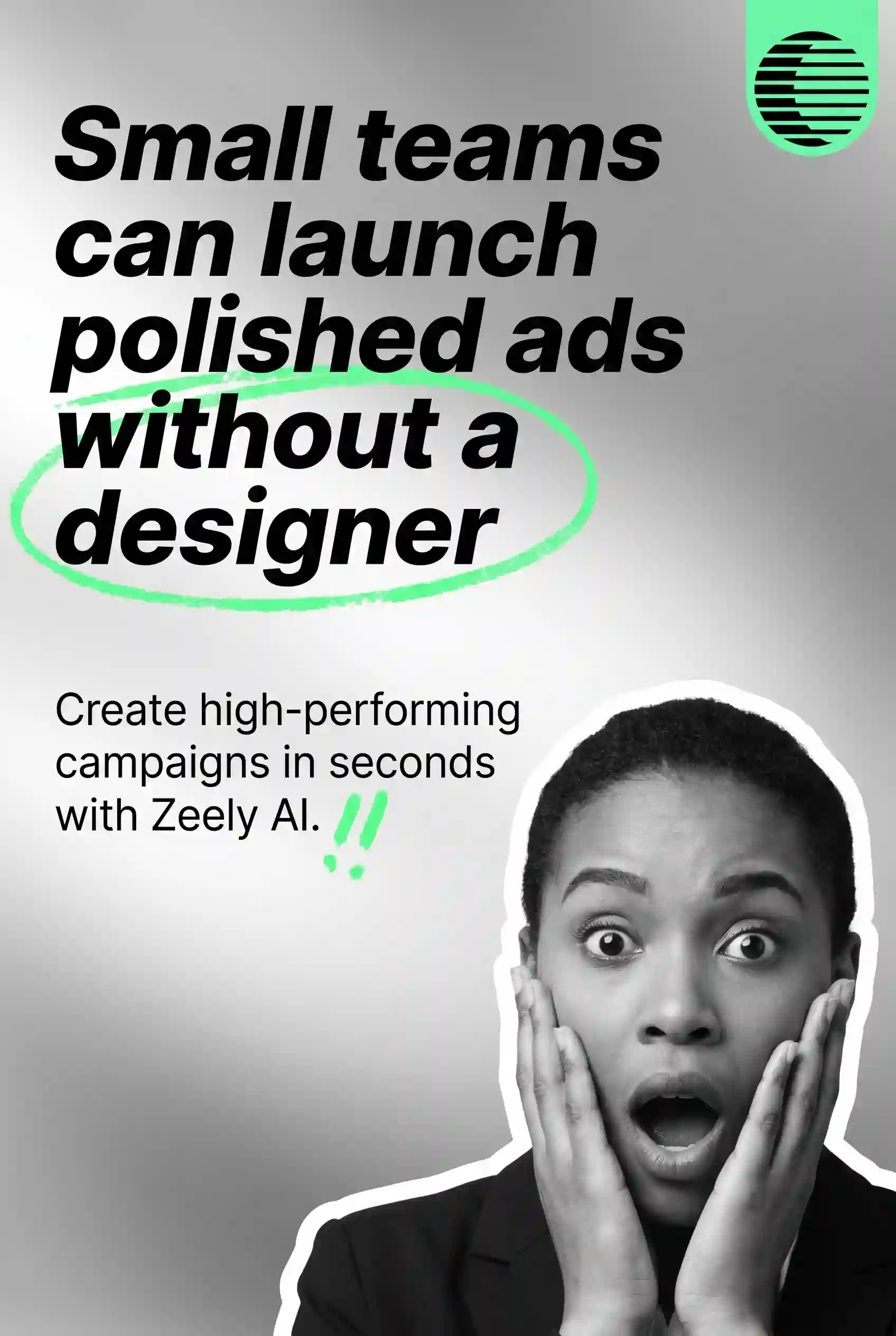
- Proof angle: “Small teams can launch polished ads without a designer.”
Each angle speaks to a different reason someone might care. The product is the same. The entry point changes.
This is also a clean way to make more ad creatives without drifting into random ideas. Read also how to generate ad creatives in bulk.
10. Shape the ad for the platform’s behavior
A strong idea still needs to fit where people will see it.
A TikTok ad should not feel like a cropped banner. A YouTube short should not open like a slow product catalog. A Meta feed ad should be readable without sound. A display ad should be simple enough to understand in one glance.
Use the platform’s behavior as a creative filter.
Ask:
- Will people hear the sound?
- Will they see this on a small screen?
- Is the product visible early enough?
- Does the crop protect the key message?
- Does the text fit the placement?
- Does the ad feel native without losing the brand?
HubSpot’s 2025 Social Media Trends Report points to social search, social commerce, and short-form video as major parts of how people discover and evaluate brands. That makes platform fit more than a formatting detail. It changes how people meet your message.
11. Keep the brand present, not overpowering
Branding should be visible, but it should not crush the idea.
Use the logo, product packaging, brand colors, voice, or a creator mention naturally. Make sure the viewer can tell who the ad is from, especially in short video formats.
For small businesses, this matters even more. A great ad that people remember without remembering the brand loses part of its value.
Good brand presence can be simple:
- Product packaging visible in the first scene
- Brand name in the voiceover
- Logo in a corner with enough space
- Consistent colors across static ads
- A final frame with the product and CTA
The brand should feel built into the creative, not pasted over it.
12. Refresh the winner before it gets tired
When an ad works, don’t retire it too quickly. Refresh it.
A winning idea can often support several new versions. Keep the main promise, then change the part that gets stale first.
You can refresh:
- The opening line
- The first frame
- The creator
- The setting
- The product angle
- The CTA
- The proof point
- The background
- The offer framing
For example, if “Plan tomorrow in five minutes” works, you could test:
“Your Monday plan shouldn’t take Sunday night.”
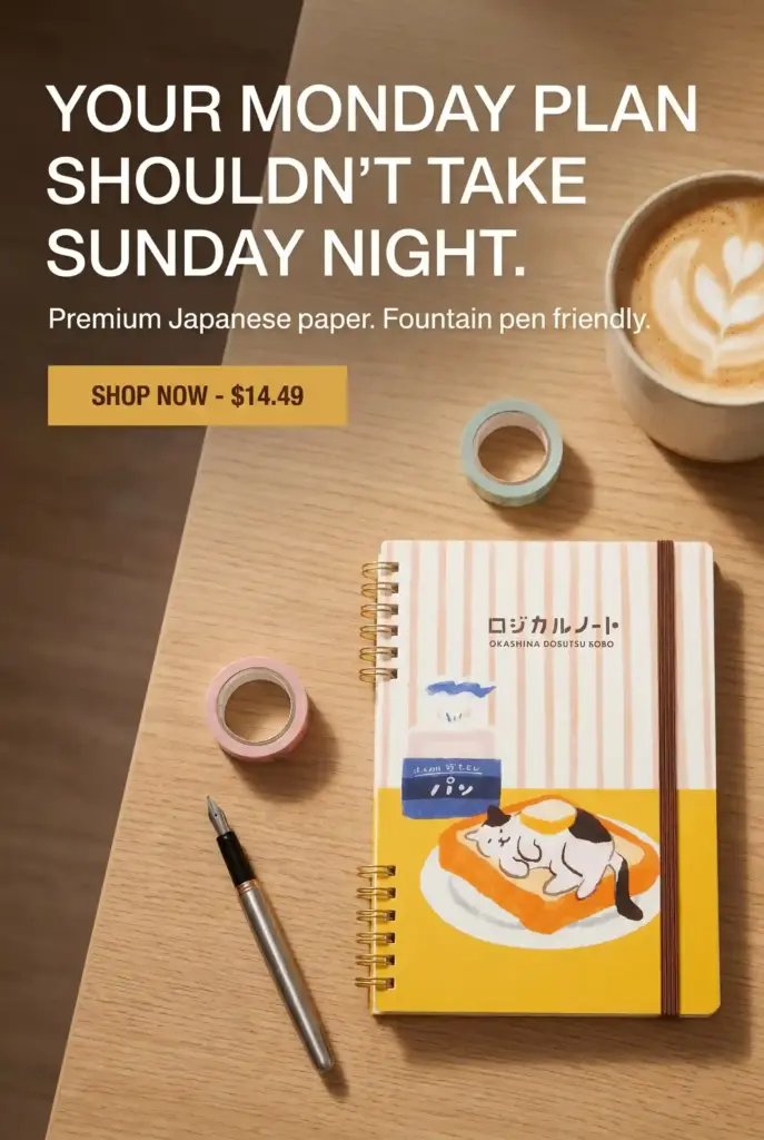
Same product. Same promise. New entry point.
This keeps your creative library alive without forcing your team to rebuild everything from scratch.
13. Review what each ad teaches you
Creative review does not need to be complicated.
After a creative runs, look at what the ad taught you. Did people respond to the problem angle? Did the product demo keep attention longer? Did the UGC opening feel more believable than the polished version? Did the CTA match the promise?
That is the simplest version of dynamic creative optimization for this article: use each ad to make the next ad clearer.
AppsFlyer’s 2025 State of Creative Optimization report analyzed 1.1 million creative variations from Q1 2024 to Q1 2025. The report frames creative review around patterns like hooks, motivations, retention, and user response, not just surface-level changes.
You don’t need to copy every data setup from a large app team. You can still borrow the habit. Track the hook, visual, audience, CTA, and result. Then use that record before making the next batch.
Want to generate ad creatives faster?
Want to generate ad creatives faster? Try Zeely’s AI ad creative generator.
Use it when you already have a product, offer, or campaign idea, but need more creative options to test. You can builde creatives, video, and AI UGC video ad ideas faster while keeping the message focused on your buyer’s real moment.
The tool is the shortcut. The stronger input is still the part that makes the ad work: a clear audience, one promise, and a reason to click.
FAQ about ad creatives
Ad creatives are the assets people see in an ad campaign. They can include images, videos, UGC-style clips, headlines, captions, product visuals, offers, and CTAs. The ad creative is the part that turns your offer into something people can notice and understand.
Start with one buyer moment, then choose one product promise. Build a visual around that promise, write a clear hook, add a CTA that fits the offer, and adapt the creative to the platform where it will appear. The best ad creatives usually feel specific, not crowded.
High-converting ad creatives usually have a clear customer situation, one easy-to-understand promise, a strong first visual, readable mobile copy, believable proof, and a CTA that matches the next step. They don’t try to tell the whole brand story in one small asset.
Start with three to five strong variations if your budget allows it. Make each version meaningfully different. Test a problem angle, result angle, proof angle, offer angle, or UGC angle. Small changes can help later, but early tests should compare different ideas.
Creative optimization means reviewing how your ad creatives perform and using that learning to improve the next version. For small teams, this can be simple. Track the hook, visual, promise, CTA, platform, and result. Then make the next creative batch based on what the ads taught you.
Final take on creating ad creatives that convert
The best ad creatives are not the busiest ones. They are the easiest to understand.
Start with the customer’s moment. Choose one promise. Show the product in a way that makes the promise feel real. Write the hook before the headline. Make the CTA feel like the next natural step.
Then create a few versions and learn from them.
That is how ad creatives become more than campaign assets. They become small, focused sales moments that help people notice your offer, understand it faster, and decide what to do next.

Emma blends product marketing and content to turn complex tools into simple, sales-driven playbooks for AI ad creatives and Facebook/Instagram campaigns. You’ll get checklists, bite-size guides, and real results, pulled from thousands of Zeely entrepreneurs, so you can run AI-powered ads confidently, even as a beginner.
Written by: Emma, AI Growth Adviser, Zeely
Reviewed on: June 8, 2026