Instagram safe zones in 2026: dimensions for Reels, Stories, feed posts, and ads
Where exactly can you place text, logos, and CTAs on a Reel or Story without Instagram's UI covering them? I'll give you the current pixel dimensions for every format, updated for Meta's March 2026 unified safe zone.
Key takeaways
- Since March 2026, Stories and Reels share one safe zone spec built on percentages, not pixels. The table below has every number
- Reels has the tightest safe zone on Instagram. Only about 51% of the frame height stays clear
- Stories are more generous at roughly 66% usable, but Stories ads close the gap by adding a CTA button at the bottom
- Feed posts have no UI overlay on the image itself. The real concern is the profile grid, which now crops every thumbnail to 3:4
An Instagram safe zone is the part of your Story, Reel, feed post, or ad that stays visible once the platform’s buttons, captions, username bar, and engagement icons load on top of it.
My pre-publish check is quick: preview with the UI on. If a headline sits under the username bar, or a CTA lands behind the like button, the creative is already dead. Better copy will not rescue a line nobody can see.

Instagram safe zone dimensions: Quick-reference table
Every number in this article comes from the table below. I took Meta’s official percentages from the Instagram Reels ad specs page and turned them into pixel values at 1080 × 1920. If you design at 1440 × 2560, just multiply. The ratios are identical.
| Format | Canvas size | Aspect ratio | Safe area | What to avoid |
| Reels, organic | 1080 × 1920 px | 9:16 | ~950 × 980 px center | Top 14% / ~270 px, bottom 35% / ~670 px, sides 6% / ~65 px each, right button rail |
| Stories, organic | 1080 × 1920 px | 9:16 | ~950 × 1270 px center | Top 14% / ~270 px, bottom 20% / ~380 px, sides 6% / ~65 px each |
| Stories + Reels ads | 1080 × 1920 px | 9:16 | ~950 × 980 px center | Use the Reels margins for cross-placement safety |
| Feed post, portrait | 1080 × 1350 px | 4:5 | Full canvas in feed | Grid crops thumbnail to 3:4. Keep key elements centered |
| Feed post, tall portrait | 1080 × 1440 px | 3:4 | Full canvas in feed and grid | No crop. Fills both views cleanly |
| Feed post, square | 1080 × 1080 px | 1:1 | ~1000 × 1000 px center | Grid letterboxes the thumbnail, so it appears smaller than portrait |
| Carousel | 1080 × 1350 or 1080 × 1080 px | Matches first slide | Same as feed post | First slide locks the ratio for all slides. Grid crops to 3:4 |
| Reels cover | 1080 × 1920 px upload | 9:16, cropped to 3:4 on grid | Center 1080 × 1440 px | Top and bottom trimmed on profile |

What changed: Meta’s March 2026 unified safe zone
Before March 2026, Stories and Reels each had their own loosely documented safe zones, and every design guide quoted different numbers. I stopped trusting any of them by mid-2025.
Meta finally settled it. In March 2026, it combined Instagram Stories, Instagram Reels, Facebook Stories, and Facebook Reels into a single percentage-based spec. One set of margins, every vertical placement. The Meta Ads Guide for Instagram Reels now reads: “Consider leaving roughly 14% of the top, 35% of the bottom, and 6% on each side of your asset free from text, logos, or other key creative elements.” I checked that page in August 2026 and the language hasn’t changed since launch. Meta also published a dedicated guide on text overlays and the safe zone with additional context on how these margins work across Stories and Reels ads.
Meta also moved its default format recommendations to 4:5 for feed images and 9:16 for feed video. The old 1:1 square lost its default status.
Instagram Reels safe zone
Reels fills the entire phone screen at 9:16, and Meta’s interface sits directly on top of your content. If you are running Instagram Reels ads, getting these margins right is the difference between a visible CTA and one that disappears under the like button.
What covers the frame
The top of the frame belongs to Instagram’s profile row. Your username, profile picture, the “Follow” button, and the three-dot menu all live here, eating about 270 px, or 14% of the canvas.
The bottom is far worse. The expandable caption, audio label, and every engagement button stack up to claim roughly 670 px. Like, comment, share, save, remix: they all live here. That is 35% of the frame gone before you put a single word on screen.
Then there is the right side. The vertical engagement rail runs from about mid-frame downward: heart, comment, share, bookmark. It chews through roughly 100–120 px from the right edge. I see text and logos collide with that rail constantly. It’s the one people forget.
After all of that, the actual safe area in the center is only about 950 × 980 px. That is 51% of the frame height. I review a lot of small-business Reels, and at least half have a key line sitting behind the like heart, invisible in the feed despite looking fine on the editing timeline.
Reels text and subtitle placement
Subtitles need bold or semi-bold weights, 42 px minimum, placed well above the caption zone. Compressed video is hard on fine text, so bump letter-spacing to +2 or +4 and skip thin fonts entirely. Writing the right ad script helps, but even the best hook fails if the text lands behind interface elements.
I close every Reel with a 2–3 second card for the CTA. Anything tappable needs to be at least 44 × 44 px. Smaller than that and thumbs miss it.
Instagram Story safe zones
Stories use the same 9:16 canvas as Reels, but the bottom overlay is much lighter.
Where Stories differ from Reels
The top looks the same: the profile picture, username, timestamp, close button, and story progress bar take up about 270 px, or 14%.
The bottom is where you win back space. The reply bar, reaction row, and share button claim only about 380 px. That is 20%, compared to the 35% that Reels takes. The result is a safe area of roughly 950 × 1270 px, and about 66% of usable frame height. Noticeable upgrade.
Stories ads: the bottom gets tighter
When you promote a Story, Instagram drops a CTA button above the reply bar. “Shop Now,” “Learn More,” “Install,” whichever you pick. That extra button pushes the blocked area closer to 25–35% of the frame. If your creative might run across both Stories and Reels through Advantage+ placements, build it to the Reels bottom margin. You lose some Story space, but nothing gets buried.
Story design tips
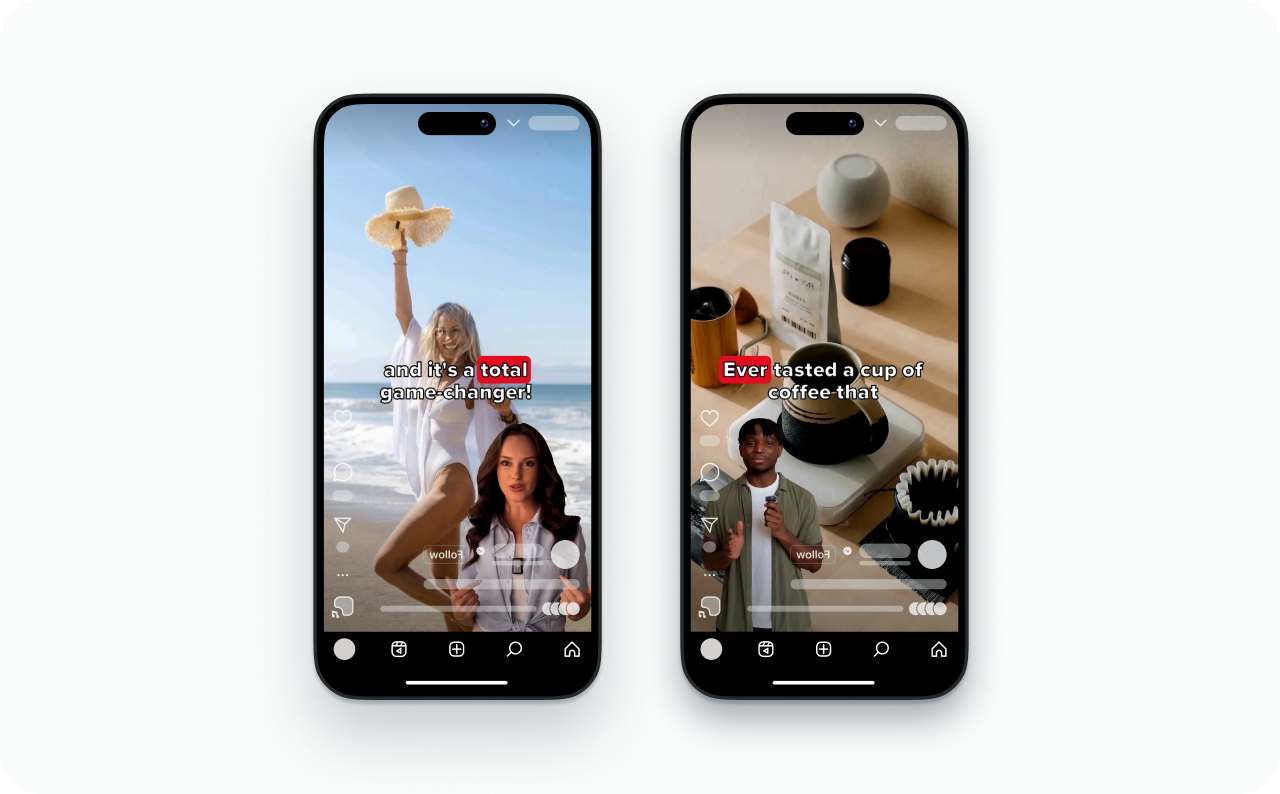
Polls, mentions, and link stickers belong below the headline, not on top of it. The hook goes in the center of the frame. Stickers go lower.
Instagram feed post and carousel safe zones
Instagram does not put its interface on top of a feed image. The profile name, caption, and engagement buttons all sit below the creative.
So the safe-zone question for feed posts is really a grid question. Instagram switched to 3:4 thumbnails in January 2025, replacing the square grid that had been the default since launch. Adam Mosseri, head of Instagram, explained the reasoning on Threads: most photos and videos uploaded to Instagram are already vertical, and cropping them to square was “pretty brutal.”
Portrait feed post: 4:5 at 1080 × 1350 px
Your 4:5 image shows uncropped in the feed. But the profile grid forces it into a 3:4 thumbnail, trimming about 45 px off the top and bottom. I have seen product shots and text-heavy posts lose their top line or bottom CTA on the grid because nobody checked the thumbnail preview. Keep faces, text, and logos inside that centered 3:4 zone and nothing gets clipped.
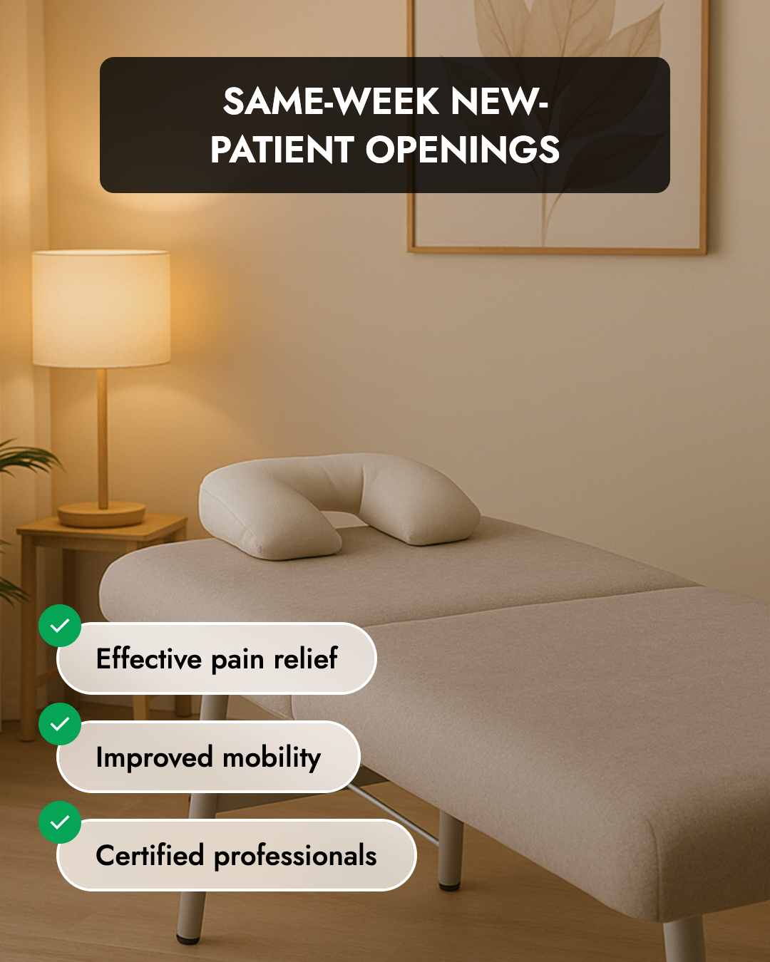
Want zero trimming? Upload at 3:4 instead. That is 1080 × 1440 px. Instagram added native 3:4 feed support in mid-2025, and by 2026 it became the cleanest way to fill both the feed and the grid with nothing lost.
Square posts at 1:1 still display in full, but the grid letterboxes them and the thumbnail ends up looking smaller than portrait. If you go square, keep key content inside roughly 1000 × 1000 px.
Carousels
The first slide’s aspect ratio locks in for every slide that follows. That first image pulls triple duty: feed preview, grid thumbnail, and ratio setter. Compose it with all three jobs in mind. Carousel ads work the same way, and the CTA button sits below the image.
Instagram ad safe zones
Organic posts don’t carry a CTA button or a “Sponsored” label. Ads do, and that is where the safe zone shrinks. If you are planning your first campaign, my guide on how much Instagram ads cost covers the budget side, but getting the creative right starts here.
Stories and Reels ads
Meta’s official ad spec applies the Reels margins to both placements. The Instagram Reels ad specs page recommends a resolution of 1440 × 2560, and at that size the percentages come out to about 358 px at the top, 896 px at the bottom, and 87 px per side.
Here is the number that catches most advertisers: the gap between the Stories bottom and the Reels bottom is 290 pixels. That is almost the height of a CTA button stacked on top of the entire engagement bar. If Advantage+ sends your creative to both placements and you designed for the lighter Stories margins, that 290-pixel difference can bury your headline. Design to the Reels margins. Always.
Meta’s own data backs up the case for vertical ads. According to the Reels ads landing page, campaigns using 9:16 video with audio and key messages inside the safe zone saw 2× higher delivery to the Reels placement and 34.5% lower cost per result compared to image ads.
Feed ads
Image ads in the feed run at 1080 × 1350 for 4:5 or 1080 × 1080 for 1:1. Video ads can now run at 9:16 in the feed too. Meta’s March 2026 creative spec update indicated that 9:16 video ads in the feed show about 7% higher CTR than square. Nothing overlaps the creative, and the CTA button sits below the image. For Instagram ad examples that work across these formats, see our dedicated gallery.
Reels covers and profile grid thumbnails
When your Reel hits the profile grid, Instagram chops the cover from 9:16 to 3:4. You lose about 240 px from the top and 240 px from the bottom. Anything you want visible on the grid has to sit inside the center 1080 × 1440 px.
Unless you pick a custom cover, Instagram just grabs the first frame. Plenty of creators skip that step and then wonder why their grid looks off. If the opening frame doesn’t survive the 3:4 crop, your profile pays the price. A quick check under “Profile grid” before posting catches most problems.

Common Instagram safe-zone mistakes
- Burying text in the bottom third of a Reel. Captions, audio labels, and the engagement bar all sit there. Your headline lands directly under the like button, and nobody reads it
- Designing Stories ads to organic margins. Organic Stories block 20% at the bottom. Ads block up to 35% once the CTA appears. If the creative might run on both placements, build to the tighter number
- Using safe-zone numbers from before March 2026. The unification changed the spec. If a guide says “leave 310 pixels at top and bottom,” check when it was written
How to check whether your content is inside the safe zone
- Meta’s safe zone templates. Available as PPT, PSD, and Keynote downloads from the Reels ads page. Layer them over your creative to see what each placement covers
- Ads Manager Safe Zone Guardrail. Toggle it on during ad setup. The overlay marks the danger zones right on your preview. Meta explains the feature in its text overlays and safe zone guide
- In-app preview. Check Stories with the UI visible before publishing. For Reels, use the “Profile grid” preview to catch 3:4 crop surprises
- DIY overlay. I keep a transparent PNG with the danger zones from the Reels row of the table marked in semi-transparent red. Took five minutes to make and has saved me dozens of mistakes. I drop it on every creative before export
Create safe-zone-compliant ads with Zeely
Zeely’s AI ad maker builds video and static ads at 9:16, 4:5, and 1:1 with the correct margins built in. No manual template work needed. Generate up to five variations from one idea and launch Meta campaigns without leaving the platform. If you are testing AI UGC against real creator content, Zeely handles both formats at the right aspect ratios. The full setup walkthrough is in my guide on creating Instagram Reels with Zeely AI.
FAQ
The part of your image or video that stays visible once Instagram’s interface loads over it. Anything placed outside can end up hidden behind the username bar, caption, or engagement buttons.
Check the quick-reference table above for exact pixel values. The short version: you lose 14% at the top, 35% at the bottom, and 6% on each side to Instagram’s interface. What survives is a centered area of roughly 950 × 980 px. The engagement button rail on the right eats another 100–120 px that people tend to forget about.
Same canvas as Reels, but lighter at the bottom. You lose 14% at the top and only 20% at the bottom, which leaves roughly 950 × 1270 px of usable space. If you run Stories ads, build to the Reels margins instead, because the CTA button pushes the bottom much deeper.
Not like Reels or Stories. Instagram’s buttons and caption show below the image, not over it. Your concern is the grid. It forces every thumbnail into 3:4, so faces or text near the very top or bottom of a 4:5 post risk getting trimmed on your profile.
Yes. Ads bring a CTA button and a “Sponsored” tag that organic posts don’t carry. For Stories and Reels, Meta tells advertisers to use the Reels safe zone margins. Feed ads don’t have any overlay on the creative itself.
March 2026 was the big update. Meta combined the Stories and Reels safe zones across both Instagram and Facebook into one spec and ditched fixed pixel values for percentages. If the guide you are reading was published before that, the numbers may be wrong.
Emma blends product marketing and content to turn complex tools into simple, sales-driven playbooks for AI ad creatives and Facebook/Instagram campaigns. You’ll get checklists, bite-size guides, and real results, pulled from thousands of Zeely entrepreneurs, so you can run AI-powered ads confidently, even as a beginner.
Written by: Emma, AI Growth Adviser, Zeely
Reviewed on: September 28, 2026